

The Situation We Were In — and Why It Mattered
We were a young agribusiness based in Texas, growing fast and building something genuinely new in the sustainable farming space. The product was solid. The team believed in it. But every time we showed up in front of a potential partner, a distributor, or even a curious customer at a trade event, we looked like a company that hadn't figured itself out yet. No consistent logo. No visual language. Nothing that said "this is a real business with conviction behind it."
That gap was starting to cost us. First impressions in agriculture are heavy — buyers and partners expect a brand that communicates both reliability and forward thinking at the same time. Getting the visual brand identity right wasn't a vanity project. It was a prerequisite for being taken seriously at the next stage of growth. I knew immediately that this needed to be done properly, not patched together.
What I Found the Solution Actually Required
When I started mapping out what a real visual brand identity project involves, I quickly realized it was nowhere near as simple as commissioning a logo and calling it done.
First, there's the conceptual layer. A brand identity for a company that bridges sustainability and traditional agriculture has to hold two different emotional registers at once — confidence and authenticity, modernity and rootedness. That tension needs to be resolved in the mark itself, not just described in a brief. Getting there requires structured brand strategy work before a single shape is drawn.
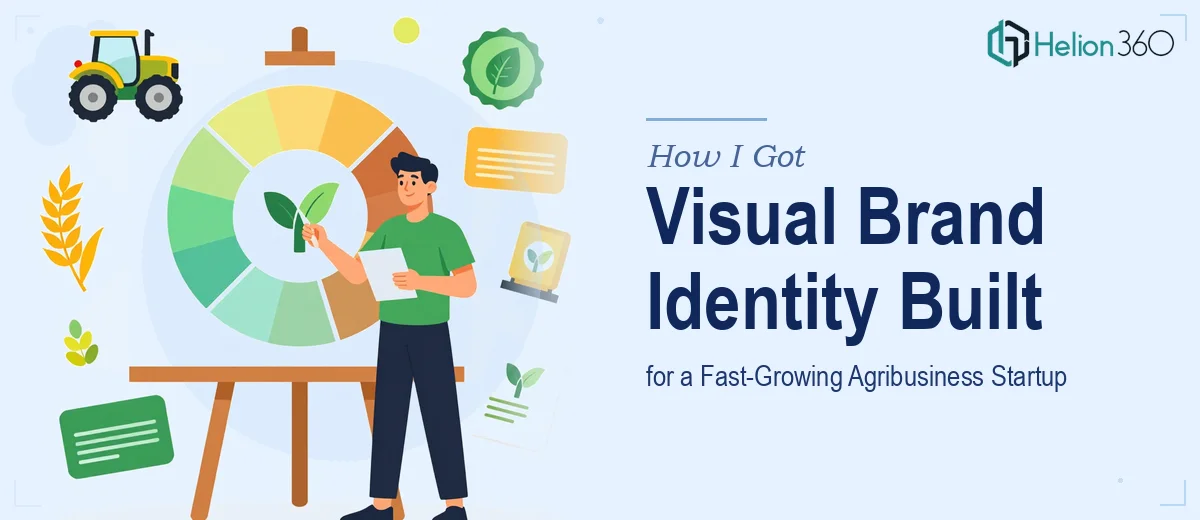
Second, the logo is only one deliverable. A complete brand identity system includes the primary mark, alternate lockups for different use cases, a defined color palette with primary and secondary values, a typography system, iconography rules, and a usage guide. Each of those components has to work independently and together across print, digital, and environmental applications.
Third, the system has to be documented in a way the whole team can use consistently. Without brand guidelines, the work degrades the moment a third party touches it. That documentation layer alone — done right — is a substantial piece of work.
What the Work Actually Involves
The foundation of any serious brand identity project is the discovery and strategy phase. This means auditing the competitive landscape, defining the brand positioning, and establishing a visual direction before any design begins. Done properly, a practitioner maps the brand attributes — in this case, qualities like sustainability, innovation, agricultural heritage, and trustworthiness — onto a visual territory: color temperature, form language, typographic tone. The friction here is that this phase is invisible but load-bearing. Skipping it or rushing it produces logos that look fine in isolation but feel off the moment context is applied, which means expensive rework downstream.
The visual mechanics of logo design require decisions that are far more precise than most people expect. A mark intended to communicate both modern and traditional qualities needs a form system that earns both readings — which might mean geometric structure with hand-drawn tension, or a wordmark using a serif with updated proportions. Typography hierarchy for a brand system typically runs three levels: a primary display face, a secondary body face, and a utility face for small applications, each chosen for rendering quality across screen and print. Color palettes for a new brand are built from a primary set of no more than four values, each specified in HEX, RGB, and CMYK to ensure fidelity across media. Getting these technical specifications wrong — even slightly — means inconsistent reproduction across channels, and fixing it after launch is painful.
The polish and consistency layer is where brand identity work most frequently breaks down for teams attempting it in-house. Every lockup variation — horizontal, stacked, icon-only, reversed — has to be constructed against a clear grid, with minimum size thresholds and clear-space rules defined and documented. Brand guidelines need to codify not just what the brand looks like, but what it doesn't: incorrect color usage, unapproved typeface substitutions, distorted mark proportions. This documentation typically runs fifteen to thirty pages when done at a standard that actually prevents misuse. Building it correctly, with real examples and edge-case rules, takes far longer than the design work that precedes it.
Why I Brought in Helion360 to Handle It
Once I understood the full scope of the work — brand strategy, mark design, full visual system, and documented guidelines — I didn't try to piece it together myself. The learning curve alone on the technical side would have taken weeks, and the strategic work required experience I didn't have on hand.
Helion360 handled the full project end-to-end: brand positioning and visual direction, primary logo and alternate lockup design, complete color and typography system, and a brand guidelines document built for real-world use. They turned it around quickly — done in a fraction of the time it would have taken me to learn and execute it myself. What stood out wasn't just the speed. It was that every decision came with a rationale grounded in how the brand would actually be used, which meant far fewer revision cycles and a final system that held up in practice.
The Outcome and What I'd Tell Anyone in My Spot
What we got back was a visual brand identity that did exactly what we needed it to do. The logo held the dual character of the brand — contemporary and grounded — without forcing it. The system was practical: easy to apply, well-documented, and immediately usable across pitch materials, packaging, and digital channels. When we showed up to our next industry meeting, the brand spoke before we did.
The business impact was real. Conversations that used to start with questions about who we were started with reactions to what we looked like — and that shifted the dynamic in our favor early.
If you're at the same point — a growing company that knows it needs a proper visual brand identity and recognizes that doing it right is not a weekend project — Helion360 is the team to engage. They deliver fast, they handle the full scope, and the execution depth is already built in.