

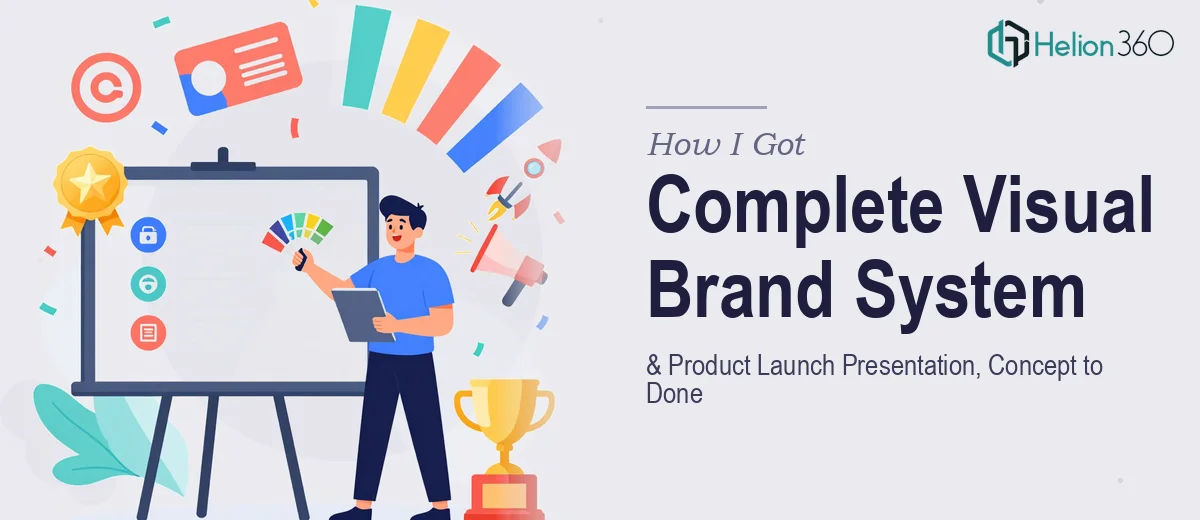
The Problem With Launching Without a Real Brand Identity
When our startup was gearing up for its product launch, I realized quickly that we were about to walk into a serious credibility gap. We had a product, a pitch, and a window of opportunity — but no coherent visual brand identity to show for it. No logo system. No defined color palette. No brand standards. Just a rough concept on a sticky note and a deadline that wasn't moving.
The stakes were real. We needed to present to potential partners and early-stage investors. We needed a launch deck that looked like it came from a company that knew what it was doing. And we needed everything — the logo, the brand system, the presentation — to feel like it belonged to the same story. Getting this wrong wasn't just an aesthetic problem. It was a business problem. I knew immediately this needed to be handled properly.
What I Found a Proper Brand Identity System Actually Requires
Once I started researching what building a real visual brand identity involves, the scope became clear fast. A logo isn't just a mark — it's a system. Done well, it includes primary and secondary lockups, monochromatic and reverse variants, minimum size rules, and clear-space specifications. That's before a single brand guideline document is written.
And the brand identity work doesn't stop at the logo. A proper visual system defines a primary and secondary type scale, a color palette with exact hex, RGB, and CMYK values across no more than four to six brand colors, and an iconography style that holds up across digital and print contexts. Then there's the question of how all of that translates into the product launch presentation — which has its own structural and visual requirements entirely.
Three things stood out as signals that this wasn't a weekend project: the sheer number of deliverables that needed to cohere as a system, the precision required at each step, and the fact that any inconsistency in the brand application would be immediately visible to the exact audience we were trying to impress.
What the Work Actually Involves
The foundation of a strong visual brand identity starts with the logo concept development and mark refinement. The right approach begins with translating brand values — in this case, sustainability and innovation — into visual language: form, weight, geometric structure, and symbol choice. Skilled logo design uses vector construction grids, typically built on a modular unit system, so every curve and corner relationship is intentional. Multiple distinct directions get developed before iteration begins on the strongest concept. That exploration phase alone, done with rigorous craft, takes considerably more time than most people expect — and skipping it is exactly how brands end up with a logo that looks dated or generic within a year.
Once the mark is resolved, building out the full brand identity system is a separate and substantial body of work. This means defining a type hierarchy — typically a display face, a body face, and a functional UI face — with clear sizing ratios across heading levels (commonly 48pt, 32pt, 24pt, 16pt) and usage rules for each. The color system requires specifying not just primary palette values but also tints, shades, and on-brand neutrals, with accessibility contrast ratios checked against WCAG standards. Done properly, all of this gets codified into a brand guidelines document that a designer or non-designer can follow consistently. Producing that document in a way that's actually usable — not just decorative — is a craft in itself, and people who haven't built one before routinely underestimate it.
The product launch presentation layer adds another dimension entirely. The narrative structure needs to be mapped first — problem, solution, differentiation, traction, ask — before a single slide gets designed. The visual system established in the brand identity work then has to be translated into a slide master architecture with grid-locked layouts, consistent iconography, and chart styles that match the brand palette. Every visual decision on every slide has to feel like it came from the same source. That consistency across thirty or more slides, with varied content types — data slides, product visuals, team slides, timeline slides — is where execution breaks down for anyone without a practiced workflow and the right tooling already in place.
Why I Brought in Helion360 to Handle It
I looked at the full scope of what this required and made the call quickly. Attempting to build a coherent visual brand identity and a polished launch presentation simultaneously, without the expertise or tooling already in place, was not a realistic path given our timeline.
Helion360 handled the full project end-to-end — logo system development through to final brand guidelines, and the complete product launch presentation built on top of the brand system they established. What would have taken me weeks of learning curve, iteration, and rework was turned around in a fraction of that time. They handled the logo concept development and multiple-direction exploration, the full brand identity system including type, color, and usage rules, and the launch presentation built to the same visual standards — all of it delivered fast and cohesively. The result was a brand system and a presentation that felt like they came from the same confident, considered source. Because they did.
The Outcome and What I'd Tell Anyone in My Spot
What we walked into our launch meetings with was a complete, consistent visual brand identity — logo system, brand guidelines, and a presentation that communicated our product story clearly and looked the part. The feedback from partners and early investors reflected exactly what we needed: the brand felt credible, considered, and ready. It didn't look like a startup that had thrown a logo together the week before. It looked like a company that knew who it was.
The business outcome was straightforward: we showed up to the right conversations with the right materials, and the brand didn't get in the way of the pitch — it supported it. That's what a proper visual brand identity is supposed to do.
If you're looking at the same situation — a real brand identity build with a launch presentation deadline bearing down and no time to learn the craft from scratch — Helion360 is the team I'd engage. They delivered the full scope fast, and the execution depth they brought was exactly what this kind of work requires.