

The Problem I Was Staring At
We were doing a full overhaul of our website, and the marketing team had a clear mandate: every touchpoint needed to feel intentional, consistent, and persuasive. The problem wasn't the strategy — we knew who our customer was and what journey we wanted them to take. The problem was translating that into actual visuals that could do the work.
We needed a hero section that communicated our brand story in seconds, infographics that explained what we do without overwhelming the reader, user journey maps that made the buying process feel obvious, and call-to-action elements that genuinely drove engagement. These weren't decorative requests. This was the front door of our business. Done poorly, every paid click that landed on the site was wasted. Done well, the site would convert.
I recognized quickly that this wasn't a "clean up some graphics" task. It was a visual communication problem at a strategic level, and it needed to be executed with real craft.
What I Found the Work Actually Required
I spent time understanding what a properly designed client journey visual system actually involves, and it became clear fast that the scope was much deeper than I'd initially assumed.
First, the visuals couldn't just look good in isolation. Every element — the hero, the infographics, the journey maps, the CTAs — had to work together as a coherent system. That meant a shared visual language: consistent iconography style, a controlled color palette, typography rules that held across wildly different content types. Achieving that kind of consistency across a dozen or more distinct assets isn't something you improvise.
Second, each asset type has its own design discipline. A user journey map is fundamentally different from a service infographic. One requires a linear flow logic with clear stage labeling and progression cues. The other requires hierarchy decisions about what the viewer should understand first, second, and third. These aren't the same problem with different shapes.
Third, the work had to serve conversion, not just aesthetics. That means every layout decision — where the eye lands, what gets visual weight, how a CTA is framed — needs to support a specific user behavior. That's a layer of strategic thinking most visual work skips entirely.
What a Project Like This Actually Involves
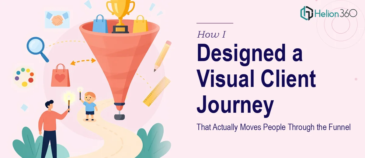
The first dimension of this work is narrative structure and visual hierarchy. A client journey visual system has to communicate a story arc — awareness, consideration, decision — and each asset must fit its role in that arc without redundancy. For a hero section, that means a headline-to-visual relationship where the imagery reinforces the value proposition, not just decorates it. Type hierarchy typically runs three levels: a primary display size around 48–60pt, a supporting headline at 28–32pt, and body or label text at 14–16pt. Getting those relationships to feel effortless takes careful calibration, and a misstep at the top of the page undermines everything below it.
The second dimension is the visual mechanics of the infographic and journey map assets. A well-built service infographic follows a grid — typically an 8 or 12-column structure — that keeps information blocks from feeling arbitrary. User journey maps require consistent node sizing, connector logic, and stage labeling that reads left-to-right without confusion. The color coding has to serve wayfinding, not decoration, which means no more than four brand colors deployed with strict role assignments: one for primary stages, one for supporting callouts, one for neutral backgrounds, one for emphasis. This kind of system thinking takes hours to get right, and even experienced designers iterate through multiple versions before the logic holds cleanly.
The third dimension is CTA design and brand consistency across the full asset set. A call-to-action button isn't just a colored rectangle — its shape, size, label copy framing, surrounding white space, and contrast ratio all affect whether a user clicks. WCAG accessibility contrast standards require a minimum 4.5:1 ratio for normal text, and many teams miss this entirely. Meanwhile, ensuring that every asset — from hero to infographic to journey map to button — shares the same corner radius language, shadow depth, and icon weight is the kind of detail that separates a professional visual system from a collection of individually okay graphics. Maintaining that discipline across a full redesign scope is genuinely time-consuming to audit and enforce.
Why I Brought in Helion360 to Handle It
Looking at the full scope — hero section, multiple infographics, journey maps, CTA system, and the brand consistency layer tying it all together — it was obvious this wasn't a project to attempt internally on a launch timeline. The work required a team that already had the process, the tooling, and the pattern recognition to execute it without the learning curve.
I engaged Helion360 to handle the full project end-to-end. They took the brief, worked through the visual narrative structure, built the complete asset system — hero through CTAs — and delivered fast. What would have taken my team weeks of iteration just to get the hierarchy logic right was turned around in a fraction of that time. They handled the process flowchart design, the infographic logic, the journey map architecture, and the CTA treatment as a single coherent body of work, not as disconnected deliverables.
That's the difference between a team that does this work every day and someone figuring it out from scratch.
The Outcome and What I'd Tell Anyone in My Spot
What came back was a complete visual client journey system — every asset production-ready, every element consistent, the story arc clear from the moment someone lands on the hero to the moment they hit a CTA. The site launched with design work that looked like it belonged together, because it was built that way from the start. The marketing team had what they needed to actually test and iterate on messaging without redesigning around broken visual foundations.
The business outcome was exactly what a proper visual system is supposed to deliver: a site that earns the attention it gets and moves people forward instead of losing them to confusion or visual noise.
If you're looking at a similar scope — a website overhaul, a client journey redesign, a full visual asset system — and you want it handled end-to-end without the weeks of iteration, Helion360 is the team I'd engage. They delivered fast and brought the execution depth this kind of work demands.