

The Brief Looked Simple — Until It Wasn't
When the task landed on my desk, it seemed straightforward enough: create a PowerPoint presentation for an upcoming tech company launch event. The deck needed to communicate the company's vision clearly, look polished enough to impress potential investors, and be ready within a week.
I've put together presentations before. Slide decks for internal meetings, project updates, the occasional client summary. But this was different. This wasn't just a set of slides — it was a statement. The kind of presentation design that had to work just as hard as the product being launched.
I opened PowerPoint and started blocking out slides. That's when the weight of the project became clear.
Where Things Got Complicated
The content itself wasn't the issue. I had the vision narrative, the market data, the product roadmap. What I didn't have was the design depth to make it all come together visually.
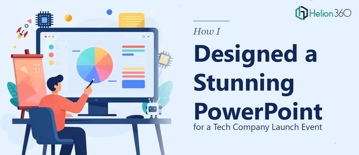
The deck needed custom infographics to break down complex market positioning. It needed charts that didn't look like default Excel exports. It needed a consistent visual language — colors, typography, spacing — that matched the brand and felt premium without being overdone.
Every time I tried to build a slide that looked right, something was off. The charts felt flat. The infographics looked generic. The overall layout lacked the cohesion you expect from a high-end PowerPoint design. I spent two days on it and kept arriving at the same conclusion: the gap between what I could produce and what this presentation actually needed was too wide to close on my own in the time available.
And the deadline wasn't moving.
Bringing in the Right Team
After hitting that wall, I came across Helion360. I explained the situation — the launch event context, the investor audience, the tight turnaround, and the design bar we needed to clear. They asked the right questions from the start: about brand guidelines, tone, the specific data we needed to visualize, and which slides carried the most weight in the story.
That conversation alone gave me confidence. They weren't just taking a brief — they were thinking about how the presentation would land in the room.
What the Design Process Actually Looked Like
Helion360's team took the raw content and restructured the visual flow from the ground up. Here's what changed:
Slide structure and visual storytelling — The narrative was reorganized so each section built logically toward the investment ask. The opening slides established context quickly, the middle sections carried the data, and the closing slides landed with clarity.
Custom infographics and charts — Instead of default chart styles, every data visual was rebuilt with clean, branded design. Market size figures, growth projections, competitive positioning — all of it translated into charts that were easy to read at a glance without losing accuracy.
Consistent design language — Typography, color usage, icon style, and layout grids were applied consistently across all slides. The deck felt like one cohesive piece, not a collection of individually built slides.
High-quality imagery and layout balance — Slides that previously felt text-heavy were redesigned with better image integration and whitespace, making them easier to present and easier for an audience to absorb.
The turnaround was fast. Revisions were handled without friction. The final file was clean, well-structured, and genuinely impressive to look at.
What the Presentation Actually Delivered
The launch event went well. The presentation held up under the scrutiny of an investor audience — which, if you've ever been in that room, you know is a real test. The visual quality of the deck reflected the seriousness of the company and the care put into the product story.
More importantly, the slides didn't get in the way. That's something I've come to see as the real measure of good presentation design: when the visuals serve the message and the presenter, rather than pulling attention away from either.
Looking back, the lesson is simple. Knowing the content isn't the same as knowing how to present it. Presentation design for a tech launch event — especially one aimed at investors — is a specific skill. Recognizing that early, rather than losing days trying to close a gap that wasn't going to close, was the right call.
Need a Presentation That's Ready for a High-Stakes Room?
If you're working toward a launch event, an investor meeting, or any presentation where the design needs to match the quality of your idea, Helion360 is worth reaching out to. Their team steps in where the complexity begins — handling the product launch presentation design work that takes real expertise and time, so you can focus on what you know best.