

The Problem With Having Great Content and No Presentation to Show for It
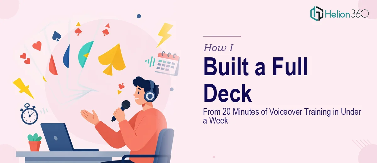
I had roughly 20 minutes of voiceover training content — scripted, structured, well-thought-out — and absolutely no way to show it to the people who needed to see it. The material covered a niche subject in depth, and I was preparing to present it to a group of stakeholders who expected something they could read, follow, and refer back to. A recording wasn't going to cut it. I needed a proper presentation deck.
The deadline was real. The audience was discerning. And the content itself was dense enough that a lazy slide-by-slide transcription would have killed the message entirely. I recognized quickly that turning spoken training content into a presentation deck that actually works is its own discipline — not just a formatting task.
What I Found Out This Kind of Conversion Actually Requires
I started by trying to understand what a good audio-to-deck conversion actually involves. What I found was that this is not a straightforward process — not if the output needs to hold up in a real presentation setting.
The first thing that became clear is that voiceover content is written to be heard, not read. The sentence structure, pacing, and emphasis that work in audio actively work against you on a slide. The content needs to be re-architected — not just reformatted.
The second thing I noticed is that a 20-minute voiceover doesn't map neatly to a set number of slides. Depending on how the content is segmented, it could expand or compress significantly, and the wrong call there changes whether the deck feels rushed or padded.
The third signal was visual. Training content, in particular, often has process logic, sequencing, and terminology that needs diagrammatic treatment — not just bullet points. That's a design decision layered on top of a structural one, and getting both right at the same time is where most DIY attempts fall apart.
What the Work Actually Looks Like When It's Done Properly
The first thing that needs to happen is a structural audit of the source content. A skilled practitioner transcribes or reviews the voiceover in full and then maps it to a logical narrative arc — identifying the core modules, the transitions between ideas, and the moments where a listener naturally pauses to process. In a 20-minute training piece, that typically means identifying somewhere between five and eight distinct content blocks, each needing its own slide or sequence. The friction here is that the person doing this work has to hold two questions simultaneously: what does this content mean, and how does an audience engage with it visually? That dual-track thinking takes time and content judgment that most people doing it for the first time underestimate.
Once the structure is set, the visual mechanics come into play. Proper slide design for training content follows a clear typographic hierarchy — typically 36pt for section headers, 24pt for key statements, and 16pt for supporting detail — with no more than four brand-consistent colors used across the deck. Process flows and sequences get treated as diagrams, not lists, because visual sequencing communicates steps more efficiently than text enumeration. A 12-column underlying grid keeps everything anchored and prevents the uneven spacing that immediately signals an amateur build. The problem is that executing this consistently across 25 to 35 slides — especially when source content is uneven in density — requires constant judgment calls that pile up quickly.
The third layer is polish and consistency across the full deck. That means ensuring that slide transitions, icon styles, chart formatting, and spacing rules don't drift across sections — a problem that compounds when content blocks were originally recorded in separate sessions or edited at different times. A single visual inconsistency on slide 28 can undermine the credibility of everything that came before it. Catching and correcting those inconsistencies in a final QA pass requires a trained eye and a defined style guide applied retroactively — exactly the kind of detail work that takes a practitioner hours and a first-timer a full weekend of frustration.
Why I Brought Helion360 In to Handle the Whole Thing
I didn't attempt this myself. I looked at what the work required — the structural re-architecture, the visual mechanics, the consistency pass — and recognized that trying to learn and execute all of it in the time I had wasn't a reasonable plan.
Helion360 handled the full project end-to-end. That meant taking the raw voiceover content, mapping it into a slide architecture, designing the full deck with proper hierarchy and visual treatment, and delivering a final file that was ready to present. They turned the whole thing around in days — not weeks — which was the only timeline that worked given when the presentation was scheduled.
What made the difference was that they brought the structure, the tooling, and the design judgment to the project from day one. There was no ramp-up, no learning curve on my end, and no back-and-forth trying to explain what a training deck should feel like. It was handled.
The Result and What I'd Tell Anyone Staring at the Same Problem
What came back was a clean, well-structured presentation deck that communicated the training content the way it was meant to be communicated — with clear visual sequencing, consistent formatting, and a hierarchy that helped the audience follow along rather than fight through dense slides. The stakeholders who received it engaged with it in the way I'd hoped. The material landed.
The lesson I took from the project is that raw content — even good content — is not a presentation. The conversion work is real, and it requires a specific combination of narrative judgment and visual execution that takes time to develop. If you're sitting on voiceover training material, a recorded walkthrough, or any kind of spoken content that needs to become a deck, the gap between source and deliverable is wider than it looks.
If you're in the same spot and need it handled fast and properly, Helion360 is the team I'd go to — they delivered end-to-end, quickly, and the depth of execution showed in the final product.