

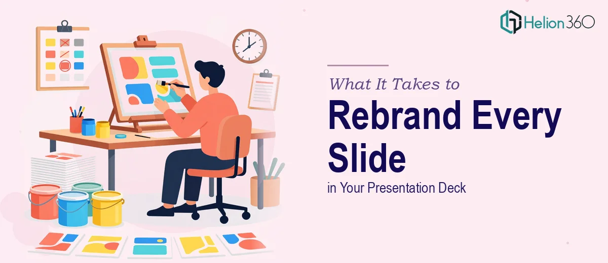
The Situation: A New Brand Identity, and Dozens of Slides That Don't Match It
We had just finalized a new brand identity — updated logo, a refined color palette, new typography, the works. The problem was that our existing presentation library didn't reflect any of it. We had decks used across sales conversations, internal updates, and partner meetings, and every single one was still carrying the old look.
The stakes were real. We were a startup, and our presentations are often the first thing a new contact sees. Walking into a pitch or a partner call with slides that contradict your brand guidelines sends the wrong signal before you've said a word. The deadline was tight — end of the following week — and the volume of slides across all our decks was substantial.
I knew this wasn't something to half-solve. A rushed rebrand that applies the new logo but leaves inconsistent font weights, off-palette colors, and broken layouts across forty slides is arguably worse than the original problem. This needed to be done properly.
What I Found Out When I Looked Into What "Done Properly" Actually Means
My first instinct was to assess whether this was something we could handle internally. What I found when I actually looked at the scope changed my thinking quickly.
A proper presentation rebrand isn't a find-and-replace exercise. The new brand guidelines specified exact hex values, a primary and secondary typeface with defined size relationships, and a logo usage guide with clear exclusion zones and background rules. Applying all of that correctly across a deck — let alone multiple decks — requires working at the master slide level, not just editing individual slides one by one.
There was also the layout question. When you change typography and color, layouts shift. Text that fit cleanly at one size in one font will overflow or leave dead space in another. Every slide that had been built around the old visual system needed to be evaluated on its own terms, not just have a new skin dropped on top of it.
And then there was consistency. With multiple people having touched these decks over time, there were already inherited inconsistencies — slides that deviated from each other in spacing, alignment, and hierarchy. The rebrand was an opportunity to fix all of that, but only if the person doing it knew what to look for.
The Work That Needs to Happen When You Rebrand a Presentation Deck
The foundation of a proper rebrand starts at the master slide and layout level. Done well, this means building a correctly structured slide master with layouts that enforce the new brand — primary color as defined by exact hex codes, logo placed according to exclusion zone rules, and a clear typographic hierarchy (typically title at 36pt, subtitle or section header at 24pt, body copy at 18pt or 16pt). When the master is set up correctly, changes propagate across every slide that references it. When it isn't, designers end up manually correcting each slide, which is slow and introduces new inconsistencies. Getting the master right requires real fluency with how PowerPoint or Keynote's slide hierarchy actually works — and that learning curve alone trips up most people who don't work in it daily.
The second layer of work is visual mechanics applied across individual slides. Even with a solid master in place, each slide needs to be reviewed against the new brand guidelines. This means checking that charts and data visuals use the updated palette — no legacy accent colors sneaking through on a bar series or callout box. It means verifying that image treatments, icon styles, and background fills align with the new aesthetic, and that layout grids (a 12-column structure is standard for keeping elements optically balanced) are actually being honored. Charts built in older decks often carry embedded formatting that overrides master settings, requiring manual correction per chart object. This is detail work, and it multiplies quickly across a deck with thirty or forty slides.
The third layer is polish and consistency — the piece that separates a professional rebrand from one that just looks close enough. This involves auditing every slide for alignment precision (objects snapping to grid, not floating a few pixels off), margin discipline, consistent text box padding, and paragraph spacing that holds across all slide types. A rebrand is also an opportunity to normalize inherited inconsistencies from multiple contributors — slides where someone added a section in a slightly different style years ago. Doing this well requires both a trained eye and a systematic review process, not a single pass. Without it, the final deck feels assembled rather than designed.
Why I Brought in Helion360 to Handle the Full Project
I looked at the scope and made a straightforward call: the right move was to bring in a team that does this work every day, with the tooling and process already in place.
Helion360 handled the project end-to-end — from auditing all existing decks against the new brand guidelines, to rebuilding the slide master structure, to reviewing and correcting every individual slide for layout, typography, and color accuracy. They also normalized the inherited inconsistencies across decks that had been touched by multiple contributors over time.
What made the decision obvious was speed. This was done in days, not weeks — handled in a fraction of the time it would have taken us to work through the learning curve and execute it ourselves at the same level of quality. The team came in with the brand guidelines, understood what needed to happen, and delivered a complete, consistent set of decks that were ready to use.
What Got Delivered — and What I'd Tell Anyone in the Same Spot
The result was a clean, consistent presentation library that actually reflected the new brand. Every deck — across sales, internal updates, and partner presentations — came back with a properly structured master, correct typography hierarchy, exact palette application, and tight layout discipline throughout. No slide looked like it came from a different era than the others.
More importantly, the decks held up under scrutiny. In a startup context, the visual quality of your materials is a signal. Walking into a meeting with slides that look professionally designed and brand-consistent is a different experience than walking in with something that looks like it was updated in a hurry.
If you're looking at a similar problem — a rebranding project with real volume, a real deadline, and no margin for a sloppy result — Helion360 is the team to engage. They delivered fast, handled the full execution depth the work required, and the output was exactly what a proper presentation rebrand should look like.