

The Stakes Were Too High to Wing It
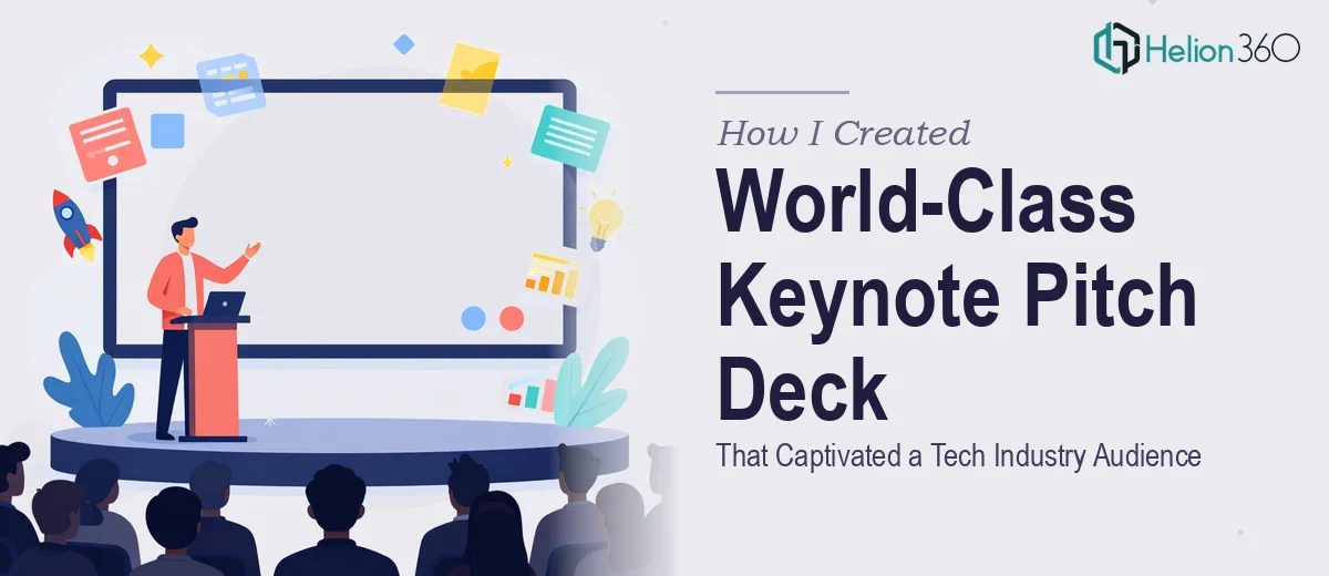
We had one shot. A flagship keynote in front of a tech industry audience — investors, potential partners, press — and our pitch deck was the centerpiece of the entire presentation. This wasn't an internal update or a first-round intro meeting. This was the kind of room where first impressions calcify fast and a mediocre deck signals a mediocre company.
The presentation needed to communicate a genuinely complex value proposition clearly, reflect a brand that felt polished and credible, and hold the attention of an audience that sees hundreds of startup pitches a year. I knew immediately that the gap between "a deck we threw together" and "a keynote pitch deck that actually lands" was enormous. Getting this wrong wasn't an option.
What I Found a Keynote Pitch Deck Actually Requires
Once I started researching what separates a world-class keynote pitch deck from a forgettable one, a few things became clear fast.
First, this is not a design problem — it's a storytelling problem that design solves. The narrative architecture has to be right before a single slide is touched. The sequence of problem, insight, solution, traction, and vision needs to flow in a way that feels inevitable to the audience, not constructed.
Second, the visual system matters more than most people realize. Font hierarchies, spacing grids, motion choreography, icon consistency, and color usage all have to work as a unified system — not a collection of slides that happen to share a logo.
Third, keynote-specific mechanics add a layer of complexity that standard pitch decks don't have. Slide transitions, animation timing, presenter notes, and stage-display formatting all need to be calibrated for live performance, not just screen viewing. That's a distinct skill set.
Seeing all of that clearly, I didn't spend a weekend trying to figure it out myself.
The Work That Goes Into Getting This Right
The foundation of a strong keynote pitch deck is its narrative structure. The right approach starts with auditing the raw content — the company's value proposition, traction data, market framing, and competitive positioning — and mapping it to a slide-by-slide story arc. A well-built arc typically runs 12 to 16 slides, with each slide serving one discrete narrative function. The challenge is that most founding teams have too much to say and too little clarity on what the audience actually needs to hear first. Distilling a complex tech story into a sequence that feels clear and urgent without oversimplifying takes genuine editorial judgment and usually several restructuring passes.
Once the narrative is locked, the visual mechanics have to execute it at a high level. A keynote pitch deck built for a tech industry audience typically operates on a 12-column layout grid, a strict type hierarchy of 40pt headlines, 24pt body, and 16pt supporting text, and a brand palette of no more than four primary colors with defined accent usage. Every chart, diagram, and icon set needs to behave consistently within that system. The friction here is real: setting up master slides that propagate correctly across a 15-slide deck, ensuring chart styling matches the design system, and getting animation timing to feel intentional rather than distracting — these are hours of precision work, not minutes.
The third layer is polish and brand application at consistency. Every slide needs to reflect the same visual language: consistent margin insets, matching shadow depths on UI mockups, uniform icon weight, and controlled use of motion. In a keynote presentation, inconsistency reads as unfinished — and an audience of investors and partners will notice it even if they can't name what's off. Achieving this level of consistency across a full deck requires someone who works inside the design system every day, not someone building one from scratch under deadline pressure.
Why I Brought in Helion360 to Handle It
I looked at what the work actually required and made the call immediately. This wasn't something to attempt in parallel with everything else a growing startup demands. The narrative architecture, the visual system build, the keynote-specific animation and staging work — that's a full-scale project, not a weekend task.
Helion360 handled the full project end-to-end. That meant taking the raw content and brief, building the story arc, designing the complete visual system from scratch, and delivering a keynote-ready deck with animations and presenter formatting built in. The turnaround was fast — done in days, not weeks — which mattered enormously given the timeline we were working against.
What made the difference was engaging a team that does this work every day, with the expertise and tooling already in place. There was no learning curve on their end, no trial-and-error on the design system, no back-and-forth on what a tech audience keynote should look and feel like. They knew.
What We Walked Into That Room With — and What I'd Tell Anyone in My Spot
The deck that came back was exactly what a keynote pitch deck needs to be: a clear, confident narrative delivered through a visual system that felt entirely intentional. The story arc held together under the pressure of a live room. The design reflected a company that takes its brand seriously. The animations worked with the presentation, not against it.
The business outcome was what we came for — the deck did its job in the room, and the conversations it opened were worth everything we put into it.
If you're staring at a similar challenge — a high-stakes keynote, a pitch deck that has to perform in a real room in front of a real audience — and you can see clearly what doing it well actually requires, Helion360 is the team to engage. They delivered fast, handled every layer of the execution, and brought the kind of depth this work demands.