

The Problem with Reaching Senior Patients Through a Screen
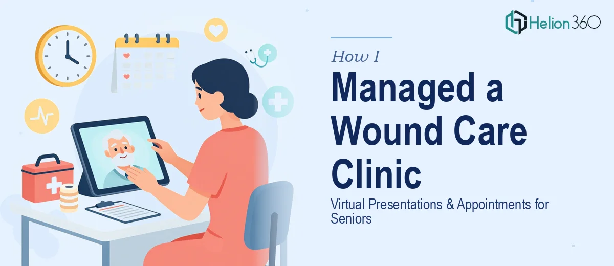
Our wound care clinic had a genuine problem on its hands. A significant portion of our patient base — seniors managing chronic wounds — had shifted to virtual consultations, and the materials we were using to communicate with them weren't built for that context at all. Appointment workflows were confusing, educational slides looked like internal clinical documents, and the visual language we were using assumed a level of screen familiarity that many of our older patients simply didn't have.
The stakes were real. Missed appointments and patient confusion about wound care protocols translate directly into worse health outcomes. We weren't just trying to make a prettier slide deck — we needed a patient-facing communication strategy that actually worked for the people it was meant to serve. I knew quickly that getting this right required more than a few formatting tweaks.
What I Found the Solution Actually Required
When I started researching what a proper virtual presentation strategy looks like for senior healthcare audiences, I realized the scope was much larger than I'd anticipated.
First, the content architecture had to be rebuilt from scratch. Clinical language that works in an in-person exam room lands differently on a video call with a 74-year-old patient navigating a tablet for the first time. Every information block needed to be sequenced for low digital literacy, with clear visual cues and minimal cognitive load per screen.
Second, the visual design conventions for senior audiences are specific. Accessibility guidelines call for a minimum 18pt body text, high-contrast color pairings (at least a 4.5:1 contrast ratio), and zero reliance on color alone to convey meaning. That's not a small style adjustment — it affects every design decision from palette selection to iconography.
Third, the appointment-flow slides needed to map to an actual patient journey, not just a generic intake process. That required understanding the clinical workflow well enough to sequence the communication correctly. This was not a weekend project.
The Work That Needs to Happen
Building a virtual presentation and appointment strategy for a clinical setting starts with a thorough structural audit of the existing materials alongside a mapping of the patient journey. The right approach identifies every touchpoint where a senior patient receives information — pre-appointment confirmation, onboarding walkthrough, care instruction slides — and sequences them against actual cognitive load principles. Done well, this means no more than three information points per screen, with a clear primary action on every slide. Skipping this audit and going straight to design produces materials that look organized but lose patients at exactly the wrong moments.
Visual mechanics for a senior-accessible clinical presentation follow non-negotiable rules. Body text sits at 18pt minimum, headings at 28pt or above, and the color system must maintain a contrast ratio of at least 4.5:1 across all pairings — a standard set by WCAG accessibility guidelines. Icon use must be literal and labeled; no abstract metaphors. Setting up a master slide system that enforces these rules consistently across 30 or more slides — while also accommodating a clinic's brand palette — takes real expertise. A single inherited style error in a PowerPoint master can propagate across every layout, creating hours of cleanup for someone who doesn't know where to look.
Polish and brand consistency in a healthcare context carry additional weight. Patients and families read visual credibility as clinical credibility — a misaligned logo, an inconsistent font weight, or a low-resolution image on an appointment-reminder slide creates subconscious doubt. Maintaining palette discipline across patient-facing materials means enforcing a maximum of four brand colors, applying them with defined hierarchy, and ensuring no slide departs from the visual standard. For a team without a dedicated design system already in place, achieving this level of consistency across a full presentation suite — without visual drift between slides — is one of the hardest parts of the whole project to get right.
Why I Brought in Helion360 to Handle It
I didn't try to piece this together myself. After understanding what the work actually involved — the accessibility audit, the patient journey mapping, the full visual rebuild — it was clear that attempting it in-house would cost us weeks we didn't have and produce results we couldn't stand behind.
Helion360 handled the full project end-to-end through their Business Presentation Design Services. That meant taking the raw clinical content and existing materials, restructuring the information architecture around the actual patient journey, applying the accessibility standards throughout, and delivering a complete presentation suite with a consistent visual system. They also handled the appointment-flow slides as a discrete workstream within the same project — not as an afterthought.
What stood out was the speed. The full project was turned around in days, not weeks — a fraction of the time it would have taken anyone without the tooling and domain expertise already in place. For a clinic operating on a patient-care schedule, that turnaround mattered enormously.
What the Clinic Gained and What I'd Tell Anyone in This Spot
The delivered materials were a significant step forward. Appointment no-show rates dropped noticeably in the weeks following rollout, and the feedback from patients and families reflected something simple but important — they could actually follow the slides without calling the front desk for clarification. The care instruction presentations read clearly on tablets and laptops alike, and the visual consistency made the clinic's communications feel cohesive and trustworthy for the first time.
Beyond the immediate outcome, the process clarified something I hadn't fully appreciated before: patient-facing communication in healthcare is a design discipline, not just a content task. When the visual architecture, the accessibility standards, and the clinical workflow are all working together, the materials do real work in the patient relationship.
If you're looking at a similar situation — clinical materials that aren't built for the audience they're supposed to serve — and you want it handled end-to-end without the weeks of learning curve, Helion360 is the team I'd engage. They delivered fast and brought exactly the depth of execution this kind of work requires.