
16May
How I Designed a Cohesive 25-Slide Presentation with Consistent Visual Branding
Learn how a 25-slide PowerPoint presentation was transformed with consistent fonts, colors, and visual design — and how Helion360 made it happen.
Read More

Presentation design, digital marketing & market research for businesses worldwide.
Loading blog…
Learn how a 25-slide PowerPoint presentation was transformed with consistent fonts, colors, and visual design — and how Helion360 made it happen.
Read More
Learn how I built an interactive PowerPoint with annotated callout circles, gradient backgrounds, and animation effects — and how Helion360 made it happen.
Read More
I needed a clear process diagram in PowerPoint to improve team communication. Here's how I approached it and what finally got the job done right.
Read More
Learn how a complex workflow slide with 9 circles and 3 squares came together in PowerPoint — and how professional design support made all the difference.
Read More
See how a three-section PowerPoint slide with images, charts, and written content was designed to present complex artifacts clearly and professionally.
Read More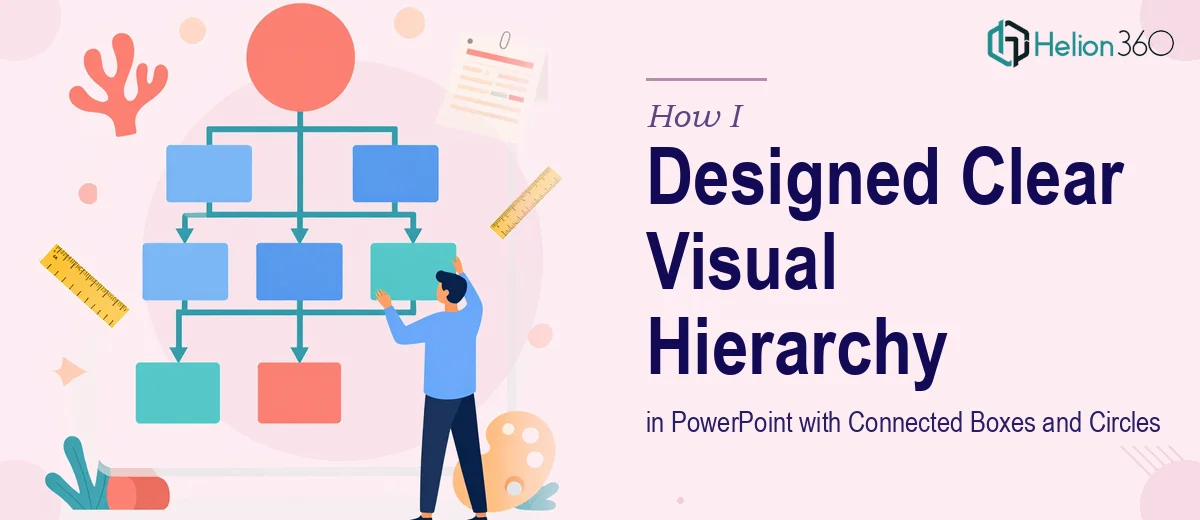
Learn how I built a clear visual hierarchy in PowerPoint using connected boxes and circles — and how Helion360 helped me get it right.
Read More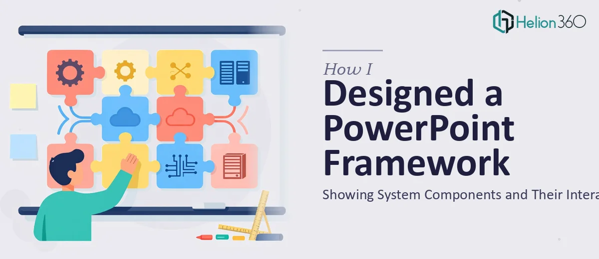
How I created a professional PowerPoint framework slide using circles to visualize system components and their interactions — and where I got help.
Read More
I had raw client materials and needed one polished PowerPoint slide. Here's how the process went, where I got stuck, and how the final slide came together.
Read More
I needed a branded PowerPoint template for our marketing campaigns. Here's how the process unfolded and what made the final result work so well.
Read More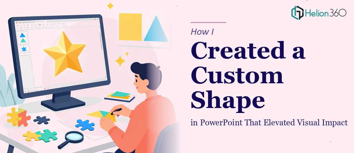
I needed a unique custom shape in PowerPoint that went beyond the defaults. Here's how the challenge unfolded and how I got it solved with professional help.
Read More