07Aug
How I Built a Presentation Website With Seamless CRM Integration
Learn how to transform raw research findings into clear, compelling presentations. Covers structure, data visualization, common pitfalls, and best practices.
Read More

Presentation design, digital marketing & market research for businesses worldwide.
Loading blog…
Learn how to transform raw research findings into clear, compelling presentations. Covers structure, data visualization, common pitfalls, and best practices.
Read More
Learn how to turn raw data into compelling visual stories in Google Slides — with real techniques, layout rules, and pitfalls to avoid.
Read More
Learn how to transform complex financial data into clear, compelling investment presentations using Excel models, data visualization, and smart slide design.
Read More
Learn how to build a functional HR management system in Google Sheets or Excel covering attendance, payroll, leave tracking, and employee records.
Read More
Learn how to transform an Excel budget template into a polished financial PowerPoint presentation — structure, charts, layout, and common pitfalls covered.
Read More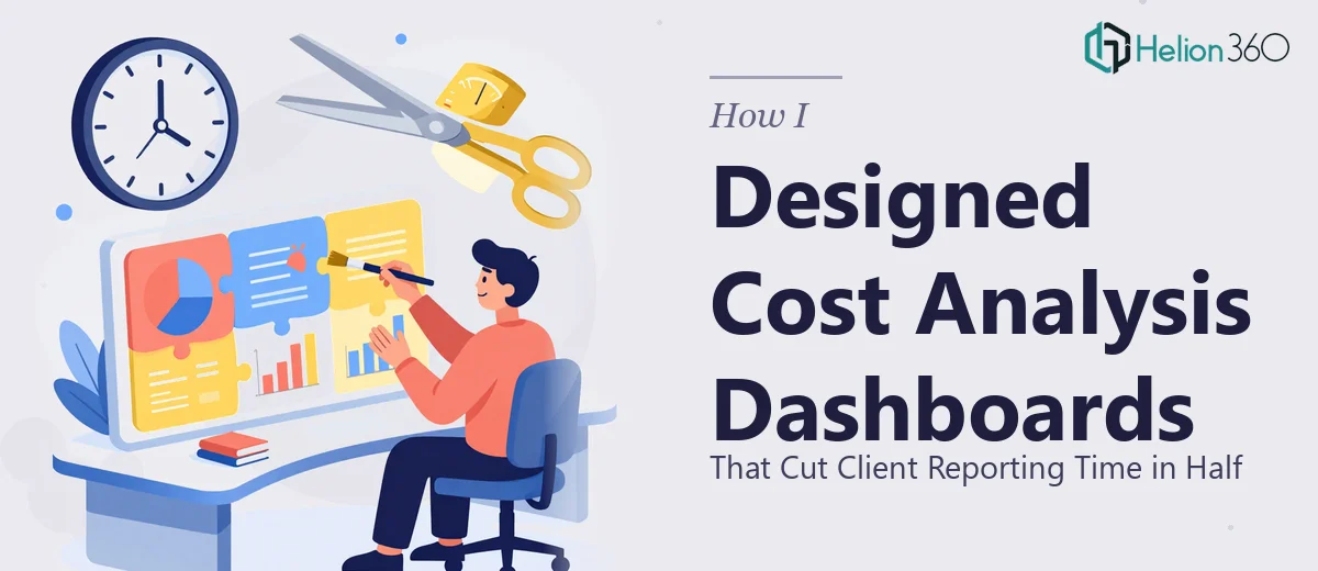
Learn how to design cost analysis dashboards that streamline client reporting, improve data clarity, and save hours every week with the right structure.
Read More
Learn how to build clear, accurate line graphs in Excel to visualize KPIs. Covers chart setup, formatting, axis rules, and common pitfalls to avoid.
Read More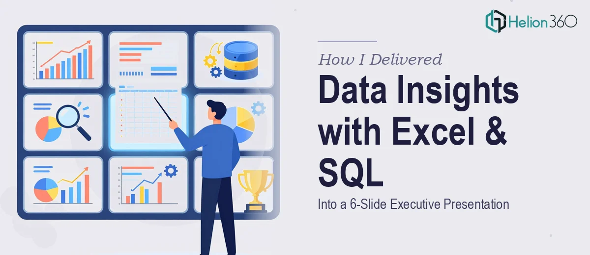
Learn how to combine Excel analysis and SQL queries into a concise 6-slide executive presentation that communicates data insights clearly and confidently.
Read More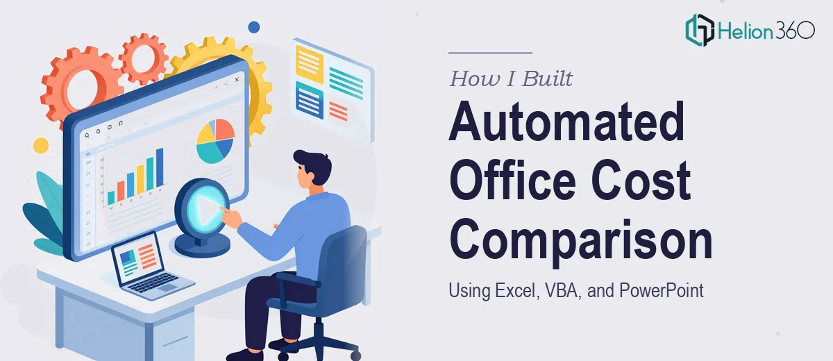
Learn how to build an automated office cost comparison tool using Excel, VBA, and PowerPoint — with real formulas, layout tips, and common pitfalls to avoid.
Read More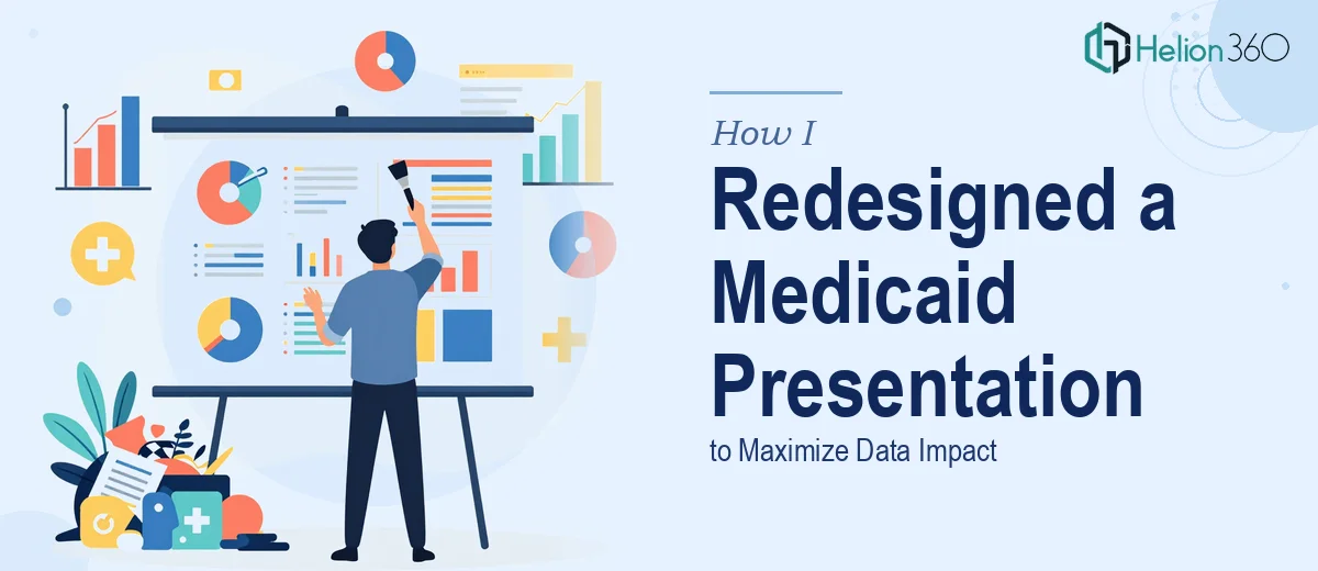
Learn how to redesign a large-scale healthcare or Medicaid presentation so complex data lands clearly, visually, and with real persuasive force.
Read More