How I Created a Geo Map from Excel Data: A Step-by-Step Approach to Geospatial Visualization
Learn how to turn raw Excel data into clear, accurate geo maps. A step-by-step guide to geospatial visualization for presentations and reports.
Read MorePresentation design, digital marketing & market research for businesses worldwide.
Loading blog…
Learn how to turn raw Excel data into clear, accurate geo maps. A step-by-step guide to geospatial visualization for presentations and reports.
Read MoreLearn how to build a real-time Excel dashboard that centralizes project management for growing teams — with formulas, layouts, and design principles that work.
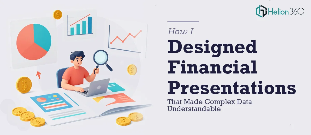
Read MoreLearn how to design financial PowerPoint presentations that turn complex data into clear, compelling visuals your audience can actually understand and act on.
Read MoreLearn how to design high-impact PowerPoint presentations with the right structure, typography, layout grids, and data visualization — even under tight constraints.
Read MoreLearn how to design data-driven PowerPoint presentations that engage audiences — with real frameworks, layout rules, and pitfalls to avoid.
Read MoreLearn how to build a robust Excel macro for Amazon PPC reporting — covering data structure, formulas, automation logic, and common pitfalls to avoid.
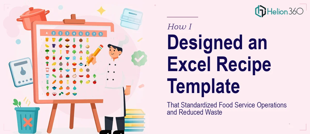
Read MoreLearn how to build an Excel recipe template that standardizes food service operations, controls costs, reduces waste, and scales with your business.
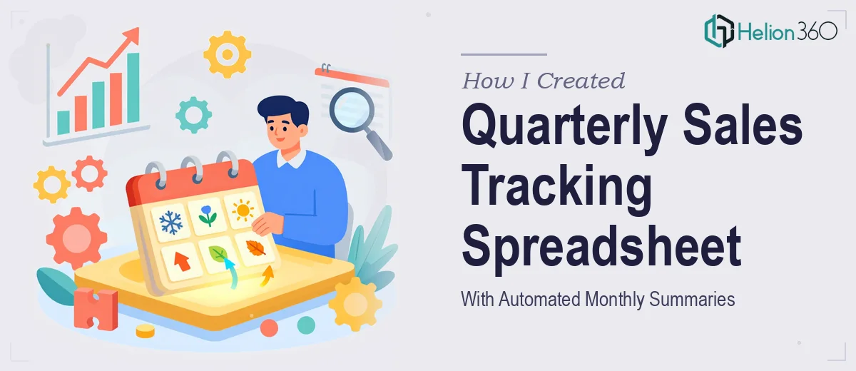
Read MoreLearn how to build a quarterly sales tracking spreadsheet with automated monthly summaries using formulas, structured data, and clean dashboard logic.
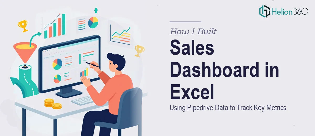
Read MoreLearn how to build a sales dashboard in Excel using Pipedrive data, with VBA macros, KPIs, and data visualization best practices for tracking key metrics.
Read MoreLearn how to build a financial metrics dashboard in Excel using dynamic formulas, structured data, and charts that update automatically as your data changes.
Read More