

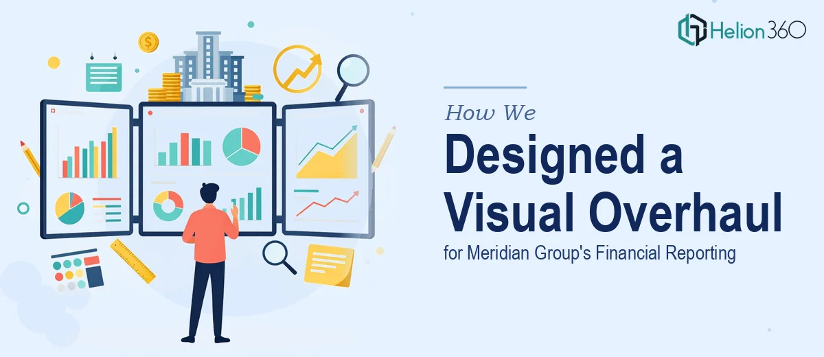
The Starting Point
When Meridian Group approached us, they weren't starting from scratch. They had Power BI dashboards in place, Excel templates their team relied on weekly, and a PowerPoint presentation they needed to present to internal stakeholders. The problem wasn't the data — it was how that data was being communicated.
The dashboards tracked important financial metrics but lacked visual consistency. The templates were functional but rigid, unable to support the range of reporting the business needed. And the presentation, while informative, wasn't landing with non-technical audiences the way the client needed it to.
What We Focused On
Helion360 approached this as a three-part visual and structural overhaul. We began with the Power BI dashboards, rebuilding the layout to establish clear information hierarchy and applying a coherent color system that made financial data easier to read at a glance. Filtering and navigation were also refined so users could move through the dashboards without friction.
The Excel templates required a different kind of work. We added structured data layers with expanded calculated fields and improved conditional formatting, giving the client a reporting foundation that could grow with the business. These weren't cosmetic changes — they were architectural improvements that reduced the manual effort involved in regular reporting cycles.
The PowerPoint presentation was the final piece. We translated the Power BI findings into a slide deck built around narrative clarity. Each slide communicated one idea. Data visualizations were reformatted for screen presentation, and the overall design was brought into alignment with the visual language established across the dashboards and templates.
What Was Delivered
The outcome was three deliverables that worked together as a cohesive reporting system. The dashboards were cleaner, more intuitive, and visually consistent. The templates were more capable and easier to maintain. The presentation was sharp enough to work in a live meeting and clear enough to stand alone as a document.
Stakeholders without a technical background were able to follow the financial narrative — which had been one of the client's primary goals from the beginning. Helion360 delivered work that balanced design quality with practical function, which is exactly the standard this kind of project demands.
Working With Helion360
If your dashboards, templates, or presentations are functional but not quite landing the way they should, Helion360 is the kind of team that knows how to close that gap. We've worked across Power BI, Excel, and PowerPoint on projects where all three needed to come together — and we know what it takes to make data communication work at every level. If you're facing a similar challenge, we're ready to step in.