

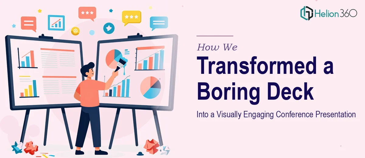
The Problem With Text-Heavy Conference Slides
When a presentation relies too heavily on written content, it stops being a presentation and starts being a document. That was exactly the challenge this client brought to us ahead of their annual company conference. The slides were packed with information, but the format was working against them — long blocks of text competed for attention rather than directing it.
The content itself was solid. The structure just wasn't built to communicate visually, and in a live conference environment, that gap matters.
Our Approach to the Redesign
Before touching a single slide, we audited the full deck to understand what the presentation was trying to accomplish. We looked at which ideas were essential, which were supporting detail, and where visual elements could carry the message more effectively than words.
From there, Helion360 rebuilt the deck in PowerPoint with a clear visual hierarchy at the center of every design decision. We stripped the text down to its sharpest form and matched each core point with a high-quality, contextually relevant image. The goal wasn't to make it look better for its own sake — it was to make the content land harder with a live audience.
We also standardized the design language across slides, ensuring consistent typography, spacing, and color use throughout. A cohesive visual system is what separates a polished conference deck from a collection of individual slides.
What the Redesigned Deck Delivered
The finished presentation was a significant departure from what we started with. Text density dropped by more than half across the deck. Every slide had a clear focal point, and the narrative moved with the kind of momentum that keeps conference audiences engaged rather than reading ahead.
The client received a complete deck presentation that was ready to present — no further revisions needed. The visual structure guided attention naturally, and the supporting imagery reinforced each message without distracting from it.
Working With Helion360
If your presentation is carrying more text than it should, Helion360 knows how to fix that without losing the substance behind it. We've handled decks like this before and understand what it takes to turn complex content into something an audience will actually remember.