

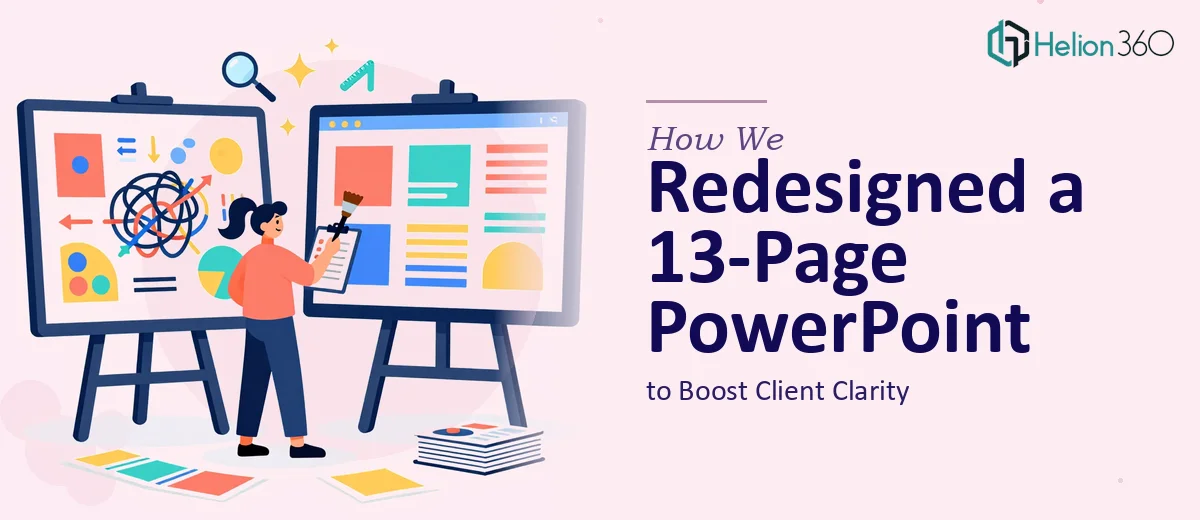
The Starting Point
Some presentations don't need new content — they need a stronger structure to carry the content they already have. That was exactly the situation here. The client had a 13-page PowerPoint that covered the right information but wasn't landing the way it should. Visual inconsistencies, dense slides, and a layout that didn't guide the viewer naturally were all working against the message.
The stakes were real. This presentation was being used for client pitches, internal meetings, and webinars — three very different contexts that all demanded clarity and professionalism.
What We Found in the Audit
Before touching a single slide, we reviewed the full deck to understand where the design was failing. The color scheme shifted across slides without logic. Headings didn't establish a clear visual hierarchy. Several slides carried more text than any viewer should be expected to process in real time. The icons felt dated and didn't align with the tone the client wanted to project.
None of these were catastrophic issues on their own. Together, they created friction — the kind that makes an audience work harder than they should to follow a presentation.
Building a Unified Visual System
Helion360 approached the redesign as a systems problem. We established a consistent color palette and applied it deliberately across all 13 slides. Typography was restructured so headings, subheadings, and body text each served a distinct role. Dense text sections were reorganized into layouts that preserved the original information while making it far easier to absorb.
We replaced outdated icons with updated graphics that matched the new visual theme, and introduced interactive elements suited for live webinar and pitch settings. Every design decision was grounded in how the audience would actually experience the slides.
What the Client Received
The final deck was a fully polished, presentation-ready file — consistent from the first slide to the last. Early feedback from the client's actual audiences confirmed what the redesign was built to achieve: better readability, stronger visual flow, and a more professional impression in every setting.
The client is now using the presentation regularly across pitches and internal briefings, and it continues to perform well.
Working With Helion360
If your presentation is carrying solid content but not delivering the impact it should, Helion360 is ready to step in. We've done this kind of work before, and we know how to turn a functional deck into one that genuinely engages its audience.