

From Data Overload to Visual Clarity in Professional Consulting Presentations
Presenting complex data to a professional audience is one of the more demanding communication challenges in the consulting world. When the information is dense and the stakes are high, the way you present matters just as much as what you present.
Our client understood the value of their data. What they needed was a way to make that data work harder — visually, structurally, and strategically.
The Problem With Dense Slide Decks
Most consulting presentations grow organically over time. New data gets added, slides get duplicated, and before long the deck becomes a document rather than a presentation. That was precisely the situation we walked into.
Slide after slide was carrying too much weight. Text blocks competed with data tables. Charts lacked context. The narrative thread was buried under layers of content that all felt equally important — which meant nothing stood out.
The audience — senior stakeholders and decision-makers — was disengaging. Not because the content lacked merit, but because the format made it too difficult to extract meaning quickly.
Building a Design Framework That Served the Message
Before touching a single slide, we mapped out the full presentation structure. We identified which sections needed to inform, which needed to persuade, and which needed to prompt a decision. That framing shaped every design choice that followed.
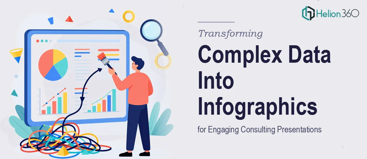
We developed custom infographics for the data-heavy sections — converting statistical comparisons, process flows, and multi-variable analyses into visuals that communicated at a glance. Color, layout, and typographic hierarchy were used deliberately to direct attention and reduce cognitive load.
Helion360 approached this not as a visual refresh but as a communication problem. The design had to serve the argument, not decorate it.
Consistency as a Long-Term Asset
One of the more practical outcomes of this project was the design system we built alongside the presentation itself. Rather than delivering a one-off product, we created a set of reusable templates and visual guidelines the client could apply to future work.
This meant the investment extended well beyond the initial deliverable. The client could now build new presentations that looked and felt consistent, without needing to brief a designer from scratch every time.
The Shift in Audience Reception
The redesigned materials changed how the presentations landed. Stakeholders reported that the information felt clearer and easier to follow. The client was able to move through sessions more efficiently, spending less time explaining visuals and more time discussing implications.
Several infographics were repurposed as standalone assets — pulled into executive summaries and printed reports — which extended the value of the design work into other parts of the business.
Working With Helion360
If your consulting presentations are carrying strong content but failing to connect with your audience, the problem is usually structural and visual — not substantive. Helion360 has worked through exactly this kind of challenge before.
We know how to take complex, layered information and build a presentation around it that holds attention and earns trust. If you're facing a similar brief, we're ready to step in and get it right.