

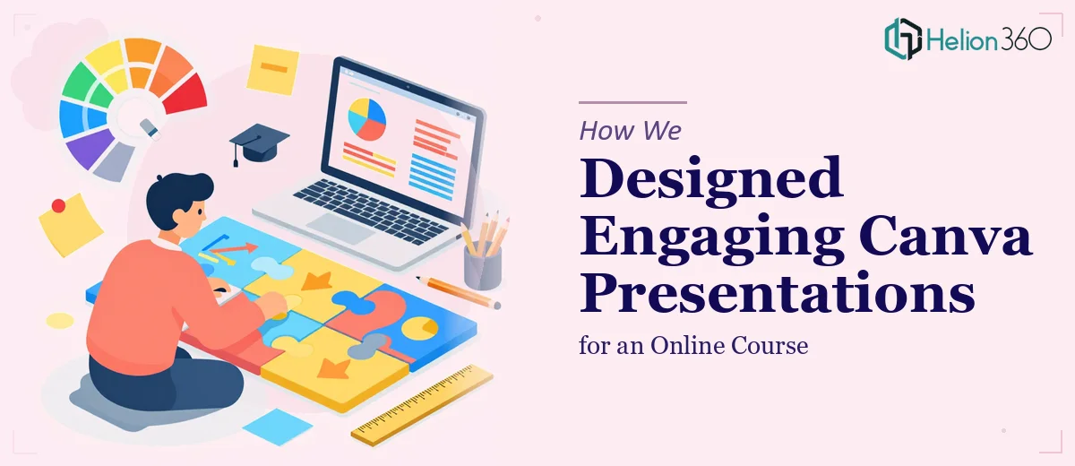
Turning Dense Course Content Into Visual Learning Experiences
Online courses live and die by how well they hold attention. Even the most carefully researched material can fall flat if it's delivered through slides that are cluttered, inconsistent, or visually uninspiring. That was the core challenge when our client came to us with a completed course curriculum and no visual layer to carry it.
The content was solid. The problem was presentation.
Understanding the Material Before Opening Canva
Before any design work began, we invested time in actually reading and understanding the course content. This isn't a step that every team takes seriously, but for educational material it's non-negotiable. You cannot design for comprehension if you don't comprehend the subject yourself.
This research phase shaped every decision that followed — from how we broke content into slide segments, to where we placed visual emphasis, to which concepts needed supporting graphics rather than just text.
Building a Visual System, Not Just Slides
One of the risks with Canva projects is defaulting to templates without adapting them meaningfully. We took a different approach. We used Canva's template library as a structural foundation and rebuilt each design to match the specific tone and complexity of the course.
A consistent visual system was established early — typography hierarchy, color palette, icon style, and layout logic. This ensured that learners moving from one module to the next experienced continuity rather than visual noise.
Each module also had its own internal pacing. Some sections were concept-heavy and needed breathing room. Others were process-driven and benefited from step-by-step slide structures. We adjusted the design rhythm accordingly.
Accuracy and Aesthetics in Equal Measure
For educational presentations, design cannot come at the cost of accuracy. Every data point, term, and instructional sequence had to reflect the source material precisely. We cross-referenced our slides against the original course content throughout the build, not just at the end.
The visual choices — icons, diagrams, layout emphasis — were all made in service of the learning objective, not for aesthetic novelty. When something looked good but added confusion, it was cut.
Delivery and Handover
Helion360 delivered the full presentation set within the agreed timeline. Each deck was built in Canva and handed over as a fully editable file, giving the client complete control over future content updates without needing design support.
The client required minimal revisions. The designs aligned with their course goals from the first review, which meant less back-and-forth and a faster path to publication.
Working With Helion360
If you're building an online course and need someone to handle the visual presentation work with care and precision, Helion360 is ready to step in. We've done this before — we know how to read educational content, extract what matters, and build presentations that actually support learning.
We don't hand back generic templates. We deliver presentation systems designed around your specific material, your learners, and your platform. If that's what you need, let's talk.