

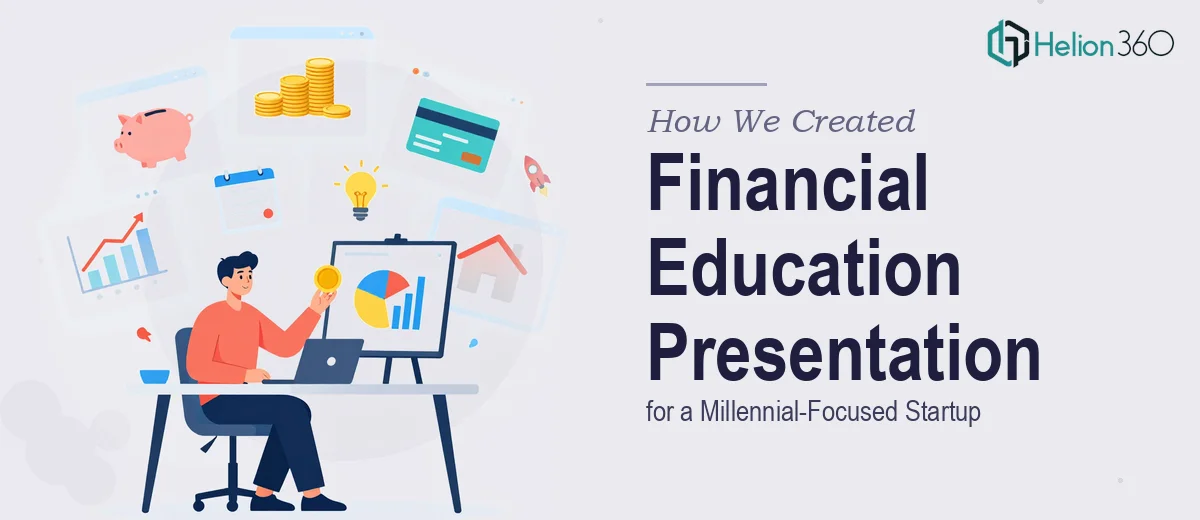
Turning Financial Complexity Into a Presentation Millennials Would Actually Engage With
Financial education has a presentation problem. The concepts themselves — budgeting, investing, saving — are not complicated at their core. But the way they are typically taught or packaged tends to alienate the very people who need them most. For a startup built around making finance accessible to millennials, this gap was the entire business challenge.
When we came on board, the client had a clear vision and solid content foundations. What they needed was someone who could shape that content into a structured, engaging, and visually coherent presentation — one that could educate without lecturing and inform without overwhelming.
The Brief: 25 Slides, Two Weeks, Zero Room for Vague Content
The scope was well-defined from the start. A 20-to-25-slide presentation covering budgeting, investing, and saving strategies, with an opening section introducing the company, its mission, and its target audience. The timeline was two weeks, and the client wanted to see sample slides early to confirm alignment on style before the full build moved forward.
What made this project genuinely demanding was the balance it required. The content had to be substantive enough to be credible — this was an educational tool, not a marketing brochure — but accessible enough to land with an audience that has limited patience for financial jargon and dense text slides.
Building the Architecture First
Before writing a single line of copy or designing a layout, we mapped the full curriculum structure. We identified the logical sequence in which the financial topics should appear, how they connected to each other, and where case studies or visual reinforcement would be most effective.
This upfront planning was what made the execution clean. Every slide had a defined role in the narrative. There were no filler slides and no redundant sections. The deck moved from company context into audience framing, then into the educational core — budgeting fundamentals, investment basics, and saving strategy frameworks — each section building on the one before it.
Writing for a Millennial Audience Without Talking Down to Them
One of the key decisions we made early was to anchor the financial content in real-world scenarios that millennials actually face — managing irregular income, balancing student loan repayment with savings goals, understanding investment options without access to a financial advisor.
This was not about simplifying the material. It was about contextualizing it. A slide on compound interest hits differently when it is framed around a 28-year-old choosing between paying off debt and starting a retirement account. We used that kind of specificity throughout, alongside embedded case studies that made abstract concepts concrete.
Helion360 handled both the content writing and the structural decisions, which meant there was no gap between what was being said and how it was being presented. The two had to work together, and that integration showed in the final deck.
Delivering Sample Slides Early to Protect the Timeline
One practical decision that paid off was delivering two sample slides before completing the full build. This gave the client a chance to weigh in on tone, visual style, and content density before we were deep into production — which meant feedback could be incorporated without disrupting the overall schedule.
It also gave both sides confidence that the project was on the right track. By the time we delivered the full 25-slide deck, the client already had a clear sense of what they were getting.
What the Final Deck Accomplished
The finished presentation covered every major curriculum point within a clean, logical structure. It opened with the company story and mission, moved into audience context, and then worked through each financial education module with enough depth to educate and enough clarity to retain attention.
The client received a polished asset that was ready to use — in workshops, investor conversations, or as a standalone onboarding resource for new users. The visual language was consistent, the copy was tight, and the case studies gave the content real weight.
Working With Helion360
If your organization is sitting on valuable content that has not yet been shaped into something your audience can actually use, Helion360 is the kind of team that knows how to bridge that gap. We have done this work across complex subject matter and demanding timelines, and we understand that a great presentation is not about aesthetics alone — it is about structure, clarity, and making sure every slide does real work.
If you are facing a similar challenge, we are ready to step in. Reach out and let us talk through what you need.