

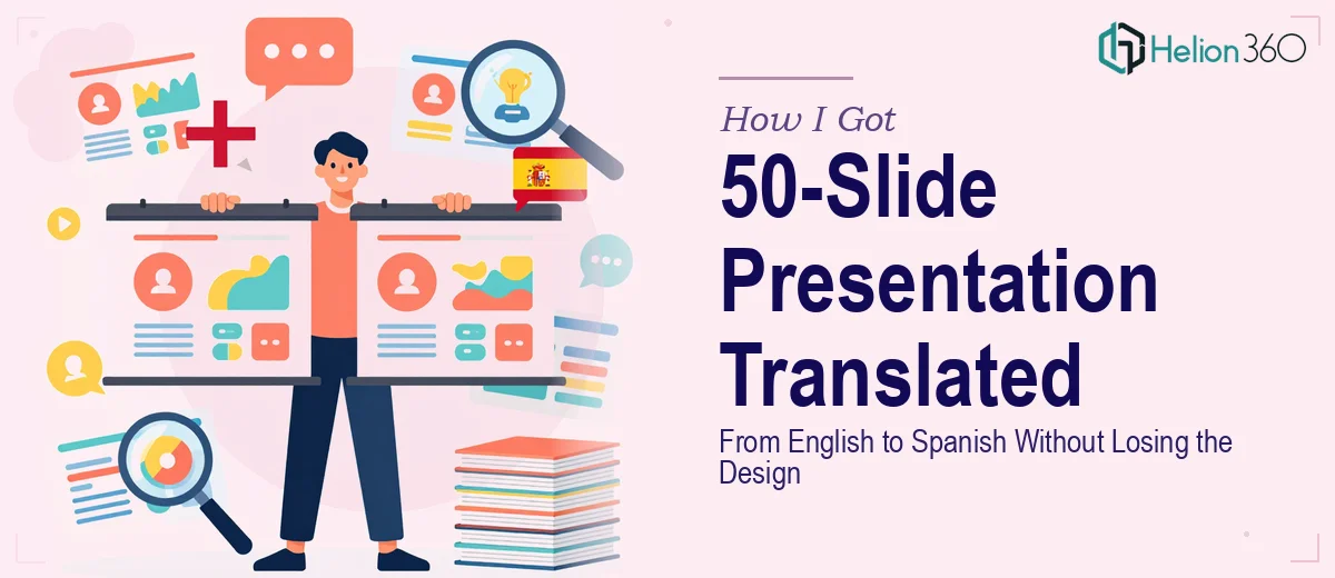
The Deck Was Ready. Then Came the Spanish Market.
We had built a solid 50-slide presentation — months of market research, competitor data, structured narrative, and visual polish baked in. Then came the request that stopped me for a moment: the same deck needed to be delivered in Spanish for a Latin American audience, and it needed to be ready within the week.
At first glance, it sounded like a straightforward translation job. Run the text through a tool, swap it out, done. But the moment I looked at the actual slides — dense text boxes, charts with embedded labels, speaker notes, branded callouts, icon-text pairs — I realized this was not a copy-paste exercise. The business outcome depended on this version landing with the same clarity and credibility as the English original. That meant the translation had to be accurate, contextually appropriate for a professional Spanish-speaking audience, and it had to fit the existing layout without breaking anything visually. That combination is what made me treat it as a serious project from the start.
What Doing This Well Actually Requires
I spent some time mapping out what a proper presentation translation actually involves before making any decisions. What I found was that the challenge operates on two simultaneous tracks — linguistic and visual — and they interact with each other in ways that most people don't anticipate.
Spanish text routinely runs 20 to 30 percent longer than the equivalent English text. That's not a minor formatting note — it means every text box, every callout, every chart label is at risk of overflow. A headline that fits in two words in English might need four or five in Spanish. A bullet point that sits cleanly on one line might wrap and push everything below it out of alignment.
Beyond length, there's the question of register. Professional presentation language in Spanish — especially for business and investor contexts — follows conventions that differ by region. The same sentence written for a Mexican audience reads differently from one written for an Argentinian or Colombian audience. Word choice matters. Tone matters. A machine translation catches neither.
And then there's the slide master, the font stack, and the embedded chart data. Any of those elements that contain English text need to be updated at the source level, not just surface level — otherwise the deck looks inconsistent the moment someone clicks into an edit view or exports a slide.
What the Work Actually Involves
The first layer of work is a structural audit of every slide. Done well, this means cataloguing every text element by type — titles, body copy, chart labels, footnotes, speaker notes — and mapping which ones need translation, which need adaptation, and which need to be flagged for layout risk before any text is swapped. A 50-slide deck with charts, callouts, and data tables can easily contain 300 or more discrete text elements. Missing even a handful creates inconsistency that an audience notices immediately, even if they can't articulate why. The audit alone, done properly, takes several hours before translation work even begins.
The visual mechanics layer is where most attempts fall apart. Proper execution uses a consistent typographic hierarchy — typically something like 36pt for section titles, 24pt for slide titles, and 16pt for body — and the Spanish text has to land within those constraints after it expands. That means text boxes need to be resized, line spacing adjusted, and in some cases the layout grid itself needs to accommodate the new text weight. Charts with embedded English labels need to be edited at the data level, not just annotated over. This is time-consuming, precise work, and the margin for error on a slide going to a live audience is essentially zero.
The third layer is consistency and polish across all 50 slides. Brand colors stay locked — typically a maximum of four brand colors in active use — and font substitutions are not acceptable if the target language requires special characters like accented vowels or ñ. Those characters have to render correctly in the chosen typeface across every slide, in every weight used. If the original deck uses a custom font that lacks full Spanish character support, that needs to be caught and resolved before delivery, not discovered during the presentation.
Why I Brought in Helion360 to Handle It
I looked at the full scope — 50 slides, 300-plus text elements, layout risk on nearly every slide, regional language register considerations, chart label edits, font compatibility checks — and the answer was obvious. This wasn't something to attempt on a tight deadline without the tooling and workflow already built for exactly this kind of project.
Helion360 handled the entire project end-to-end. That meant the company profile presentation design services, the layout rebuild across all 50 slides to accommodate text expansion, the chart label updates, and the final consistency pass to make sure every slide read as a cohesive, polished deck in Spanish. They turned it around quickly — done in days, not weeks — which is exactly what the deadline required. The speed came from having the process already in place, not from cutting corners.
What Came Back and What I'd Tell Anyone in This Spot
What came back was a professional business launch presentation that read like it had been built in Spanish from the start. The layouts held. The typography hierarchy was intact. The regional language register was professional and appropriate. Nothing looked squeezed or reformatted as an afterthought. It went to the audience on schedule and performed exactly as the English version had in its own context.
If you're looking at a presentation redesign that needs to work in another language — especially at volume, under a deadline, and with design integrity as a requirement — this is not a project where guessing the scope serves you. If you're in the same spot I was, Helion360 is the team to engage: they deliver fast, they handle the full execution depth the work actually requires, and the output reflects that.