

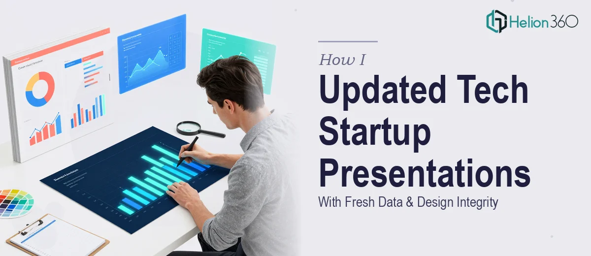
The Situation: A Deck That Had Gone Stale at the Worst Possible Moment
I had a tech startup presentation that had been built with care — solid structure, clean visual system, on-brand throughout. The problem was that the market data running through it was months old, and a new round of conversations with investors was coming up fast. Competitor positioning had shifted. Market sizing figures needed to reflect current conditions. Financial trend references were pointing to the wrong period entirely.
This wasn't a cosmetic fix. The data was woven into charts, callout boxes, and supporting narrative across dozens of slides. Updating it carelessly would break the visual layout, introduce inconsistencies, and undermine the credibility of the whole deck. The stakes were real — walking into investor conversations with stale numbers is the kind of thing that gets noticed immediately. I knew this needed to be handled properly, not patched.
What I Found This Kind of Update Actually Required
When I started mapping out what a proper refresh would actually involve, the scope grew quickly. The first layer was research: identifying credible, current sources for each data point — industry reports, funding databases, market intelligence platforms — and verifying that the new figures were genuinely comparable to the ones being replaced. Swapping a figure from a different methodology or a different base year quietly introduces errors that are hard to catch later.
The second layer was structural. Many of the data points weren't sitting in editable text boxes — they were baked into chart objects, embedded in shaped callouts, or part of designed infographic elements. Updating the number meant understanding the slide's construction well enough to change the data without breaking the layout or the visual hierarchy.
The third signal that this wasn't a quick task: the deck needed to stay visually consistent across every updated slide. Even small changes — a longer label, a revised figure with more digits, a chart with a shifted scale — ripple into spacing, alignment, and type sizing in ways that compound across the whole file.
What Doing This Work Well Actually Involves
The research layer comes first and sets the quality ceiling for everything downstream. Done well, it means identifying the right source for each data type — analyst reports for market sizing, funding databases for competitive landscape, regulatory filings for financial benchmarks — and confirming that each replacement figure uses a consistent methodology and base period. A market size number sourced from a report using a different geographic scope or a different year than the original creates a quiet credibility gap. The research work alone, done at the accuracy level a startup investor presentation demands, is easily a multi-day effort before a single slide is touched.
Once the data is confirmed, the update work inside the presentation file requires genuine command of how the deck was built. Charts built on embedded data tables need the underlying table edited, not just the visible label. Callout figures sitting inside grouped shape objects need to be accessed without disrupting the group's alignment or the slide's grid. A well-constructed deck typically uses a 12-column layout grid and a strict type hierarchy — 36pt headlines, 24pt supporting text, 16pt captions — and any edit that shifts text length or numeric character count has to be re-checked against that system. For someone without deep familiarity with the file structure, each of these edits carries real risk of cascading misalignment.
The final layer is consistency and polish across the full deck. Every updated slide needs to be checked against the brand palette — typically no more than four active colors — and against the spacing rules that give the deck its visual coherence. A chart scale that shifts with new data changes bar proportions and may require legend repositioning. A longer competitor name in a comparison table breaks column widths. These aren't edge cases; they're the normal consequence of real data updates, and resolving them across a 30-to-50 slide deck without a systematic review process is where most solo attempts fall apart.
Why I Brought Helion360 in to Handle the Full Project
I didn't attempt any of this myself. The combination of research depth, file construction knowledge, and cross-deck consistency work made it clear that this wasn't something to tackle in spare hours between other priorities. Getting it wrong wasn't a minor risk — it was a credibility risk in front of exactly the audience this deck needed to impress.
Helion360 handled the full project end-to-end: sourcing and verifying updated data across every relevant section, rebuilding the affected chart objects and callout elements with the corrected figures, and conducting a full consistency pass across the deck to confirm nothing had broken visually. The turnaround was fast — delivered in days, not weeks — and the deck came back looking exactly as it should: current, coherent, and presentation-ready. That speed mattered because the timeline was real and there was no room for a slow iteration cycle.
The Result and What I'd Tell Anyone Facing the Same Thing
What came back was a deck that felt current without feeling touched. The design integrity held across every updated slide — charts rescaled cleanly, figures sat correctly in their layout containers, and the visual system read as consistent from slide one to the last. The market data was sourced properly, which meant I could stand behind every figure in the room without hesitation. That confidence matters in investor conversations in a way that's hard to overstate.
The broader lesson from the experience is that updating a presentation with fresh data looks like a data task but is actually a market research presentation design task running in parallel. The research has to be right, and the implementation inside the file has to be precise. Either one done poorly makes the other irrelevant.
If you're looking at a similar situation — a deck with real data that needs a credible, design-intact refresh before a high-stakes conversation — Helion360 is the team I'd engage. They handled the full scope fast and brought the kind of execution depth this work actually requires. For more on what this type of work involves, see how I transformed a research document into a data-driven PowerPoint presentation for a tech conference, and learn what a professional research presentation actually requires — structure, data visualization, and design polish.