

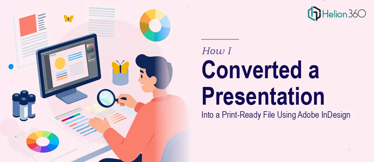
The Presentation Looked Fine on Screen — Print Was a Different Story
I had a polished digital presentation that had done its job well in boardrooms and on screens. The next step was producing a high-quality printed version — a leave-behind for an executive audience at an industry event. It needed to look as sharp in someone's hands as it did on a monitor.
What I assumed would be a straightforward file conversion turned into something I quickly realized had layers. Color rendering, bleed settings, resolution standards, font licensing — things that don't matter on a screen matter enormously in print. The audience for this output was senior, the event was soon, and a document that looked amateurish in print would undermine the credibility of everything in it.
I recognized fast that this wasn't a task I should attempt to figure out on the fly. It needed to be done right, by someone who already knew what right looked like.
What I Found the Solution Actually Required
Once I started looking into what a proper digital-to-print conversion actually involves, the scope became clear immediately.
The first signal of real complexity was color mode. Digital presentations are built in RGB — screens emit light and mix color that way. Print requires CMYK, and the conversion isn't automatic. Colors that look vivid on screen can appear flat or shifted when printed if the conversion isn't handled carefully at the file level.
The second signal was resolution. Screen assets are typically 72–96 PPI, which is fine for display. Print requires a minimum of 300 PPI for sharp output. Images that look crisp on screen can reproduce blurry in print if they aren't replaced or upsampled properly — and upsampling has limits.
The third signal was document structure. Print files need bleed areas — typically 3mm on all sides — so that background colors and images extend beyond the trim line and don't leave white edges after cutting. A digital presentation file has none of that baked in. Rebuilding the layout to accommodate bleed, safe zones, and crop marks is a structural change, not a cosmetic one.
This wasn't a file export. It was a rebuild.
What the Conversion Work Actually Involves
The structural work starts with auditing every asset in the original file and mapping what needs to change before a single layout decision is made. That means cataloguing all placed images, checking their native resolution and color profile, and flagging anything that won't reproduce cleanly at 300 PPI. For a 20–30 slide deck, this audit alone can surface a dozen problem assets. The document then needs to be rebuilt in a print-native environment — typically Adobe InDesign — where master pages, margins, bleed areas, and slug zones are set correctly from the start. Getting a 12-column grid to propagate correctly across master pages, with consistent 3mm bleed on every spread, takes precision and time, especially for someone new to print production.
Visual mechanics at the print stage involve more than moving elements around. Typography rules tighten considerably — minimum 7pt body copy, no hairline rules thinner than 0.25pt, and any text that sits over a background image needs sufficient contrast verified against CMYK values, not RGB. Chart types that read well on screen — thin-line graphs, gradient fills, subtle drop shadows — often need to be rebuilt with print-safe treatments. Gradients can band in CMYK output if not handled with the right blend space settings. These are the kinds of details that don't appear until proofing, at which point they're expensive to fix.
Polish and consistency across a multi-page print document requires palette discipline that goes beyond what a digital file demands. Every color in the document needs to be defined as a named CMYK swatch — no spot colors left as RGB approximations, no ad hoc hex values that crept in from the original deck. Brand colors need to be verified against their CMYK equivalents and applied consistently across all pages, including backgrounds, callout boxes, and iconography. On a 30-page document, an inconsistent swatch can appear on a single spread and only show up during a print proof. Catching it before that point requires a systematic swatch audit, not a visual scan.
Why I Brought in Helion360 to Handle It
The moment I understood what this conversion actually required, I knew attempting it myself wasn't a realistic option. I didn't have InDesign proficiency at a production level, I didn't have the time to develop it, and I had a firm deadline tied to a real event.
Helion360 handled the full project end-to-end. That meant the asset audit, the InDesign rebuild with correct bleed and master page structure, the RGB-to-CMYK color conversion across the entire palette, and the final preflight check against the print vendor's spec sheet. They turned it around quickly — the kind of pace that comes from doing this work regularly, with the tooling and process already in place.
What stood out was that nothing came back to me half-done. The file arrived press-ready, with a packaged InDesign folder, exported PDF with crop marks, and a separate low-res proof PDF for visual review. Done in days, not the weeks it would have taken me to learn and execute the same output at this quality level.
What I'd Tell Anyone Looking at the Same Problem
The printed version of that presentation held up exactly as it needed to. The colors were accurate, the type was sharp, and the layout felt intentional rather than like a slideshow printed on paper. The executive audience picked it up and read it — which was the whole point.
If you're sitting on a digital deck that needs to move into print and you're starting to realize how different those two environments actually are, the learning curve is real and the margin for error at production is low. If you want it handled end-to-end without working through that curve yourself, converting complex PowerPoint presentations into print-ready PDFs is the kind of specialized work that requires expert handling — they delivered fast, managed every production detail, and the output was exactly what a print vendor needs to run a clean job. For similar multi-page design projects with print requirements, converting digital presentations into print-ready files using professional design tools ensures nothing gets lost in the transition between screen and paper.