

When a Standard Slide Deck Just Wasn't Enough
After every company conference, someone has to turn the highlights into a presentation. This time, that someone was me. The brief was straightforward: take the key takeaways from a two-day internal conference and package them into a slide deck for a broader team rollout.
I started the way most people do — bullet points, summary text, a few stock photos. By slide four, I already knew it wasn't working. The content was accurate but flat. Nothing about it made you want to keep watching. I kept thinking: these were actually exciting sessions. Why does this deck feel like a meeting agenda?
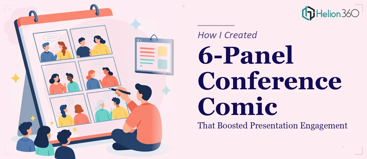
That's when the idea of a 6-panel comic strip came up. Not a cartoon for the sake of novelty, but a structured visual narrative — one panel per key conference moment — that could sit inside the Google Slides deck and carry the story in a way that text simply couldn't.
The Problem With Designing Comics for Presentations
I'm reasonably comfortable in PowerPoint and Google Slides, but illustrating a comic panel is a different skill entirely. There's panel layout, character consistency, dialogue pacing, visual hierarchy within each frame, and then the challenge of making the whole thing feel cohesive and on-brand.
I tried sketching out the six panels myself using basic shapes and icons. The structure made sense, but the execution looked amateurish — the kind of thing that pulls attention away from the message rather than toward it. On top of that, the company had a defined color palette and branding guidelines that needed to be respected throughout. Getting that right across six illustrated panels while keeping the tone both informative and engaging was genuinely beyond what I could deliver in the three days available.
I also kept second-guessing the tone. Should it be humorous? Informative? Some mix of both? Without a clear visual style reference, every panel felt like a separate decision.
Bringing in the Right Team
After a day of back-and-forth with myself, I reached out to Helion360. I explained the brief: a 6-panel comic strip designed for direct integration into a Google Slides and PowerPoint presentation, tied to a real conference recap, with specific branding requirements and a three-day deadline.
Their team asked the right questions upfront — what were the six moments to illustrate, what was the overall tone of the conference, were there existing brand assets to work from, and how would the comic interact with the rest of the slide content around it? That last question was one I hadn't fully thought through, and it turned out to matter a lot for how the panels were sized and framed.
From there, they took over the design work completely.
What the Final Comic Delivered
The six panels came back structured cleanly — each one illustrating a distinct conference moment with consistent character design, brand-accurate colors, and clear visual storytelling that didn't require any caption to explain. The style landed in a place that was professional but approachable, with enough personality to make people actually stop and read rather than click past.
Integrating the comic into the Google Slides presentation was straightforward. The panels were delivered as editable elements, so placement and sizing could be adjusted without losing quality. On the PowerPoint side, the same assets dropped in without any compatibility issues.
The response from the broader team when the deck went live was noticeably different from the usual conference recap presentation. People engaged with the comic slides longer, referenced them in follow-up conversations, and a few people specifically asked who designed them.
What I Took Away From This
Visual storytelling inside a presentation isn't just about making slides look nice. A well-executed comic strip communicates tone, sequence, and meaning in a way that text and photos simply don't. The format works because it combines narrative structure with immediate visual comprehension — people understand what's happening in a panel before they've read a single word.
The other lesson was practical: knowing the limits of what you can produce in the time available is not a weakness. The comic needed illustration skill, brand sensitivity, and presentation design knowledge applied together under a real deadline. That combination is where professional help pays off clearly.
If you're working on a presentation that needs something beyond standard slides — whether that's illustrated content, a comic-style visual narrative, or custom graphic design built for Google Slides or PowerPoint — Helion360 is worth a conversation. They handled the complexity of this project efficiently and delivered exactly what the brief required.