

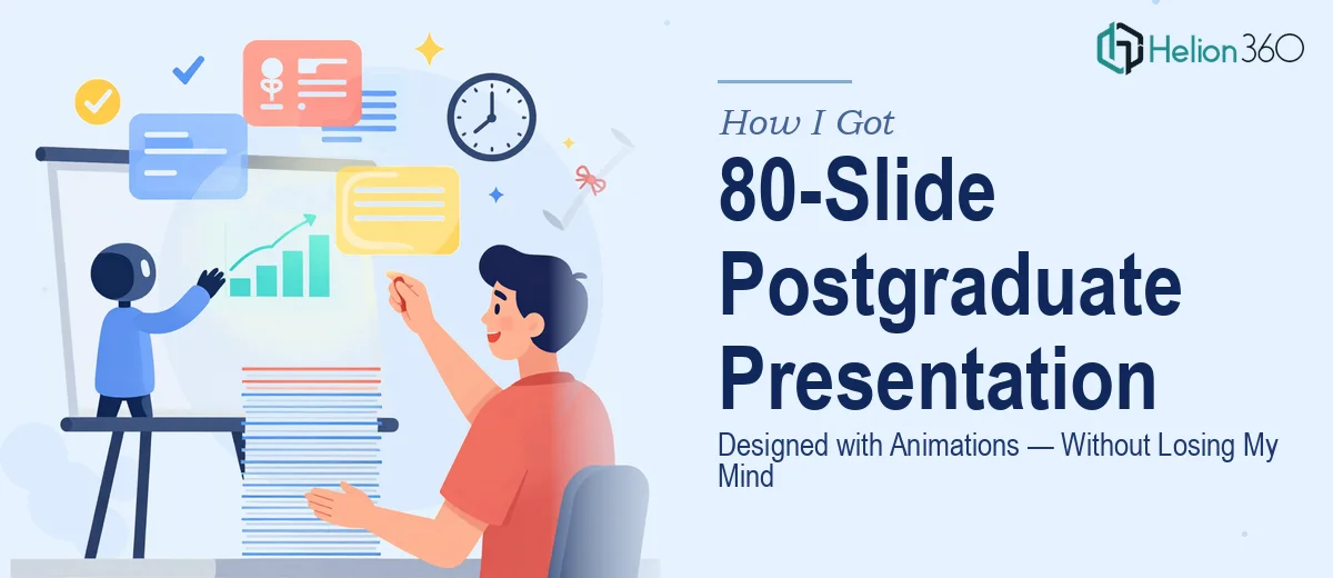
The Pressure of a Final Postgraduate Presentation
When you're wrapping up a postgraduate course, your final presentation is not a formality. It is the culminating argument for everything you spent months, sometimes years, developing. The panel sees dozens of these. They notice when the structure is loose, when the slides look assembled rather than designed, and when the visual language doesn't match the seriousness of the research.
I was looking at roughly 80 slides, content still in development, a hard submission window, and the knowledge that animated sequences would be needed to communicate certain concepts clearly. That last part alone — animations that behave correctly and reinforce the narrative rather than distract from it — was enough to signal that this was not something to handle on the side while also writing the actual content. I needed this done right, and I needed someone who already knew how to do it.
What I Found Out This Kind of Presentation Actually Requires
Before I engaged anyone, I did enough research to understand what proper execution of an 80-slide academic presentation actually involves. The scale alone changes the math. At 80 slides, design decisions made on slide 3 have to hold up through slide 78 — which means master slides, layout libraries, and style rules aren't optional. They're structural.
Then there's the animation layer. Purpose-built animations for academic presentations — process flows, phased reveals, comparative frameworks — require a different level of intentionality than a simple fade-in. Each animated element needs to reinforce a specific point in the argument, not just add motion for visual interest.
On top of that, the content was still being written in parallel. That means the design workflow had to be flexible enough to absorb structural changes without requiring a rebuild every time a section evolved. That kind of adaptive, concurrent workflow is a skill in itself — and it made clear, quickly, that this wasn't a weekend project.
What the Work Actually Involves at This Scale
The first layer of work is structural and narrative. An 80-slide deck for a postgraduate final defense needs a clear information hierarchy before a single slide is touched visually. The right approach involves auditing all available content, mapping chapters to slide clusters, and establishing a flow logic — introduction, literature context, methodology, findings, discussion, conclusion — that makes sense both as a read-through and as a live presentation. Each cluster needs a consistent internal rhythm: a framing slide, supporting detail slides, and a summary or transition. Without this architecture locked in early, the design work on individual slides becomes unstable because the content footprint keeps shifting. For someone doing this for the first time while also writing the dissertation chapter by chapter, the structural mapping alone can consume days.
The second layer is visual mechanics. A presentation at this scale typically runs on a 12-column layout grid with defined safe zones for content, headers, and supporting visuals. Typography works on a strict hierarchy — around 36pt for section headers, 24pt for slide titles, 16pt for body text — and that scale must hold consistently across every layout variant. Color discipline matters too: academic presentations rarely benefit from more than three to four brand or thematic colors, and every deviation from that palette has to be a deliberate choice. The friction here is real. Applying these rules consistently across 80 slides, including the edge cases where a chart or a full-bleed image breaks the standard template, requires both design fluency and patience.
The third layer is animation logic and execution. Effective slide animations in academic contexts follow a rule of purposeful sequencing: each trigger reveals information the audience needs at exactly the point the presenter is addressing it, not before. Build sequences for process diagrams, phased data reveals, and comparative frameworks require careful construction in the animation pane — entrance effects, timing offsets, and trigger logic that holds together during a live presentation under pressure. A single misaligned trigger or an animation that fires out of sequence can undermine the entire argument flow. Getting this right across multiple animated slides, especially when the content is still evolving, is the kind of work that compounds in complexity quickly.
Why I Brought in Helion360 to Handle It
I looked at what this project genuinely required — structural mapping, consistent visual execution across 80 slides, animation sequencing, and the flexibility to absorb content changes mid-build — and it was immediately clear that attempting it myself wasn't the smart move. The learning curve alone would have cost me weeks I didn't have.
Helion360 handled the complete deck presentation end-to-end. That meant taking the content as it developed, building and maintaining the master slide architecture, applying consistent visual mechanics across every layout, and constructing the animated sequences with the kind of precision that holds up in a live academic defense setting. The team turned this around quickly — work that would have taken me weeks of trial and error was delivered in a fraction of that time. They worked in parallel with my content development, which is exactly the concurrent workflow this kind of project demands.
What Was Delivered and What I'd Tell Anyone in This Situation
The final presentation held together as a single coherent document — visually consistent from the opening framing slides through the methodology section and into the findings and conclusion. The animated sequences communicated process logic clearly without feeling gratuitous. The panel received a presentation that looked like the research behind it: considered, structured, and professionally executed.
Anyone staring down a large-scale academic presentation with a real deadline, evolving content, and animation requirements should be honest with themselves about what that work actually takes. The gap between a passable deck and one that genuinely serves the argument is significant — and that gap is almost entirely in the execution depth.
If you're in the same position and want the full project handled end-to-end without the weeks of learning curve, polished presentation decks are worth the investment — they deliver fast and bring exactly the execution depth this kind of work requires.