

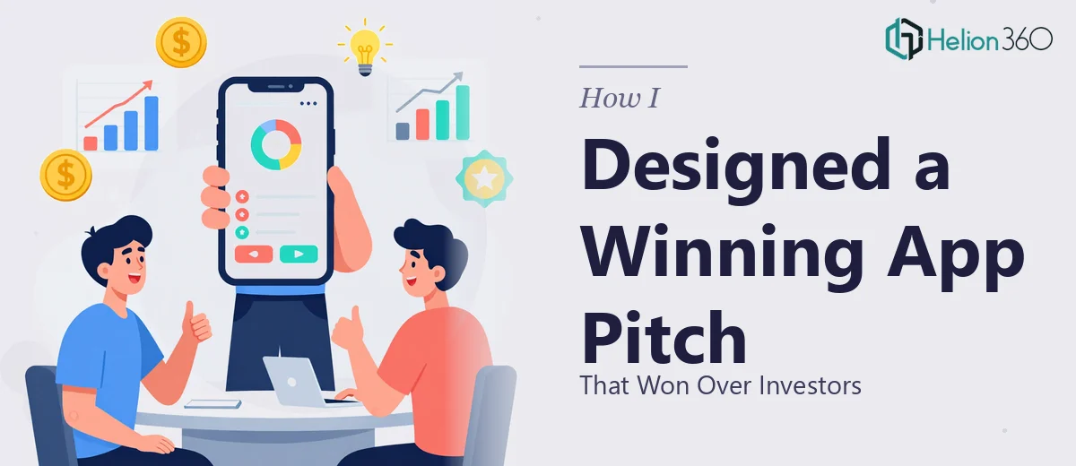
The Situation I Was Staring Down
I had a mobile app ready to show the world — or at least, ready to show investors and potential partners. The core product was solid. The features were real. The growth case was compelling. What I didn't have was a presentation that could communicate any of that clearly in a room where attention spans are short and first impressions are permanent.
The stakes were straightforward: this deck would be the first detailed look most investors would get at our app. It needed to communicate usability, product logic, design thinking, and growth potential — all without overwhelming or losing the room. I knew immediately that a half-finished slide deck thrown together overnight wasn't going to cut it. This needed to be done right, and it needed to look like it was done right.
What I Discovered About Doing This Well
Once I started researching what a proper mobile app investor presentation actually involves, the complexity became clear fast.
First, there's the visual storytelling layer. The presentation isn't just explaining what the app does — it's making the audience feel the experience of using it. That means UI mockups rendered at the right device frame scale, screen flows shown in logical sequence, and interface elements that look pixel-accurate rather than like rough drafts. Getting those assets presentation-ready takes real production work.
Second, there's the narrative architecture. Investors aren't evaluating features in isolation — they're evaluating a business. The deck needs to move logically from problem to solution to traction to market to ask. Every slide has to earn its place in that sequence.
Third, there's the brand consistency question. The presentation has to feel like an extension of the product itself — same palette, same typographic voice, same design sensibility. If the app looks polished and the deck looks generic, that's a signal investors notice whether they say so or not.
I saw quickly that getting all three of those right simultaneously wasn't a one-person weekend project.
What the Work Actually Involves
The right approach to a mobile app presentation starts with narrative structure — mapping the full story arc before a single slide gets designed. The standard flow for an investor-facing product deck runs from market problem through solution concept, into a UI walkthrough, then technical credibility, and finally the growth and monetization case. Each section has its own audience expectation: the problem slide needs tension, the UI section needs visual proof, the growth section needs logical progression. Getting this sequence wrong means investors disengage before reaching the most important material. Reworking a narrative structure mid-production costs more time than building it correctly from the start, and most people underestimate how long a proper story audit actually takes.
Visual mechanics are where mobile app presentations live or die. Device mockups need to be rendered at consistent scale — typically a 9:16 or 19.5:9 ratio for modern smartphone frames — and placed on a 12-column layout grid so every screen sits in an intentional position rather than floating randomly. Type hierarchy matters here: slide titles at 36pt, supporting labels at 24pt, and captions or callouts at 16pt. App UI screenshots must be cropped and masked correctly, interface annotations need to align precisely to their target elements, and any animation showing user flow has to be built as a frame-by-frame state transition rather than a crude fade. Each of these mechanics takes time and a practiced hand to execute without visual noise.
Polish and brand consistency across every slide is the final layer — and the one that most attempts at self-service break down on. A proper mobile app presentation holds to a maximum of four brand colors applied with strict role definitions: one primary, one accent, one neutral background, and one text color. Any drift from that system — a slightly different shade on one section, an off-brand button color in a UI callout — reads as careless to a design-literate investor audience. Applying that discipline across 20 to 30 slides, while keeping spacing, padding, and alignment consistent through every layout variant, is the kind of production work that compounds in difficulty the more slides are in play.
Why I Brought Helion360 In to Handle It
I didn't spend time trying to figure out how to build this myself. Once I understood what the work actually required — UI mockup production, narrative architecture, brand system application across a full deck — it was obvious that the smart move was engaging a team that does this work every day and already has the tooling and expertise in place.
Helion360 handled the full project end-to-end: narrative structure and slide sequencing, device mockup production and UI screen integration, and visual polish across the complete deck. They turned it around quickly — done in days, not weeks. What would have taken me weeks of learning curve, iteration, and second-guessing was handled in a fraction of that time by a team that's built this kind of presentation before and knows exactly where the execution traps are.
The result felt like the app and the deck were made by the same team. That's the standard that matters when you're in front of investors.
What I'd Tell Anyone Looking at the Same Problem
The deck that came back was exactly what the moment required. Investors could follow the product logic without being walked through it slide by slide. The UI sections communicated usability clearly. The growth story landed with the visual credibility it needed to. The presentation did the job it was built to do.
If you're sitting on a solid product and need a mobile app investor presentation that communicates both the design thinking and the business case, don't underestimate what that actually takes to produce well. The narrative, the visual mechanics, and the brand consistency all have to work together — and pulling that off under deadline pressure without the right experience in place is a risk that isn't worth taking.
If you're in the same spot I was — a real product, a real audience, and no time to learn a new craft — Helion360 is the team to engage. They deliver fast, handle the full execution depth this work requires, and the output shows it.