

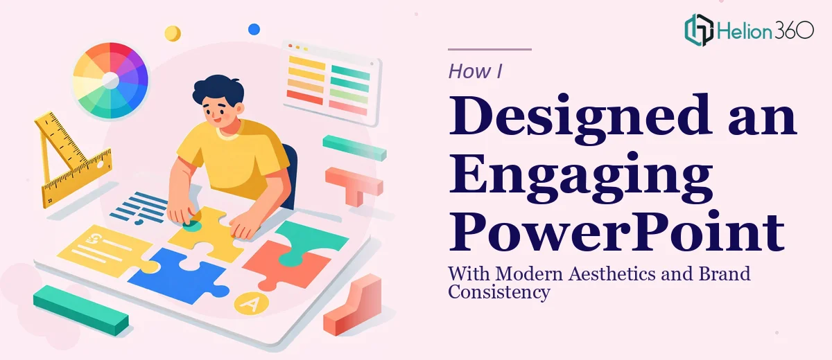
The Situation and What Was on the Line
The presentation was short — maybe twelve slides — but the stakes felt anything but small. It was going up in front of an audience that would form an impression of our brand within the first few seconds of seeing each slide. The existing deck had the right content, but visually it was flat, inconsistent, and doing nothing to hold attention. The deadline was a week out, and I knew that handing something underwhelming to that room wasn't an option.
I spent about twenty minutes looking at what we had and what it needed to become. The gap was obvious. This wasn't a matter of swapping in a nicer font or dropping in a logo. What I was looking at required a real redesign — the kind that demands both design sensibility and an understanding of how to hold an audience's attention slide by slide. I recognized quickly that doing this well was not a weekend task for someone without the background. It needed to be handled properly, from the start.
What I Found a Real Presentation Redesign Actually Involves
Once I started researching what a proper PowerPoint redesign with modern aesthetics actually requires, the complexity became clear fast. It's not just about making things look pretty — it's about visual communication decisions that compound across every slide.
First, modern presentation design operates on systems. A professional redesign starts with a master slide architecture that controls layout grids, type hierarchy, and color application globally — so changes propagate correctly and nothing breaks between slides. Getting that foundation right is a precision exercise.
Second, brand consistency at the slide level is harder than it sounds. It means more than placing a logo in the corner. It means defining a working palette, locking down font weights and sizes, and making sure every visual element — icons, dividers, image treatments — speaks the same visual language throughout the deck.
Third, engagement design for a short deck requires deliberate thinking about pacing and visual hierarchy. Which slides need breathing room? Where does a strong visual moment earn its place? These are judgment calls that separate a deck that holds attention from one that people glance at and forget.
What the Work Actually Requires to Get Right
The first layer of work is structural — auditing the existing slides and mapping a visual narrative that serves the content. This means deciding which information deserves its own moment on a slide, where white space should do the work, and how the flow guides the audience from one idea to the next without cognitive overload. A well-structured short deck typically uses a 12-column layout grid, with consistent margin depths — often 0.5 to 0.75 inches — so the eye moves predictably. Setting up slide masters that enforce this grid correctly across every layout variant takes real precision. Skipping this step produces a deck where alignment looks right on some slides and subtly wrong on others, and audiences notice even when they can't name what's off.
The second layer is the visual mechanics — typography, color, and graphic elements working together. A disciplined redesign limits the palette to three to four brand-aligned colors and enforces a clear type hierarchy: typically 36pt for headlines, 24pt for subheads, and 16pt for body text. Every icon, divider, and shape needs to share a consistent visual weight and style — mixing outlined icons with filled ones, or using three different corner-radius values across shapes, erodes the professionalism of the whole deck. Getting this right across twelve or more slides without introducing inconsistencies requires systematic work, not slide-by-slide improvisation.
The third layer is polish and brand fidelity — the final pass where every detail is checked against the brand standards. Image treatments need to match: consistent overlay tones, consistent cropping ratios, consistent placement logic. Text boxes need identical internal padding. Slide transitions, if used, need to be restrained and purposeful. This review pass sounds straightforward, but in practice it surfaces a long list of small corrections — misaligned elements that appear only in certain view modes, color hex values that are close but not exact, font weights that drift between slides. Each one is minor in isolation; together, they determine whether the deck looks like it was built by a professional or assembled in a hurry.
Why I Brought Helion360 In to Handle the Full Project
I didn't spend time attempting the redesign myself. The combination of a tight deadline and the clear execution depth this project needed made the decision straightforward — I needed a team that does this work every day, with the systems already in place.
Helion360 handled the project end-to-end: the master slide architecture, the full visual redesign aligned to our brand palette and type standards, and the final polish pass across every slide. The turnaround was fast — done in days, not the weeks it would have taken me to build up the skills, set up the tooling, and work through the inevitable revision cycles on my own.
What stood out was that nothing came back needing explanation. The grid was consistent, the brand application was accurate, and the visual hierarchy made the content genuinely easy to follow. That's the difference between a team that polishes decks occasionally and one that has the full design process dialed in.
The Result and What I'd Tell Anyone Facing the Same Problem
The deck that went into the room looked like it had been built intentionally — tight layout, clean hierarchy, visuals that reinforced the message rather than competing with it. The audience engaged with it. The feedback after was positive in a way that the original slides would never have earned.
The content hadn't changed. What changed was how it was communicated visually. That's what a proper PowerPoint redesign with modern aesthetics actually delivers — not decoration, but clarity and presence.
If you're looking at a similar gap between what your slides currently look like and what they need to look like — and you're working against a real deadline — Helion360 is the team I'd engage. They handled the full execution fast, and the quality of the work showed exactly why this kind of project deserves a team that builds presentations at this level every day.