

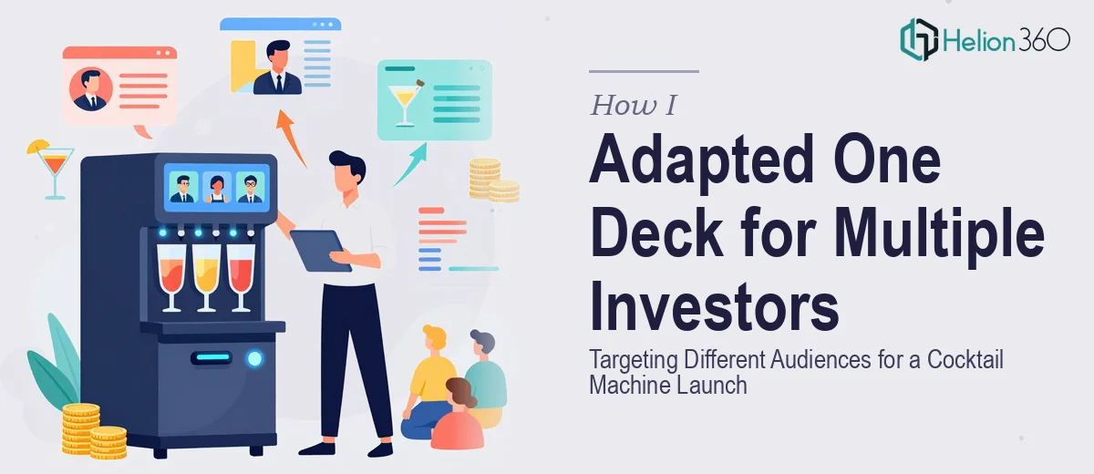
The Deck Was Done. The Problem Was It Was Built for Everyone — and No One.
I had a working Canva presentation for a cocktail machine we were preparing to launch. It covered the product, the market opportunity, and the business model. On the surface, it looked complete. The real problem surfaced when I started mapping out the investor roadshow — different audience segments, different priorities, different rooms. A hospitality-focused angel group cares about venue throughput and unit economics. A consumer hardware fund wants to see the product roadmap and defensibility. A lifestyle brand investor is reading the deck through a completely different lens.
One generic presentation was not going to work across all three contexts. The stakes were real: first impressions with these groups happen once, and a deck that feels slightly off-target signals that the founder doesn't understand who they're talking to. I knew immediately this needed to be approached with precision, not patched with a few slide swaps.
What I Found Out This Kind of Work Actually Requires
I assumed adapting a pitch deck meant adjusting a few headlines and swapping the cover slide. What I found when I actually examined the problem was substantially more involved than that.
The narrative structure of a pitch deck is not decoration — it is the argument itself. When the audience changes, the sequence of what gets introduced, when the problem gets framed, and how urgency is established all need to shift. A hospitality investor needs to see the operational case before they care about the consumer story. A hardware investor needs to see the IP and product differentiation before the revenue model lands with any weight. Re-sequencing slides without breaking the internal logic of the argument is a structural problem, not a cosmetic one.
The second layer was the visual system. Canva presentations carry embedded constraints — font substitutions that look fine on screen and fall apart in export, layout grids that aren't enforced consistently across slides, and brand color usage that varies slightly from slide to slide in ways that read as amateur in a boardroom setting. Cleaning that up across three audience-targeted versions while keeping the core brand intact was its own challenge. I recognized quickly that doing this correctly, at the level these investor meetings required, was not a weekend project.
What the Work Itself Involves
The foundation of this kind of project is a structural and narrative audit of the source material. A practitioner working on a multi-audience pitch deck starts by mapping the existing slide sequence against each target audience's decision-making priorities. The hospitality investor version, for example, restructures the argument so that market size and venue density data appear in the first third of the deck, before the product detail. The hardware investor version leads with differentiation and manufacturing feasibility. Each version needs its own logical spine — not a shuffled set of the same slides.
The visual mechanics of adapting from Canva to a presentation-ready format require enforcing a consistent layout system that Canva's freeform environment doesn't guarantee. Proper pitch decks use a defined type hierarchy — typically 36pt for primary headlines, 24pt for supporting text, and 16pt for data callouts — applied uniformly across every slide. A 12-column grid governs element placement so that text blocks, charts, and imagery don't shift between slides. Rebuilding this from a Canva source means identifying every layout inconsistency and resolving it across all three versions simultaneously. That propagation work alone takes significant time when done correctly.
Consistency across three targeted versions — while keeping them visually unified under a single brand — is where execution friction compounds quickly. The brand palette needs to be locked to a maximum of four defined colors, applied with the same logic on every slide across every version. A chart type chosen for the financial projection in one version must be replicated with identical formatting in the others. Small divergences — a slightly different shade, an axis label that wraps differently, a logo that's positioned two pixels off — accumulate into a deck that feels inconsistent when investors flip through it. Managing that level of discipline across three parallel documents is the kind of work that trips up even experienced designers working under time pressure.
Why I Brought Helion360 In to Handle the Full Project
I didn't try to work through this myself. The structural complexity alone — three audience-targeted narrative versions, each requiring its own argument sequence — made it clear that piecemeal effort wasn't going to produce investor-grade output in the time I had. The right move was to engage a team that does exactly this kind of work.
Helion360 handled the project end-to-end: the narrative restructuring for each audience segment, the visual rebuild from the Canva source into a properly gridded and typographically consistent presentation system, and the final polish pass across all three versions. They turned it around quickly — done in days, not the weeks it would have taken me to work through the learning curve and execution on my own. What I handed over was a functional but rough Canva file and a brief on each target investor type. What came back was three investor-ready decks, each with its own argument structure and visual discipline, unified under the same brand.
The Result — and What I'd Tell Anyone Facing the Same Problem
The investor meetings went into the room with the right material in front of the right people. Each deck read as purpose-built for its audience, not adapted-and-hoping-for-the-best. The hospitality group engaged immediately with the operational data. The hardware fund responded to the product differentiation framing. That specificity doesn't happen when you're working from a single general-purpose presentation.
The broader lesson is that presentation adaptation — real adaptation, not cosmetic — is a structural and visual discipline that requires both expertise and time. It is not something to attempt under deadline pressure with a design tool that wasn't built for this level of precision.
If you're looking at a similar situation and need it handled end-to-end without the weeks of rework, Helion360 is the team I'd engage — they delivered fast and brought exactly the level of execution depth this kind of work demands.