

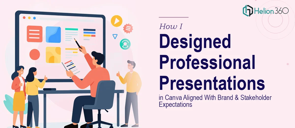
When a Presentation Needed to Do More Than Just Look Good
I was sitting on a stack of clinical research materials that needed to be translated into stakeholder-ready presentations — clean, credible, and tightly aligned with our organization's brand guidelines. The audience wasn't forgiving: senior leadership, external partners, and cross-functional teams who would judge the work the moment the first slide appeared on screen.
The problem wasn't a shortage of content. It was that the content needed to carry professional weight. A poorly formatted deck in that context doesn't just look bad — it undermines the credibility of the data and the team behind it. I knew this needed to be done properly, not patched together between other responsibilities.
I was working primarily in Canva, which sounds simple enough. But getting Canva to produce something that genuinely meets brand guidelines and holds up under stakeholder scrutiny is a different project entirely from just dragging and dropping elements onto a template.
What I Found the Solution Actually Required
When I started researching what a properly executed Canva presentation actually involves, the scope became clear quickly. This wasn't about picking a nice template and swapping in some text.
First, brand alignment in Canva requires deliberate setup — custom color palettes locked to exact hex values, uploaded brand fonts assigned correctly at the text style level, and logo placement that respects clear space rules on every slide. Getting that wrong, even slightly, produces a deck that feels off-brand in ways stakeholders notice immediately even if they can't articulate why.
Second, the structural challenge: clinical and research-oriented content involves dense information — timelines, protocol summaries, data tables — that needs to be distilled into a format audiences can absorb in under 30 seconds per slide. That requires real editorial judgment, not just formatting.
Third, Canva's brand kit and master template system behaves differently from PowerPoint's slide master. Propagating changes across a multi-slide deck without breaking individual slide layouts is a workflow that takes time to understand and execute cleanly. I could see immediately that doing this well across a full deck was not a weekend task.
What the Work Actually Involves
The structural work starts with an audit of the source material — identifying which information belongs in a presentation and which belongs in an appendix or supporting document. Done well, this involves mapping a clear narrative arc: a setup slide that frames the context, a middle section that presents findings or updates with one core idea per slide, and a close that lands on a specific action or decision. In practice, most source documents need significant editing before a single design decision is made. Cutting a 40-page protocol summary down to an 18-slide stakeholder update without losing critical nuance takes editorial experience, not just time.
The visual mechanics in Canva require more precision than the platform's casual reputation suggests. A properly brand-aligned deck uses a locked color palette — typically no more than 4 brand colors applied with strict rules about primary, secondary, and accent usage. Typography hierarchy follows a defined scale, commonly something like 36pt for headers, 24pt for subheadings, and 16pt for body text, with line spacing and paragraph spacing set consistently across every text box. The layout grid — even in Canva — needs to follow a consistent margin and column structure so that elements align across slides and the deck reads as a unified document rather than a collection of individually designed pages.
Polish and consistency across a full multi-slide deck is where most self-managed Canva projects fall apart. Brand application has to be checked slide by slide: logo placement, icon style consistency, image treatment (same filter, same crop ratio), and spacing between elements. In a 20-slide deck this is roughly 400 individual design decisions. A single inconsistent font weight or misaligned text box on slide 14 will catch a stakeholder's eye in a room where every detail signals preparation. This level of review — systematic, not impressionistic — takes a practitioner who has done it dozens of times to execute without it consuming days.
Why I Brought in Helion360 to Handle It
I looked at what the project actually required — structural editing, brand-precise Canva execution, and a consistency pass across every slide — and it was clear that attempting it myself wasn't the smart use of my time. The learning curve for doing Canva properly at this level is real, and the stakes of getting it wrong in front of that audience were higher than I wanted to risk.
I brought in Helion360 to handle the full project end-to-end. They took on the narrative structure work — organizing the source content into a logical, stakeholder-appropriate flow — applied the brand guidelines with precision across the full deck, and delivered a polished, consistent presentation that was ready to present without a single round of my own cleanup.
What stood out was the speed. The project was turned around quickly — done in days, not the weeks it would have taken me to work through the Canva brand kit setup, the slide-by-slide consistency pass, and the structural editing on my own. That's the value of engaging a team that does this work every day, with the process and tooling already in place.
What the Project Delivered and What I'd Tell Anyone in the Same Position
The result was a presentation that held up in the room. Stakeholders engaged with the content instead of the formatting. The brand alignment was exact — no comments about inconsistent fonts or off-palette colors, which in that kind of review meeting is a meaningful outcome. The structure made the clinical update easy to follow, and the data was presented clearly without being stripped of its context.
Anyone looking at a similar situation — complex source material, real brand standards to meet, and a stakeholder audience that will notice the difference — should be honest with themselves about what it actually takes to do this well in Canva. The gap between a functional draft and a professionally polished deck is wider than it looks going in.
If you're in that position and want the work handled end-to-end without burning your own time on a steep learning curve, Helion360 is the team I'd engage — they delivered fast and brought the kind of execution depth this type of project needs.