

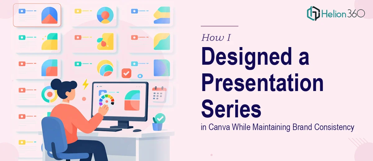
When Brand Consistency Across Multiple Presentations Became a Real Problem
I was managing a fast-moving internal communications cycle — multiple presentations needed to go out in quick succession to different audiences: leadership updates, onboarding decks, and project briefings. Each one touched the same brand, but each had different content, different layouts, and different stakeholders reviewing them.
The stakes were straightforward but real. These weren't throwaway slides. They were going in front of senior decision-makers and being used in training contexts where visual credibility mattered. Inconsistency across decks — a slightly different logo placement here, a headline font that drifted there, a color that was close but not quite right — would signal disorganization at exactly the wrong moment.
I knew quickly that producing a full presentation series and keeping everything visually locked across it wasn't something I could manage on the side. This needed to be done properly, by people who actually knew what brand-consistent presentation design at scale required.
What Doing This Well Actually Involves
My first instinct was to underestimate the problem. I figured a shared Canva template would solve most of it. Then I started looking at what maintaining genuine brand consistency across a presentation series actually demands in practice.
The first signal of real complexity was the master template architecture. A proper brand-consistent template system isn't just a pretty cover slide — it's a structured set of slide masters with locked style rules for typography, spacing, and color that need to cascade correctly across every layout variant. In Canva and equivalent tools, that means building parent-level brand kits and layout families that individual slides inherit from, not just copy.
The second signal was the content variation problem. Different presentations in a series have legitimately different structural needs — a leadership update has different information density than an onboarding module. Forcing them into the same rigid template either breaks the template or strips the content of its logic. The solution requires a flexible system, not a single rigid layout.
The third signal was the review and QA layer. Someone has to audit the full set against the brand rules before anything goes out — checking that spacing hasn't drifted, that secondary palette colors haven't crept in where they shouldn't be, and that every deck reads as part of the same visual family. That audit alone is a skilled, time-consuming task.
The Work That Goes Into Getting It Right
The foundation of any brand-consistent presentation series is a properly structured template system. Done well, this means defining a strict typographic hierarchy — typically a three-level scale such as 36pt for primary headlines, 24pt for section titles, and 16pt for body text — and locking those values into reusable slide masters rather than applying them manually per slide. The brand color palette needs to be limited to four active colors maximum, with clear rules about which tones are primary, accent, and neutral. Building this architecture correctly in a tool like Canva requires setting up a brand kit at the account level and mapping every layout variant to it. For someone doing this for the first time, getting the master template to propagate correctly across a full layout library takes considerably longer than expected — a day of work easily becomes two.
Once the template system exists, applying it coherently across presentations with different structural needs is where execution gets genuinely difficult. A leadership update deck might need dense data layouts with charts, while an onboarding module needs image-forward visual storytelling with minimal text. The right approach designs layout variants — data-heavy, visual-forward, text-balanced — that all share the same grid and typographic rules but flex in content density. A 12-column underlying grid keeps alignment consistent across wildly different slide types. The friction here is that building and testing each variant for edge cases — long headlines, portrait images, tables — multiplies the time required substantially.
The final layer is cross-deck quality assurance. This means reviewing every finished slide against the brand standard not just visually but systematically — checking that spacing margins are uniform (typically 40–60px gutters), that no off-brand typeface has slipped in through a copied element, and that the color values are exact hex matches rather than visual approximations. This kind of audit requires a trained eye and a structured checklist, and it needs to happen at the end of every deck in the series. Skipping it is how a presentation series that looked consistent in isolation ends up feeling inconsistent when the audience sees them side by side.
Why I Brought Helion360 in to Handle the Full Series
I looked at what the work actually required and made the decision quickly. I didn't have the time to build a proper template architecture from scratch, design multiple layout variants, and QA a full presentation series — not with the timeline I was working to.
Helion360 handled the entire project end-to-end. They built the master template system with the full layout library, applied it consistently across every deck in the series, and handled the cross-deck brand audit before delivery. The turnaround was fast — the full series was done in days, not the weeks it would have taken me to work through the learning curve and execution depth on my own.
What stood out was that they came in with the process already built. The template architecture, the QA workflow, the layout variant library — that infrastructure existed on their end from day one. I wasn't paying for them to figure it out. I was engaging a team that does this work all day and already had the tooling and expertise in place.
The Result and What I'd Tell Anyone Who's Seen This Same Problem
What came back was a coherent, professional presentation series that read as a unified visual family across every deck — regardless of content type or audience. The leadership update, the onboarding module, and the project briefing all looked like they came from the same organization, which they did, and now they looked like it. The decks went out on time and held up under scrutiny from senior reviewers without a single brand inconsistency flagged.
The lesson I'd share is that brand consistency across a presentation series is a systems problem, not a design problem. It requires template architecture, layout engineering, and structured QA — not just a good eye and some spare time.
If you're looking at a similar series and want it handled end-to-end without the weeks of learning curve, Helion360 is the team I'd engage — they delivered for me fast and brought exactly the execution depth this kind of work needs.