

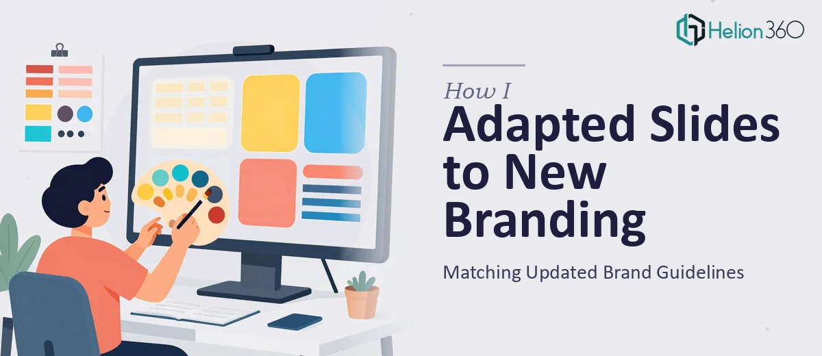
When the Brand Changed and the Deck Didn't
Our brand guidelines had just gone through a significant refresh. New color palette, updated typography, a revised logo, and tightened rules around how visual elements were supposed to sit on a page. The problem was that we had a core Google Slides presentation — the one used across sales conversations, partner briefings, and internal updates — that still reflected the old brand. Every slide was a reminder that we hadn't caught up.
The stakes were real. This deck was going in front of external audiences within weeks. Showing up with a presentation that contradicted the brand guidelines we'd just invested in would undermine both the update and the credibility of whoever was presenting it. I knew this needed to be done properly — not patched, not approximated — but fully brought into alignment with what the brand now stood for.
What I Found Out This Actually Involves
My first instinct was to assume this was mostly a cosmetic update — swap the colors, change the fonts, done. That assumption didn't survive much investigation.
The first thing I found was that brand application in a presentation isn't just about substituting hex codes. A properly on-brand deck uses a defined color hierarchy across slide types: primary backgrounds, accent elements, text contrast ratios, and support colors all governed by rules that don't just transfer automatically when you change a theme.
The second thing was typography. Updated brand guidelines often introduce new typeface pairings with specific size relationships — something like a 36pt heading, 24pt subheading, 20pt body hierarchy — and applying those consistently across dozens of slides while preserving readability and visual balance is genuinely painstaking work.
The third signal was the logo. A refreshed logo isn't just a drop-in replacement. Clearspace rules, placement anchors, and how the mark interacts with background colors all need to be respected on every individual slide. What looked like a find-and-replace task turned out to be a slide-by-slide judgment call.
The Work That Needs to Happen
The right approach to a brand-aligned presentation update starts with a structural audit of the source file. Every slide layout needs to be reviewed against the new guidelines — not just the visible elements, but the master slides and layout templates underneath them. A deck that hasn't been built on a clean master structure will produce inconsistencies that resurface every time someone duplicates a slide or adds new content. Rebuilding or repairing the master slide architecture so that brand rules propagate automatically is the foundation everything else depends on. For a deck of 30 or more slides, this audit and rebuild phase alone takes significant time for anyone who hasn't done it repeatedly.
Visual mechanics are the next layer. Proper brand application means working within a defined layout grid — typically a 12-column structure — that governs where text blocks, images, and graphic elements sit. Type hierarchies must be applied consistently: heading, subheading, and body sizes defined not just by point size but by weight, tracking, and line height. Color usage needs to follow a strict palette discipline, usually capped at 3 to 4 brand colors with clearly defined roles. The friction here is that even experienced designers can find themselves making dozens of micro-decisions per slide — and in a large deck, those decisions compound quickly into either a coherent visual system or quiet inconsistency.
Polish and consistency across the full deck is where most self-managed updates fall apart. Individual slides can look correct in isolation while the deck as a whole still feels visually uneven — different padding widths, slightly off-brand icon styles, image treatments that don't match. Done well, the final pass involves reviewing every slide in sequence, checking alignment, spacing, and brand consistency as a system rather than as individual units. This requires both a trained eye and enough distance from the work to catch what becomes invisible when you've been staring at the same file for hours.
Why I Brought in Helion360 to Handle It
Once I understood what a proper update actually required, it was immediately clear that attempting this myself wasn't the right call. I didn't have the spare hours, and more importantly, I didn't have the practitioner-level familiarity with Google Slides master structures and brand application at scale that this kind of work demands.
Helion360 handled the full project end-to-end. That meant the master slide audit and rebuild, the full application of the updated typography and color system across every slide, and the logo and brand element placement review throughout the deck. They turned it around quickly — done in days, not the weeks it would have taken me to work through the learning curve and execution myself.
What mattered to me was that they came to this with the tooling and the process already built in. There was no ramp-up time, no back-and-forth explaining what brand consistency means in practice. They understood the brief, asked the right clarifying questions upfront, and delivered a deck that looked like it had been designed from scratch to the new guidelines — not patched.
The Result and What I'd Tell Anyone in the Same Position
The delivered deck was consistent in a way the original never was — clean master structure, brand-correct typography hierarchy, proper palette application across every slide type, and logo placement that respected clearspace rules throughout. The team that used it in the first external meeting came back to say it felt noticeably more polished and on-brand. That's not a small thing when the presentation is a direct reflection of how seriously you take your own brand.
The broader lesson was that brand-aligning a presentation is a discipline, not a task. The number of decisions involved — structural, typographic, visual — adds up fast, and doing them well requires both experience and time that most people running projects don't have available.
If you're looking at a similar situation and need it handled properly without the weeks of trial and error, check out how presentation redesign should be approached — Helion360 is the team I'd engage, they delivered fast, worked end-to-end, and brought the kind of execution depth this work genuinely requires.