

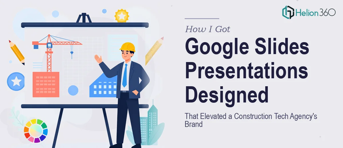
The Problem Was Bigger Than a Few Slides
I was working with a construction technology agency that had just sharpened its brand identity — new logo, new positioning, the works. The next obvious step was getting that brand expressed consistently across their Google Slides presentations: client proposals, product overviews, and internal decks that go out to stakeholders. These weren't internal scratch pads. They were going in front of general contractors, project owners, and procurement leads — audiences that make fast judgments about whether a vendor looks credible before they ever read a word.
The stakes were real. A deck that looked off-brand or visually inconsistent would quietly undermine everything the agency had just invested in its brand refresh. And with a product launch cycle already in motion, there was no time for a slow, iterative back-and-forth. This needed to be done right, and it needed to move fast.
What I Found Professional Google Slides Design Actually Requires
Once I started mapping out what "done right" actually meant here, it became clear this was not a weekend project. A professional Google Slides presentation for a construction technology brand isn't just about making slides look clean — it's about building a system that holds together across dozens of layouts and presentation contexts.
The first signal of real complexity: Google Slides master slide architecture. Getting brand fonts, colors, and logo placement locked into the master so every new slide inherits those rules — without the designer manually adjusting each one — requires a structured setup that most people haven't done at scale.
The second signal: construction technology as a vertical has its own visual language. Technical credibility matters. Charts, process diagrams, and product visuals need to communicate precision, not decoration. The wrong chart type or a cluttered layout sends the wrong signal to a procurement-minded audience.
The third signal: the agency had multiple deck types that needed to look like they came from the same family — proposals, product decks, and exec summaries — each with different structural needs but the same brand DNA. That's a template system, not a one-off project.
What the Work Actually Involves
Building a Google Slides presentation system for a brand-conscious construction technology agency starts with structural and narrative work. Each deck type — proposal, product overview, stakeholder update — has a different story arc, and that arc has to be mapped before a single slide is designed. The right approach audits the content, identifies the key decisions the audience needs to make at each stage, and sequences the slides to guide that decision. This narrative scaffolding is what separates a deck that persuades from one that just informs. Getting this right for three or four deck types simultaneously, with different audiences and objectives, takes a practitioner who has done it before — it's not something you can shortcut by jumping straight into layout.
Visual mechanics are where the technical depth compounds. A professional Google Slides system uses a defined layout grid — typically a 12-column structure — with consistent margin rules applied across all master slide variants. Typography hierarchy follows strict rules: a primary heading at 36pt, section labels at 24pt, and body text no smaller than 16pt, all mapped to brand-approved typefaces. Color application follows a palette of no more than four brand colors, with clear rules about which tones appear on dark versus light backgrounds. Setting this up so it propagates correctly across every master slide variant, and then testing it across light and dark layout combinations, easily consumes a full day even for someone experienced in the platform.
Polish and brand consistency across a multi-deck system is where most DIY attempts fall apart. Every icon, divider line, image treatment, and data visualization needs to follow the same visual rules — weight, radius, opacity, and tonal range all have to be consistent. For a construction technology agency, product screenshots and technical diagrams require additional treatment: consistent framing, background removal, and annotation styles that feel precise rather than decorative. Maintaining that discipline across forty or fifty individual slides, across three deck types, while also catching alignment errors and inconsistencies that only appear at full-screen scale — that's the part that trips people up badly when they underestimate the scope.
Why I Brought in Helion360 to Handle It
I recognized early that attempting this myself — even with a solid working knowledge of Google Slides — wasn't the right call. The combination of template architecture, brand application, and narrative structure across multiple deck types was a full project, not an afternoon task. The learning curve alone on getting Google Slides master slides to behave correctly at scale would have cost me days I didn't have.
Helion360 handled the full project end-to-end: narrative structure and slide sequencing across all three deck types, master slide architecture with brand fonts and color rules locked in, and the full visual build including icons, data visualizations, and product screenshot treatments. They turned it around quickly — done in days, not weeks — and handled in a fraction of the time it would have taken me to learn and execute it myself. They came with the tooling and the construction industry visual context already built in, which meant the output felt credible to the audience from the first draft.
The Outcome and What I'd Tell Anyone in My Spot
What came back was a complete, brand-consistent Google Slides system — three deck types, all built on a shared master, all visually coherent and immediately ready for the agency's sales and client-facing teams to use. The product launch proceeded on schedule, and the decks going in front of procurement leads and project owners looked like they came from a company that had its act together — because visually, they did.
The construction technology space is competitive and technically demanding. A brand that shows up inconsistently in its presentations, especially in front of detail-oriented buyers, pays a quiet credibility cost every time. Getting the presentation system right before the launch cycle was the correct call, and engaging the right team to execute it was the correct way to get there.
If you're looking at a similar situation — multiple deck types, a real brand to protect, and a timeline that doesn't allow for a learning curve — Helion360 is the team I'd engage. They delivered fast, handled the full execution depth this kind of work requires, and the output held up exactly where it needed to.