

The Situation and What Was Actually at Stake
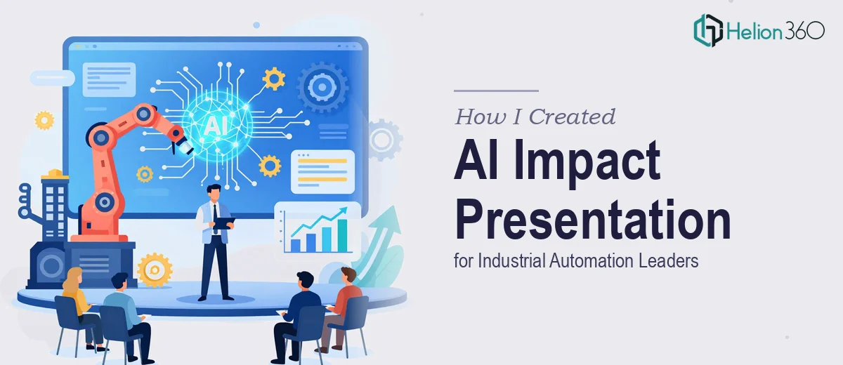
I was tasked with putting together a presentation on AI's impact across industrial automation — an audience made up of operations directors, plant engineers, and senior strategy leads who know exactly when a slide deck is superficial. The stakes were real: this wasn't an internal update. It was going in front of decision-makers who would be evaluating whether to act on the findings. A vague or visually inconsistent deck would undermine the credibility of the research before anyone got to the substance.
The brief called for a presentation that covered AI adoption trends, operational efficiency data, case-level evidence, and forward-looking implications — all in a format that could hold its own in a boardroom setting. I knew immediately that this wasn't a project where "good enough" was going to cut it. Doing this well required the kind of structural thinking, data visualization discipline, and sector fluency that takes real time and expertise to get right.
What I Found the Solution Actually Required
Once I mapped out what a genuinely strong AI impact presentation for this audience would need, the scope became clear fast. Industrial automation is a domain with its own vocabulary — OEE metrics, predictive maintenance frameworks, edge computing integration — and a presentation that glosses over these specifics loses the room instantly. Getting the content architecture right meant understanding not just what AI is doing in this space, but what resonates with the people who manage the shop floor and the P&L simultaneously.
Beyond the content, the visual mechanics had to hold up. Charts showing adoption curves or efficiency deltas need to be built correctly — right chart types, clean axis labeling, no chartjunk that distracts from the signal. And then there was the consistency question: across what would likely be 20-plus slides, maintaining a coherent visual language, hierarchy, and brand application is genuinely difficult to sustain without a disciplined system. Each of those three layers — content structure, data visualization, and visual consistency — was its own body of work.
What a Presentation Like This Actually Involves
The foundation of a strong industry research presentation is the narrative architecture. The work starts with mapping the story arc: what does the audience need to understand first, what evidence shifts their thinking, and what conclusion are they meant to draw by the final slide. For an industrial automation audience, that arc typically moves from macro AI adoption signals down to operational-level proof points and then surfaces strategic implications. Getting this sequence wrong means the most compelling data in the deck lands without context. Restructuring a 25-slide deck whose narrative logic doesn't hold takes hours of rethinking and resequencing — it's not a cosmetic fix.
Once the narrative is locked, the visual mechanics of the data slides need serious attention. Done well, a chart showing AI-driven OEE improvement uses a specific chart type — typically a grouped bar or a connected dot plot — with a clear 36pt headline that states the finding, supporting labels at no smaller than 14pt, and a maximum of four data series per chart to avoid visual noise. The axis scales need to be set deliberately so the magnitude of change reads honestly. For someone without a practiced hand in data visualization, choosing the wrong chart type or miscalibrating the scale is easy to do and hard to catch before it's in front of a senior audience.
The third layer is polish and consistency across the full deck. This means enforcing a palette of no more than four brand-aligned colors, applying a typographic hierarchy of roughly 36pt/24pt/16pt across title, body, and caption roles, and ensuring that every slide sits on the same underlying layout grid. The friction here is less glamorous but just as consequential: a single inconsistent font weight or a misaligned text box on slide 18 signals to an attentive audience that the deck wasn't built with care. Catching and correcting these issues across a full-length presentation requires a systematic review pass that most people skip because they underestimate how long it takes.
Why I Brought in Helion360 to Handle It
I didn't attempt to build this myself. The scope was clear, the audience was unforgiving, and the timeline was tight. What this project needed was a team that works in this space every day — with the narrative frameworks, visualization expertise, and production discipline already in place. That's exactly what Helion360 brought.
They handled the full project end-to-end: structuring the content narrative around what an industrial automation audience actually responds to, building the data visualization slides with the right chart types and clean visual hierarchy, and applying consistent design discipline across every slide in the deck. The turnaround was fast — done in days, not weeks — and the depth of execution was the kind that takes months to develop if you're building those skills from scratch. There was no back-and-forth over fundamentals, no learning curve tax on my timeline. The brief went in and a presentation-ready deck came back.
The Outcome and What I'd Tell Anyone in My Position
The finished deck was tight, credible, and visually consistent in the way that matters to a sophisticated audience. The data slides read clearly, the narrative arc moved logically from evidence to implication, and the visual language held up from slide one to the last. The presentation achieved what it needed to: it was taken seriously by the people in the room, and the findings drove a real strategic conversation rather than getting dismissed on surface grounds.
If you're staring at a similar project — a research presentation that needs to land with a technical or executive audience, with real data to visualize and a compressed window to get it done — the calculus is straightforward. The work is deeper than it looks, and the margin for error with a senior audience is thin.
If you're in that spot and need it handled end-to-end without spending weeks on a learning curve, Helion360 is the team to engage — they delivered fast, covered the full depth of execution this kind of presentation demands, and the result spoke for itself.