

The Situation and What Was Riding on It
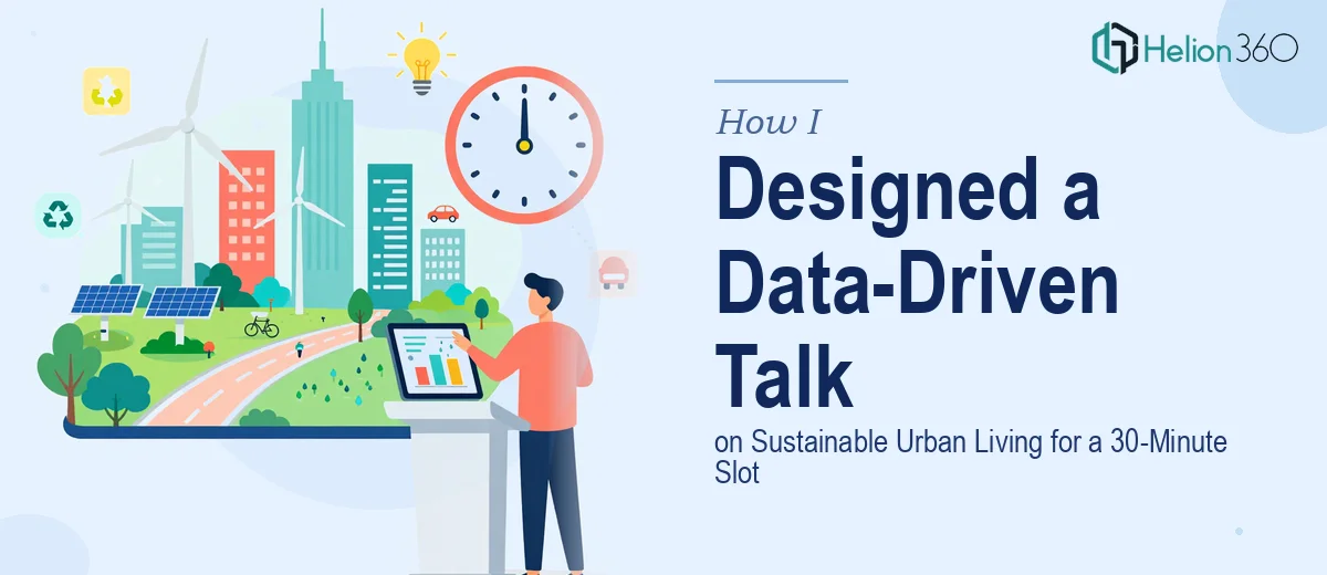
I had a 30-minute speaking slot at an urban planning conference, and my topic was sustainable urban living — specifically, the measurable impact of green infrastructure investments in mid-size cities. The audience was a mix of city planners, policy advisors, and real estate developers. These are people who read research for a living. A deck full of vague assertions and stock photography wasn't going to land.
The data I had was real and genuinely compelling — energy consumption figures, green space indices, transit mode-share statistics across several cities, and longitudinal housing density numbers. But raw data sitting in spreadsheets is not a presentation. And a 30-minute slot with a live Q&A afterward meant the narrative had to be airtight, the visualizations had to be instantly readable, and the pacing had to be deliberate.
I knew straight away that this needed to be done properly — not patched together the night before.
What I Found a Well-Built Research Presentation Actually Requires
Once I started mapping out what a polished, data-driven presentation on this topic would actually involve, the scope became clear quickly.
The first signal of real complexity was the data itself. I had numbers from multiple sources — municipal reports, academic studies, transit authority data — each using different base years, different unit conventions, and different geographic definitions for what counts as "urban." Making those sources speak to each other coherently, without misrepresenting what any single dataset actually shows, is not a formatting task. It is an analytical and editorial task.
The second signal was the visualization layer. Sustainable urban living data involves comparisons across cities, trends over time, and spatial relationships — three very different visual logics that each require different chart types and layout treatment. Picking the wrong chart type doesn't just look bad; it actively misleads the audience.
The third signal was the time constraint. Thirty minutes for a complex research topic means roughly 20 to 25 slides at a deliberate pace. Every slide has to earn its place. That kind of editorial discipline — knowing what to cut — is a skill in itself.
What the Work Actually Involves
The foundation of a presentation like this is structural and narrative work — and it is more demanding than it looks. The right approach starts with auditing every data source for consistency: aligning base years, normalizing units, and flagging any numbers that can't be directly compared without a caveat. From there, a story arc has to be mapped that moves the audience from context to evidence to implication in a sequence that feels logical, not like a data dump. For a 30-minute slot, that typically means a three-act structure: establish the urban challenge, present the evidence for what works, and close with actionable implications. Getting that architecture right before a single slide is designed saves enormous revision time later and is where most self-built decks fall apart.
The visual mechanics of a data-driven presentation introduce their own layer of complexity. Proper layout discipline for a research deck uses a consistent 12-column grid, a type hierarchy of roughly 36pt for slide titles, 24pt for data callouts, and 16pt for supporting labels — and those rules have to hold across every slide without drift. Chart selection follows its own logic: city-to-city comparisons belong in grouped bar or dot-plot formats, time-series data belongs in line charts with clearly annotated inflection points, and spatial data needs a map-based treatment rather than a table. Applying those choices consistently across 20-plus slides, while keeping the palette to a maximum of four brand-aligned colors, is painstaking work. One inconsistent axis label or misaligned legend undermines the credibility of everything around it.
Polish and consistency across the full deck is the final layer — and it is where hours quietly disappear. Every text box, every chart frame, every icon set has to be pixel-aligned across master slides. Transitions have to be purposeful, not decorative. Speaker notes have to mirror the verbal logic of each slide so the presenter isn't reading off the screen. For a research audience specifically, citation placement matters: source attributions need to appear at the footer of every data slide in a consistent format, and any figures derived from calculations rather than direct citation need a clear methodology note. None of this is glamorous. All of it is necessary.
Why I Brought in Helion360 to Handle the Full Project
Looking at what the work actually required, I didn't spend time debating whether to attempt it myself. The data reconciliation alone would have taken days. The visualization decisions required real expertise in research presentation design — the kind that comes from doing this type of work repeatedly, not from reading a tutorial.
I engaged Helion360 to handle the project end-to-end. They took the raw data, the source materials, and a brief on the audience and speaking context — and turned around a fully structured, fully designed deck in a fraction of the time it would have taken me to work through even the structural layer on my own.
What they handled in full: the data audit and source reconciliation, the narrative architecture and slide-by-slide story mapping, the visual design and chart production across all slides, and the speaker notes calibrated to a 30-minute delivery. Done in days, not weeks — with the kind of execution depth that a research-literate audience actually demands.
The Result and What I'd Tell Anyone in the Same Position
The deck that came back was exactly what the slot required — a clean, credible, data-driven presentation on sustainable urban living that moved logically from urban challenge to evidence to implication, with visualizations that were immediately readable to a specialist audience. The Q&A after the talk was substantive, which told me the audience had engaged with the content rather than spent their energy decoding cluttered slides.
The outcome wasn't just a good-looking file. It was a presentation that held up under scrutiny from people who do this work professionally — and it was ready well before I needed it.
If you're staring at a similar project — real data, a serious audience, a firm deadline, and a clear sense that the stakes are too high to wing it — Helion360 is the team to engage. They handle the full execution fast, and the expertise is already in place.