

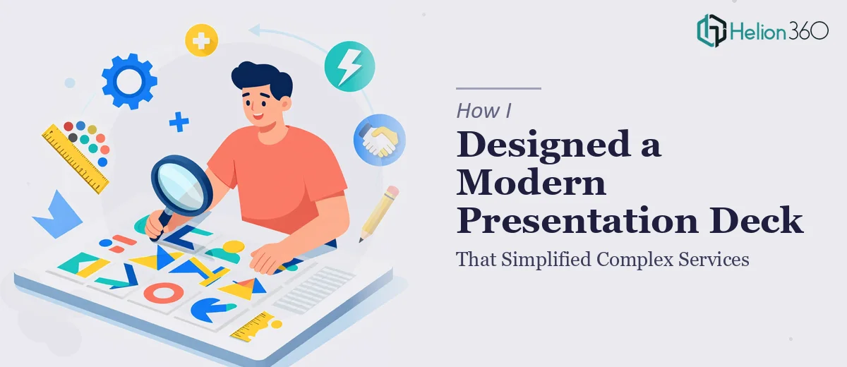
When a Complex Services Deck Becomes a Real Problem
I was staring at a brief that asked me to communicate a wide-ranging set of community services to two very different audiences in the same presentation. The deck needed to be clear enough for a non-specialist reader, credible enough for a funding body, and polished enough to hold its own in a formal review meeting. The deadline was real and the stakes were higher than a typical internal slide update — this was the kind of presentation that would either build confidence in what we were doing or quietly undermine it.
The existing materials were scattered. There were Word docs, a rough spreadsheet summary, some old slides with inconsistent formatting, and a folder of notes that had never been visualized into anything coherent. I knew straight away that building a clean, modern presentation deck from that source material was not something I could afford to figure out as I went.
What I Found Out the Work Actually Requires
Before I did anything else, I spent time understanding what a well-executed presentation deck for complex services genuinely involves. What I found was that most people underestimate it significantly.
The first signal of real complexity was the structural layer. Converting scattered information about different service types, audiences, and geographic coverage into a logical narrative arc — with a clear opening, a logical middle, and a decisive close — is not just a content editing task. It requires someone who understands how a reader processes a slide deck versus a report.
The second signal was visual hierarchy. Presenting information about multiple service categories without the deck becoming a wall of text or a confusing cluster of boxes requires deliberate design decisions at the layout level — not just aesthetic choices, but functional ones.
The third signal was brand consistency at scale. Applying a coherent visual language across 20 or 30 slides, where every title, label, icon, and color usage reinforces the same identity, takes disciplined execution that gets tedious and error-prone fast when someone is doing it without the right setup.
The Work That Needs to Happen
The first thing proper presentation design for a complex services deck requires is a structural audit and narrative build. The practitioner starts by mapping every piece of source content against a simple story framework — context, what exists, why it matters, what comes next. For a multi-service deck, that typically means grouping service types into no more than three to four thematic clusters so the audience has a mental model to hold onto. The honest execution friction here is that most source documents are not written for slide logic — they're written for reports. Rewriting content to work in a 15-to-20 word headline-plus-three-line-body-copy format, across 25 or more slides, takes far longer than it looks from the outside.
The second aspect is visual mechanics — how information is laid out on each slide using a consistent grid, typography scale, and chart selection. Done well, a modern presentation deck uses a 12-column underlying grid, a three-level type hierarchy (typically 36pt section headings, 24pt slide titles, 16pt body), and a maximum of four brand colors applied with strict rules about which gets used where. The challenge is that applying these rules consistently in PowerPoint or Google Slides — especially across master slide variants — requires either deep software fluency or a lot of rework. A single misaligned text box or an off-brand accent color on one slide breaks the sense of professionalism across the whole deck.
The third aspect is polish and brand consistency across the full slide count. This means icon sets drawn from a single visual family, image treatments that match in tone and crop ratio, and spacing rules that hold from the first slide to the last. The execution reality is that even experienced presenters who know what "consistent" looks like often can't maintain it when they're building slides one by one under time pressure. Checking 30 slides for padding consistency, font weight accuracy, and color hex exactness is a systematic task — not a creative one — and it's the kind of thing that gets skipped when someone is racing a deadline.
Why I Brought in Helion360 to Handle It
I recognized early that attempting to build this deck myself — even with a reasonable grasp of what good looks like — would cost me time I did not have and produce a result that fell short of the standard the brief required. The structural complexity alone, before touching a single design element, was a project in itself.
Helion360 handled the full project end-to-end using market research presentation design services. That meant taking the scattered source material and turning it into a coherent narrative structure, building the visual framework from scratch using a proper grid and type system, and delivering a fully consistent, polished deck ready for the actual presentation environment. The turnaround was fast — done in days, not weeks, and handled in a fraction of the time it would have taken me to learn and execute it myself. They brought the tooling and the template infrastructure already in place, which meant no ramp-up time and no guesswork on the design system.
The Outcome and What I'd Tell Anyone in My Spot
What came back was a data-driven presentation I could walk into a room with confidently. The service categories were organized into a clear narrative that non-specialists and stakeholders could both follow. The visual design was clean and consistent — every slide felt like it belonged to the same family, and the information hierarchy made it easy for a reader to know what mattered most on each page. The presentation landed well and did exactly what it was supposed to do: communicate a complex picture clearly and leave the audience with confidence rather than confusion.
If you're looking at a similar brief — scattered source material, a deadline that doesn't leave room for trial and error, and a standard that has to hold up in a real room — Helion360 is the team I'd engage. They delivered fast, handled the full execution depth the work required, and the result spoke for itself.