

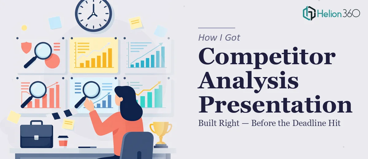
The Situation We Were Facing and Why It Couldn't Wait
We were at a pivotal point in our startup's early roadmap. Leadership needed a clear picture of the competitive landscape — not a rough sketch, but a structured, decision-ready competitor analysis presentation that could actually drive strategy. The ask was specific: cover at least three major competitors, map their product offerings, growth strategies, and unique positioning, and layer in a SWOT analysis for each.
The deadline was one week out. The audience wasn't casual — this was going to land in front of people who ask hard questions and expect sourced answers. A slide deck with vague bullet points and clip-art icons wasn't going to cut it. I recognized immediately that this needed to be treated as a real research and design project, not a task to squeeze in between everything else on the plate. Getting it wrong wasn't an option.
What I Found This Work Actually Required
My first instinct was to scope the effort honestly before committing to any path. What I found was that a well-built competitor analysis presentation is genuinely multi-layered work.
The research phase alone is more rigorous than it looks. Mapping three competitors across product features, pricing signals, market positioning, and growth trajectory means pulling from multiple source types — industry reports, public filings, product documentation, press coverage — and synthesizing that into something coherent rather than just dumping data onto slides.
Then there's the SWOT layer. A SWOT that's actually useful isn't a four-box template with generic observations. It requires grounding each strength, weakness, opportunity, and threat in specific evidence and framing it in a way that connects to the startup's own positioning decisions.
And finally, the output has to communicate clearly under pressure. Executives and stakeholders skim. The visual design, the data hierarchy, and the narrative flow all need to do real work — not just look professional, but make the insights land fast. That combination of research depth and presentation craft isn't something you can shortcut.
What the Work That Goes Into This Actually Looks Like
The right approach starts with a structured audit of what's actually known versus what needs to be found. Done well, this phase means defining the competitor set with intention — not just listing obvious names, but scoping which players are most strategically relevant based on market segment, funding stage, and go-to-market motion. The practitioner's decision here is to establish a comparison framework upfront — typically five to eight attributes tracked consistently across all competitors — so that the final presentation doesn't read as three disconnected profiles but as a genuine side-by-side analysis. Getting this architecture right before a single slide is built is what separates useful competitive intelligence from a document that generates more questions than it answers. For someone new to this work, the audit and framework-setting phase alone can consume the better part of two days.
The visual mechanics of a competitor analysis presentation follow specific conventions that experienced designers know well. A clean comparison matrix typically runs on a 12-column layout grid, with typography set at a 32pt heading, 20pt subheading, and 14pt body hierarchy — tight enough to be data-dense, readable enough to survive a projected screen at the back of a room. SWOT grids need to be visually balanced across four quadrants with consistent color coding: typically two warm tones for internal factors and two cool tones for external factors, pulled from a palette capped at four brand-compliant colors. The friction here is that building master slides that propagate grid and palette rules consistently across 20-plus slides — without alignment drift or font substitution errors — takes practiced hands. A single master slide misconfiguration can cascade across the entire deck.
Polish and consistency across the full deck is where many DIY attempts fall apart in the final stretch. Every icon set needs to follow the same visual weight. Every data callout needs the same formatting treatment. Competitor logos require proper clearspace and consistent sizing. Page numbers, section dividers, and source citation footnotes all need to sit in the same position across every slide. When you're working across a competitive landscape deck that covers three competitors, each with their own profile, SWOT, and strategic takeaway slide, the consistency discipline required is significant. What looks like a simple formatting task becomes a careful quality pass that, done properly, takes several hours even for experienced designers.
Why I Brought in Helion360 to Handle the Full Project
Once I understood what this project genuinely required — primary and secondary research, a structured comparison framework, SWOT analysis grounded in evidence, and a professionally designed presentation that could hold up in a high-stakes room — I didn't spend time trying to piece it together myself. The timeline was too tight and the execution depth was too specific.
Helion360 handled the project end-to-end. That meant the research and synthesis, the competitive framework and SWOT builds, and the full presentation design — not just a polish pass on something I'd already started. They delivered fast, turning around a complete, decision-ready deck in a fraction of the time it would have taken me to work through the research methodology, build the framework, and then tackle the design layer on top. This is a team that does this work every day, with the process and tooling already in place. There was no ramp-up time, no back-and-forth explaining what a SWOT should actually say.
The Result, and What I'd Tell Anyone Facing the Same Deadline
What came back was a structured, visually consistent competitive analysis presentation that covered all three competitors with depth — product positioning, growth signals, SWOT analysis, and a clear differentiation and brand positioning section at the end. It held up in the room. The questions it generated were strategic ones, not clarifying ones, which is exactly what a document like this should produce.
Anyone looking at a similar situation — tight deadline, high-stakes audience, competitive landscape analysis that actually needs to inform decisions rather than just check a box — will quickly see that the research and design work involved isn't a weekend project. The scope is real, the craft standards are specific, and the margin for error is low when the output is going to drive roadmap thinking.
If you're in that same spot and need it handled end-to-end without weeks of ramp-up, Helion360 is the team I'd engage — they delivered fast, covered the full execution depth this kind of work requires, and the result was something we could actually use.