

When a Standard Slide Deck No Longer Cuts It
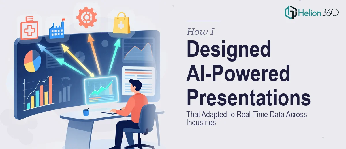
I was brought onto a project that had an unusual brief: build presentations that did not just display information but actually responded to it. The goal was to create AI-powered presentations capable of pulling real-time data, adapting visual layouts based on the audience, and working across four industries — healthcare, finance, technology, and education.
I have worked with PowerPoint and Google Slides for years. I know my way around animations, data charts, and template systems. But this was something different. The scope involved integrating live data feeds, building conditional visual logic, and maintaining design consistency across presentations that were fundamentally dynamic — not static.
I started where most designers do: trying to figure it out myself.
The Problem With Building Dynamic Presentations from Scratch
My first attempt involved setting up data-linked charts in PowerPoint using Excel connections. That worked for simple numbers, but it broke down quickly when the data sources were external APIs or dashboards. Each industry had different data structures. A healthcare summary slide needed to read differently than a financial projection chart or an education engagement metric.
I also ran into user experience issues. An AI-driven presentation is only as useful as its readability under pressure. During a live meeting, a slide that jumps between states or loads slowly loses the room entirely. The interactive elements I was testing felt clunky, and the visual storytelling felt disconnected from the data being shown.
I tried three different approaches over about two weeks. None of them solved the core problem: making real-time data feel designed rather than raw.
Bringing in a Team That Understood Both Sides
After hitting a wall with the technical-design overlap, I came across Helion360. I explained the brief — multi-industry AI presentations, real-time data visualization, audience-specific layouts, and interactive elements for virtual meetings. Their team understood exactly what I meant without needing a lengthy explanation.
What stood out was that they did not treat this as a standard presentation redesign job. They asked specific questions about data sources, transition behavior, and how each industry audience would consume the content. That kind of structured thinking was exactly what the project needed.
Helion360 took over the production side while I stayed involved on the content and messaging layer. The division worked well.
What the Final Presentations Actually Looked Like
The finished decks were structured around modular slide systems — each section designed to pull updated figures from connected data sources without breaking the visual layout. Charts in the finance deck updated dynamically during the presentation itself. The healthcare slides used simplified infographic-style data visualization that made clinical metrics readable at a glance.
The education module used a completely different visual language — warmer tones, step-by-step flow diagrams, and lighter typography — while the technology deck leaned into a cleaner, dashboard-style aesthetic. Each felt like it belonged to its industry, even though the underlying AI-presentation framework was consistent across all four.
Interactive elements were embedded where they added value rather than as novelty. A clickable scenario toggle on the finance slides let presenters switch between projected growth models mid-meeting. That alone saved significant back-and-forth during client discussions.
What I Took Away From the Process
Building AI-powered presentations that adapt to real-time data is not a design problem or a technical problem — it is both at once. The moment you separate those two disciplines, something breaks. Either the data is accurate but ugly, or the design is beautiful but the live functionality is fragile.
The other thing I learned is that industry-specific presentations are not just about swapping color palettes. The information hierarchy, the pace of the deck, and the way data visualization is handled all change based on who is in the room and what decisions they are making.
If you are working on a project that sits at the same intersection — complex data, multiple audiences, and a need for presentation design that actually holds up in a live environment — Helion360 is worth reaching out to. They handled the parts that were beyond what I could deliver alone, and the output reflected that clearly.