

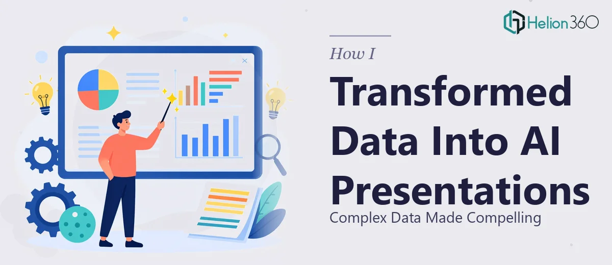
When the Data Was Clear but the Presentation Was Not
I work in a team that runs on data. Every week, we're pulling together analysis, insights, and projections — and at some point, all of that needs to be communicated clearly to stakeholders who don't have time to sift through spreadsheets. That's where the real challenge started.
I could read the numbers. I understood what they meant. But turning dense, multi-layered data into a presentation that actually communicated a clear narrative? That was a different skill set entirely. My slides ended up looking more like data dumps than business presentations. Walls of text, ungainly charts, no visual hierarchy — and absolutely no story thread tying it together.
The Problem With Doing It All Yourself
I tried a few approaches before admitting I needed a different solution. I experimented with AI tools that promised to auto-generate slides from prompts or raw inputs. Some of them were genuinely useful for quick drafts, but the output still needed significant design work to look polished and professional. The layout choices were often inconsistent, the charts weren't formatted to highlight the right insights, and the overall flow felt disjointed.
I also tried rebuilding slides manually in PowerPoint, pulling in data visualizations and reformatting everything by hand. That worked — to a degree — but it was slow, and every round of feedback from the team meant going back and reworking the structure again. I was spending more time formatting than actually preparing for the presentation itself.
The issue wasn't that the data was unclear. The issue was that presenting data in a way that drives decisions requires real design thinking, not just slide assembly.
Bringing In the Right Support
After hitting that wall a few times, I reached out to Helion360. I explained the situation: we had complex analytical content that needed to be turned into a polished, professional presentation that could hold an audience's attention and make the key findings immediately understandable.
Their team asked the right questions from the start — about the audience, the message I wanted to land, and the tone the presentation needed to carry. That alone told me they weren't just going to take my raw content and dress it up. They were thinking about communication strategy, not just visual design.
What the Final Presentation Actually Looked Like
Helion360 restructured the content so it followed a logical narrative arc. The dense analysis was broken down into key takeaways, each supported visually rather than buried in text. Charts were redesigned to emphasize the most important trends instead of displaying every data point at once. Slide transitions and layout consistency gave the whole deck a professional rhythm that made it easy to follow.
The data visualization work was particularly strong. Where I had tables of figures, they created clean visual summaries that communicated the same information in a fraction of the reading time. The result was a presentation that could stand on its own — someone could flip through it without a verbal walkthrough and still grasp the core message.
From a communication standpoint, the finished deck was a significant step up from anything I had been able to produce on my own within a reasonable timeframe.
What This Experience Taught Me About Data and Presentation Design
The gap between having good data and presenting it well is wider than most people expect. AI tools can accelerate parts of the process — generating initial structures, suggesting layouts, drafting text — but transforming complex information into a compelling presentation still requires human judgment about what the audience needs to understand and feel.
Designing for clarity is a specific discipline. It involves knowing when to use a chart versus a callout statistic, how much text belongs on a single slide, and how the visual flow guides someone through an argument. Those decisions compound across a deck, and getting them right consistently takes experience.
If you're in a similar position — strong on content but stuck on how to make it land visually — Helion360 is worth reaching out to. They stepped in where the work had become too complex and time-consuming to handle alone, and what they delivered made a real difference in how the presentation was received.