

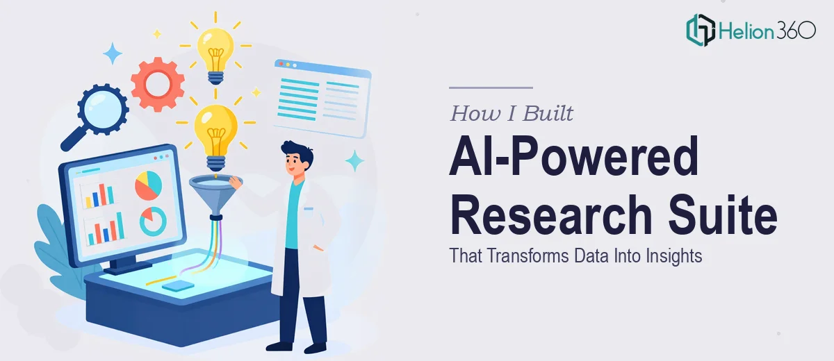
The Idea Was Clear. The Execution Was Not.
I had a vision that seemed straightforward on paper: build a suite of tools that would use artificial intelligence to analyze large datasets, surface meaningful insights, and pipe those results directly into polished, presentation-ready outputs. The goal was to eliminate the bottleneck between research and presentation — that painful gap where raw data sits in spreadsheets and no one knows how to make it tell a story.
I had worked with data pipelines before. I understood the basics of machine learning and had used tools like TensorFlow in smaller projects. What I did not fully anticipate was how quickly the complexity would compound once I started connecting the pieces.
Where Things Got Complicated
The core challenge was not building any one component in isolation. It was the integration. The AI layer needed to process unstructured research data, identify patterns, and generate structured summaries. Those summaries then needed to flow into a presentation interface that was visually coherent and adaptable for different use cases — executive briefings, product demos, investor updates.
I spent several weeks prototyping the data analysis module. Getting the machine learning models to produce reliable, context-aware outputs from varied datasets was difficult enough. But when I started working on the presentation output layer, I ran into a different kind of problem entirely. The visual design and slide logic were outside my core skill set. I could structure data. I could not reliably translate that structure into a market research presentation design services that looked professional and communicated clearly.
I also underestimated how much the user interface mattered. A technically sound system that outputs awkward, hard-to-read slides defeats the entire purpose. The presentation layer is not a secondary concern — it is the product.
Bringing in the Right Support
After hitting that wall, I came across Helion360. I explained what I was building: an AI-driven research tool that needed a polished presentation output layer integrated into the same workflow. Their team understood the brief quickly and did not require a lengthy back-and-forth to get started.
What I handed off was essentially the design and presentation architecture side of the suite — the component I could not do well on my own. They worked on structuring how the AI-generated content would map to slide layouts, how data visualizations would render within the presentation framework, and how the overall interface would guide a user from raw insight to finished output without friction.
The result was a presentation layer that felt native to the product rather than bolted on. Charts rendered cleanly. Summary slides used hierarchy and spacing that actually communicated priority. The layouts adapted to different content lengths without breaking.
What the Final Suite Actually Does
The completed system takes a dataset or research document as input, runs it through the AI analysis pipeline, and produces a structured insight summary. That summary is then automatically formatted into a presentation-ready format — with slides organized by section, key findings highlighted visually, and supporting data displayed through clean, readable charts.
Helion360's contribution to the data-driven PowerPoint presentation design side made it viable as a real product rather than a technical demo. The gap between a working prototype and something you can actually put in front of stakeholders is significant, and that gap was bridged by getting the visual output right.
What I Took Away From This
Building an AI-powered research and presentation suite is not a single-discipline project. The data science and the presentation design are equally important, and treating one as secondary will limit what the tool can actually do. I learned that early enough to course-correct before the project stalled.
The AI layer can be sophisticated, the data pipeline can be well-engineered, but if the market data analysis report does not communicate clearly, none of that work lands with the audience it was built for. Investing in the design side of the output was not a compromise — it was the decision that made everything else useful.
If you are building something similar and finding that the presentation layer is holding the rest of the project back, Helion360 is worth reaching out to — they stepped in at exactly the right point and delivered the part I could not handle alone.