

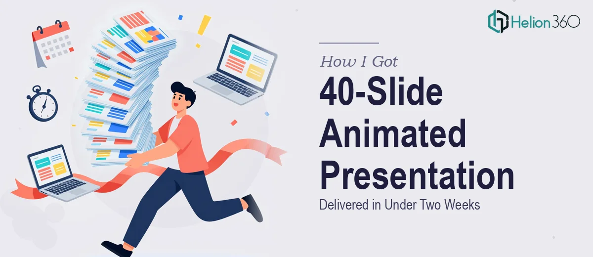
The Conference Was a Month Out and the Slides Were a Mess
We had a tech conference coming up in four weeks. The content covered product features, market trends, and customer success stories — a lot of ground to cover across roughly 40 slides. The stakes were real: this was a public-facing presentation in front of an informed technical audience, and it needed to feel like we belonged on that stage.
What we had was a rough draft — dense text, inconsistent layouts, no visual hierarchy to speak of, and zero animation. It looked like an internal working document, not a conference keynote. I knew immediately that getting this into shape wasn't a formatting job. It was a full design and animation project, and it needed to be done right. The margin for error in front of a live audience is thin. A presentation that looks unpolished doesn't just reflect badly on the slides — it reflects badly on everything behind them.
What I Found Out This Kind of Work Actually Requires
I started looking into what a properly animated PowerPoint conference presentation actually involves, and the scope became clear fast.
First, animation in PowerPoint isn't drag-and-drop. A 40-slide deck with purposeful motion means every entrance, emphasis, and transition is a deliberate choice — timed to the narrative, consistent across sections, and responsive to how a live presenter will actually move through the material. Done carelessly, animation is distracting. Done well, it guides the eye and reinforces the story.
Second, conference presentations have specific visual conventions. The audience is reading from a distance, under variable lighting, on a screen they don't control. That changes everything about type size, contrast ratios, and information density per slide.
Third, the content itself — product features, market trends, success stories — spans multiple tones and formats. Each section needs its own visual treatment while still feeling like one unified deck. That kind of consistency doesn't happen by accident. It's the result of a properly built master slide system and a disciplined approach to brand application from slide one through slide forty.
What the Work Actually Involves
The right approach to a project like this starts with the narrative structure. Before a single animation is applied, the deck needs to be audited as a story — which slides are doing heavy lifting, where the audience needs a moment to breathe, and how the three content themes (product features, market trends, success stories) connect into a single coherent arc. In a 40-slide deck, section transitions are structural decisions, not stylistic ones. Getting this wrong means the audience loses the thread at exactly the moment the presentation needs them most. Rebuilding a narrative architecture mid-project is expensive in both time and coherence.
Visual mechanics come next, and this is where conference-specific rules matter. Body text in a conference environment needs to sit at a minimum of 24pt to be legible from mid-room; headline hierarchy typically runs 40pt / 28pt / 20pt across title, subtitle, and callout. Layout grids — commonly a 12-column structure — need to be set at the master slide level so every content slide inherits correct margins and alignment automatically. Charts visualizing market trends require the right chart type for the data story being told: a bar for comparison, a line for change over time, a scatter for correlation. Choosing the wrong type isn't a minor visual mistake — it actively misleads the audience about what the data means. Setting this up correctly across 40 slides, with live chart objects rather than static images, takes time even for an experienced practitioner.
Then there's animation and brand consistency, which are inseparable in a professional deck. Smooth transitions between sections — the kind that feel intentional rather than default — rely on entrance and exit animations that match the pace of a live presenter. The standard approach uses Fade or Wipe animations at 0.5–0.75 second durations for body content, with motion path or grow/shrink effects reserved for feature highlights. Brand color palettes need to be locked to a maximum of four primary colors with two accent options, applied consistently across every slide background, icon set, and text element. Drift in either animation style or color application reads immediately to a trained audience — and in a conference room, that inconsistency is impossible to hide.
Why I Brought in Helion360 to Handle It
I looked at the scope — 40 slides, full animation, three content themes, a live conference audience, and a two-week window — and the decision was straightforward. This wasn't a project to attempt in spare hours. The gap between a deck that looks competent and one that actually performs in a room is entirely in the execution depth, and that depth requires tools, templates, and pattern recognition that comes from doing this kind of work repeatedly.
Helion360 handled the full project end-to-end: narrative restructuring across all three content sections, master slide build with the full animation system, and brand-consistent visual treatment from the title slide through the closing. They turned the project around quickly — delivered in well under the two-week window — which meant we had time to review, request adjustments, and go into the conference without a last-minute scramble. That speed isn't luck. It comes from a team that does this work every day with the infrastructure already in place.
What We Walked Away With — and What I'd Tell Anyone in This Spot
We walked into that conference with a deck that looked like it was built for the room it was in. The animations guided attention without distracting from the presenter. The transitions held the narrative together across all three content sections. The audience stayed engaged — which, for a 40-slide technical presentation, is exactly the outcome you're building toward.
The thing I'd tell anyone staring at a similar project is this: the complexity isn't in knowing what good looks like. It's in having the time, tooling, and execution depth to get there before the deadline. If you're looking at a business presentation design services that needs to perform in front of a live audience and you want it handled end-to-end without the weeks of learning curve, Helion360 is the team to engage — they delivered fast and at a level of execution this kind of work demands.