

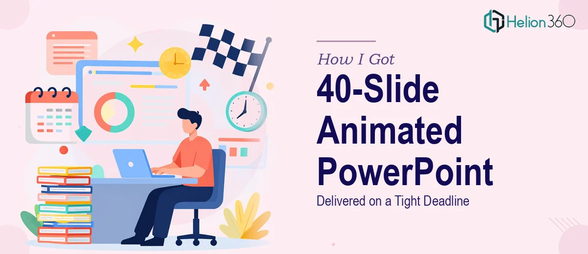
The Week Everything Depended on One Presentation
We had a product launch landing in seven days. The deck existed — about 40 slides — but the animations were either nonexistent or embarrassingly basic. Static bullet points appearing one at a time. Transitions that looked like they came from a 2009 template. For an internal review, that might have been fine. For a live product launch presentation in front of a room that included press and partners, it was not.
The stakes were real. First impressions of the product line were going to be shaped by how the presentation felt — not just what it said. A sluggish, visually flat deck would undercut the energy we'd spent months building. I knew almost immediately that this needed professional-grade animated PowerPoint design, and that patching it ourselves over a frantic weekend wasn't a viable plan.
What I Found Out This Work Actually Involves
Before reaching out to anyone, I spent an hour researching what a properly animated PowerPoint presentation actually requires when done well. What I found made the scope immediately clear.
First, animation in PowerPoint isn't just about adding motion — it's about sequencing. Every element on a slide has an entry point, a timing trigger, and a relationship to the elements around it. Get the sequencing wrong and the deck feels chaotic instead of polished. Doing it right across 40 slides means managing hundreds of individual animation events.
Second, brand consistency has to hold through all of it. The motion style, the easing curves on transitions, the way text enters versus how charts build — all of it needs to feel like it belongs to the same visual language. That requires a defined approach before a single animation is applied.
Third, the file has to be presentation-ready: no bloated file size, no broken animations on export, no layout shifts when the aspect ratio changes between screens. These are the kinds of issues that only surface at the worst possible moment — like five minutes before you go live.
What the Work Itself Actually Requires
The right approach to a project like this starts with a structural and narrative audit of the existing deck. Before any animation touches the file, a practitioner needs to evaluate which slides are carrying the most communication weight and sequence them accordingly. A 40-slide deck typically falls into three to four narrative phases — context, problem, solution, and call to action — and the animation strategy should reinforce those phases rather than apply a uniform treatment across every slide. Getting this mapping done correctly takes focused time, and skipping it produces motion that looks busy rather than purposeful.
The visual mechanics layer is where most of the execution time lives. Done well, this means applying a consistent animation grammar: entrance animations set to appear on-click or after-previous with uniform duration values (typically 0.3–0.5 seconds for element reveals, 0.7–1.0 seconds for slide transitions), easing set to ease-in-out rather than linear, and chart builds that sequence data points in the order the narrative needs them. A 12-column layout grid needs to be in place before animation begins so that element positioning doesn't shift when animations fire. For someone new to PowerPoint's animation pane, building this layer correctly across 40 slides is easily a two-day project — and that's assuming no brand specifications to interpret.
Polish and consistency across the full deck is the third layer, and it's where amateur work tends to fall apart. The standard is no more than three motion types per deck, a strictly enforced color palette of four brand colors maximum, and uniform font hierarchy — typically 36pt for headers, 24pt for subheadings, and 16pt for body — applied consistently across every master and layout slide. Any deviation has to be caught and corrected before the file is exported. On a 40-slide file, a consistency pass alone can take several hours, and it requires someone experienced enough to spot the issues before they compound.
Why I Brought in Helion360 to Handle It
I didn't spend time trying to figure out how to do this myself. The scope was clear, the deadline was real, and the margin for error was essentially zero. What the work required — animation sequencing, brand-consistent motion design, a clean final file — was exactly the kind of execution that needs someone who does it every day with the tooling already in place.
Helion360 handled the full project end-to-end: the animation audit and sequencing strategy across all 40 slides, the full visual mechanics layer with consistent timing and easing applied throughout, and the final polish pass that caught every inconsistency before delivery. The whole thing was turned around in a fraction of the time it would have taken me to learn and execute it myself. Done in days, not weeks — which is exactly what the deadline required.
The team didn't need lengthy briefing sessions. They understood brand alignment, animation logic, and presentation-readiness from the start, and the back-and-forth was minimal.
The Result — and What I'd Tell Anyone Looking at This Same Problem
What came back was a 40-slide deck that moved and breathed like the product it was presenting. The animations reinforced the story rather than distracting from it. Charts built in sequence. Transitions held the visual language of the brand throughout. The file was clean, sized correctly, and performed reliably on the day.
The launch went well. The deck played a real role in how the product was received — not because of flashy effects, but because the presentation felt considered and professional from the first slide to the last.
If you're looking at a similar situation — a tight deadline, a product launch slideshow that needs to perform at a level your current version isn't at, and no realistic path to getting there yourself in the time you have — Helion360 is the team to engage. They delivered fast, handled the full execution depth the work required, and the result spoke for itself.