

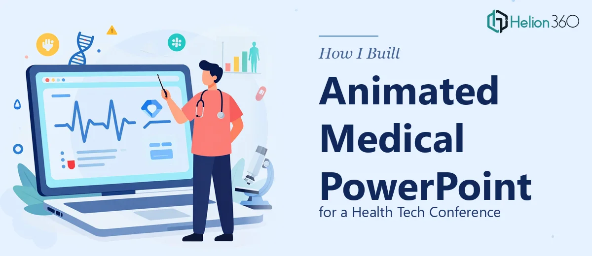
The Brief Sounded Simple. The Reality Was Not.
We had a health tech conference coming up in three weeks, and our team needed a polished, animated medical PowerPoint presentation that would represent us well in front of investors, clinicians, and tech professionals. The raw material was straightforward enough — a set of medical documents with clinical trial data, product comparisons, and outcome statistics.
My job as digital marketer was to coordinate the deck. I figured I could handle it internally. I had decent PowerPoint skills, some design sense, and access to stock images. What I underestimated was the complexity of translating dense medical data into something an audience could actually follow in real time.
Where Things Started to Break Down
The medical documents we had compiled were detailed. There were multi-page clinical summaries, tables with dosage comparisons, patient outcome charts, and annotated medical images that needed to appear in context. My first attempt at building the slides produced something that looked like a research paper had been dropped into PowerPoint.
The data was accurate, but the presentation design was doing nothing to help the audience process it. Text-heavy slides, static charts, poorly placed images — none of it communicated the story we were trying to tell. I also realized quickly that adding meaningful animation to slides with medical content is not just a design task. Timing each element, making sure the animation sequence helps guide attention rather than distract from it — that requires experience I did not have.
Another challenge was the tight deadline. Iterating on slide design while also managing conference logistics and other marketing deliverables was not realistic.
Bringing in the Right Help
After a frustrating second attempt at the deck, I reached out to Helion360. I explained the project — conference setting, medical content, animated PowerPoint requirement, and a tight turnaround. Their team asked the right questions upfront: slide count, audience type, brand guidelines, animation style preferences, and what we specifically wanted each section of the presentation to accomplish.
I shared the medical documents and a rough outline of the key messages. What happened next made the difference. Instead of just decorating the slides, the Helion360 team restructured the content flow so that each section built on the last. Clinical data was turned into clean animated charts that revealed one finding at a time. Medical images were placed with precision alongside the data points they supported. The animations were purposeful — not decorative — helping the presenter control the pace of information delivery.
What the Final Presentation Looked Like
The completed animated medical PowerPoint presentation was a significant step up from where we started. Key outcomes data was visualized using bar and flow charts with entrance animations timed to the presenter's narrative. Medical imagery was integrated cleanly, not as filler but as direct visual support for the clinical claims on screen.
Slide transitions were subtle and consistent. The overall design language matched our brand without looking like a generic corporate template. Each slide had one clear focal point, which made a real difference in how the audience received the information.
The conference session went well. Several attendees specifically mentioned that the presentation was easy to follow despite the technical nature of the content — which, for a health tech startup presenting clinical data, is exactly the outcome we needed.
What I Took Away From This Process
The biggest lesson was that animated presentation design for medical content is a specialist skill. It is not just about knowing PowerPoint — it is about understanding how visual sequencing, data presentation, and design hierarchy work together to make complex information accessible.
I also learned that sharing source documents directly with an experienced team and letting them structure the content saves significant time compared to trying to build a first draft internally and then asking for revisions.
If you are working on a conference presentation that involves technical or medical data and needs to look credible in a high-stakes room, the design layer is not something to leave to the last minute.
Working on a complex presentation with medical data, charts, or animations? Helion360 works with teams who need their content designed clearly and delivered on time — without the back-and-forth of trying to build it alone.