

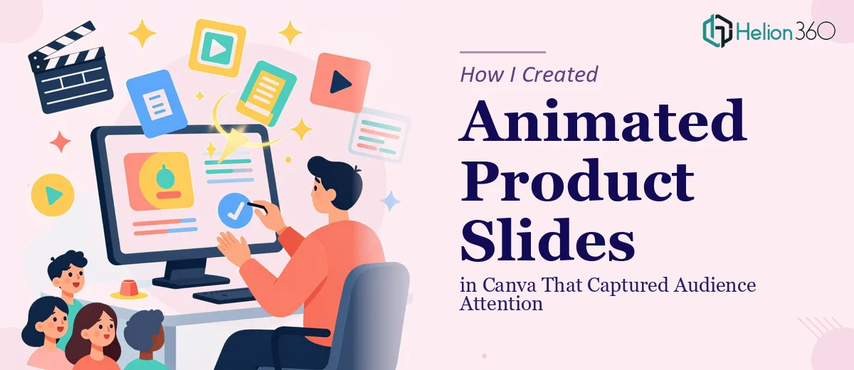
The Problem With Our Product Slides
We had a product showcase coming up — a presentation aimed at a room full of potential buyers who had seen hundreds of slide decks before. The brief was clear: create animated slides in Canva that would highlight our latest products and services in a way that felt polished, purposeful, and visually compelling.
On the surface, it sounded simple enough. Canva has animation features built right in. How hard could it be to add a few transitions and make things move?
The moment I started thinking seriously about the outcome — a deck that would actually hold a room's attention rather than just check a box — I realized this was not a two-hour job done casually on a Tuesday afternoon. The stakes were too high to let it look like something thrown together. I needed it done right.
What I Found the Solution Actually Required
I did some research into what well-executed animated Canva slides actually involve, and the gap between "adding animation" and "designing animated slides that work" is substantial.
First, Canva's animation system is not simply a matter of clicking "animate" on each element. Effective animated product slides require deliberate decisions about which elements animate, in what sequence, at what timing, and with what entrance and exit style. An entrance that fires at the wrong moment pulls the viewer's eye away from the message rather than toward it.
Second, animation has to serve the narrative. Each slide needs a clear visual hierarchy — typically a headline, a product visual, and a supporting detail — and the animation sequence has to respect that hierarchy so the audience processes information in the right order. Getting that sequence wrong creates cognitive friction rather than clarity.
Third, brand consistency across an animated deck is harder to maintain than it looks. Canva offers dozens of animation styles, and mixing them without a clear system produces a deck that feels chaotic. A controlled palette of two or three animation styles applied with discipline is what separates professional animated slides from amateur ones.
What the Work Itself Actually Involves
Building animated product slides that genuinely capture audience attention starts with structural and narrative work before a single animation is applied. The right approach means auditing every piece of product content — descriptions, imagery, key selling points — and mapping it to a slide-by-slide story arc. Each slide needs a single, clear message, and the visual layout must be decided before animation enters the picture at all. A 12-column layout grid, applied consistently across every master slide, ensures that product images, text blocks, and accent elements land on predictable visual axes. Setting up that grid correctly in Canva so it propagates across all slides is one of those tasks that takes far longer than expected if you haven't done it dozens of times before.
The visual mechanics of animation in Canva require decisions that go well beyond clicking a preset. The platform offers entrance animations — Rise, Pop, Fade, Pan — each of which carries a different visual weight and speed. Done well, a product showcase uses no more than two animation styles across the full deck, applied with a consistent timing rule: typically 400–600ms for primary elements and a staggered 150–200ms delay between supporting elements on the same slide. Applying this kind of system across twenty or more slides while keeping product images crisp, text legible at the intended display size, and every animated element within safe margins is tedious, detail-intensive work. One misaligned element that snaps into view at the wrong moment breaks the illusion of polish.
Polish and brand consistency across the full deck is where most attempts fall apart. The work involves enforcing a tight visual system: a maximum of four brand colors, a clear type hierarchy using something like 36pt headlines, 24pt product names, and 16pt supporting copy, and a single consistent background treatment across every slide. In Canva, brand kit application sounds automatic but frequently requires manual correction slide by slide, particularly when product photography varies in tone or background. Getting every slide to feel like part of one coherent visual system — not a collection of individually decent slides — is the layer of execution that takes the most time and the most experienced eye to get right.
Why I Brought in Helion360 to Handle It
I looked at what this project actually required and made the decision quickly: this wasn't something to attempt myself with an afternoon and a tutorial. The combination of narrative structuring, animation system design, and slide-by-slide polish across a full product deck was a defined body of work that needed a team who does this constantly.
Helion360 handled the full project end-to-end — from organizing the product content into a coherent slide-by-slide narrative, to building the animation system with consistent timing and entrance logic, to delivering a fully polished deck with brand colors, typography hierarchy, and product imagery all aligned. What would have taken me several days of learning, iteration, and fixing — and still might not have hit the standard we needed — was turned around quickly. They brought the tooling, the system, and the experience that's already built in. The brief went in, a finished deck came back, and it was ready to present.
The Outcome and What I'd Tell Anyone in the Same Position
The deck landed exactly as intended. The animation felt purposeful rather than decorative — each product was introduced with a clear visual sequence that directed the audience's attention without distracting from the message. The room responded the way you want a room to respond: engaged, leaning in, asking questions about the products rather than tuning out.
The lesson I took from the project is straightforward. Animated slides in Canva look accessible because the platform is accessible. But the gap between a functional Canva deck and a professional animated deck that holds an audience's attention is filled with structural decisions, animation logic, and polish work that adds up fast. If you're looking at a similar brief and want it handled end-to-end without the learning curve and iteration cycles, Helion360 is the team I'd engage — they delivered fast and brought exactly the level of execution depth this kind of work needs.