

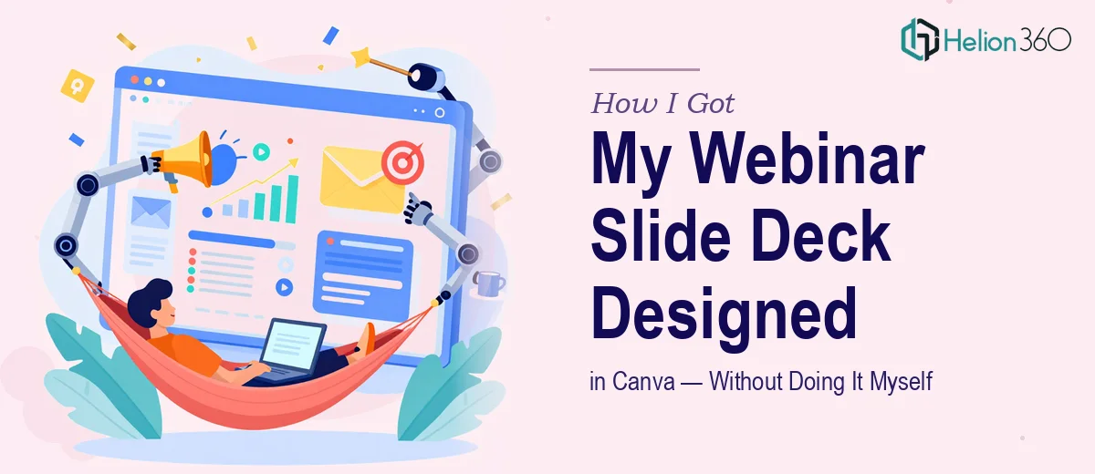
The Webinar Was Booked and the Deck Didn't Exist Yet
We had a digital marketing webinar locked in — attendees registered, a speaker confirmed, and a topic list that covered everything from SEO trends to campaign performance metrics. What we didn't have was a slide deck that could actually hold the room.
This wasn't a small internal meeting. It was a live presentation to an audience expecting polished, credible content on a fast-moving subject. The slides needed to carry complex data, brand-consistent visuals, and a logical flow across six distinct topic areas — all in a format that worked on screen in real time.
I looked at what we were dealing with and knew immediately this wasn't something to patch together over a couple of evenings. The stakes were too high and the scope too broad to risk a mediocre result.
What I Found Out a Well-Designed Webinar Deck Actually Requires
I spent time researching what a professionally built Canva webinar presentation actually involves, and the complexity became clear fast.
First, a six-section deck covering topics like social media's impact on consumer behavior, emerging SEO trends, and future industry predictions isn't just a lot of slides — it's a content architecture problem. Each section needs its own visual logic while staying coherent as a single presentation. That's a structural challenge before a single graphic is placed.
Second, Canva's flexibility is real, but so is its ceiling. Doing brand-consistent work across 40 or more slides — with custom infographics, on-brand color palettes, and data visualizations that actually communicate rather than just decorate — requires deliberate system-building inside the tool, not slide-by-slide improvisation.
Third, webinar audiences read slides differently than boardroom audiences. Hierarchy, pacing, and text density have to be calibrated for a viewer who's watching a screen while listening. That's a specific discipline, and getting it wrong costs you audience engagement at the worst possible moment.
What the Work Itself Actually Involves
The right approach to a project like this starts with structural and narrative work before any design begins. A six-topic webinar deck needs a clear content map — each section audited for what it needs to communicate, how much time it gets, and where it sits in the overall arc of the presentation. The narrative spine has to be defined first: introduction sets context, middle sections build the argument, case studies provide proof, and the forward-looking section lands the takeaway. Getting this right typically means several passes at the outline before a single frame is touched, and it's the step most people skip — which is why so many decks feel like six separate documents rather than one cohesive story.
Visual mechanics are where the execution gets technical. A well-built Canva deck for a webinar uses a defined layout grid — typically based on consistent margin widths and a clear hierarchy of title (around 36pt), subhead (around 24pt), and body copy (around 16pt) — applied uniformly across every master layout. Infographics covering data like campaign performance metrics or SEO trend lines need chart types matched to what the data actually shows: bar charts for comparison, line charts for trend over time, not decorative icons dropped in as a substitute for real visualization. Building this system inside Canva so it propagates consistently takes significant setup time, and deviating from it on even a handful of slides breaks the professional impression the whole deck is supposed to create.
Polish and brand consistency across a long deck is the part that quietly takes the most time. Holding to a maximum of four brand colors, ensuring every image is treated with the same style filter or overlay, keeping spacing identical between section headers and body content across 40-plus slides — these are details that don't show when they're right but are immediately obvious when they're wrong. The edge cases compound: a data-heavy slide needs different proportions than a quote slide, and forcing both into the same template without adjustment produces awkward results. Managing that variation while keeping the deck visually unified is where experience in webinar presentation design makes a measurable difference.
Why I Brought Helion360 in to Handle the Full Project
Once I understood the scope — structural narrative work, visual system setup in Canva, data visualization across multiple topic areas, brand consistency across a large deck — it was obvious this wasn't something to attempt in-house with the time available.
I engaged Helion360 to handle the project end-to-end. That meant the full content architecture across all six sections, the visual system built inside Canva with consistent layouts and typography hierarchy, the infographics and data charts designed to actually communicate the underlying insights, and the brand application held cleanly across every slide.
The deck was turned around quickly — handled in a fraction of the time it would have taken to learn the tooling, build the system, and iterate through the design decisions required. This is a team that does this work all day, with the expertise and process already in place. There was no ramp-up, no trial and error on the fundamentals, and no slides that looked like they belonged in a different presentation.
What Came Out of It and What I'd Say to Anyone in the Same Spot
The final deck covered all six topic areas — from the digital marketing introduction through to future industry predictions — with a visual consistency and narrative clarity that held up under live webinar conditions. Attendees engaged with the content. The speaker had slides that supported the talk rather than competed with it. The data visualizations read clearly on screen. It looked like what it needed to look like.
The biggest thing I'd pass on to anyone facing a similar project: the complexity is real, and the time it would take to do this work properly yourself is not a small number. A webinar slide deck in Canva that actually holds a live audience's attention involves structural thinking, visual system discipline, and data design skills working together — not just filling in a template.
If you're looking at a project like this and want it handled end-to-end without spending weeks on the learning curve, Helion360 is the team I'd engage — they delivered fast and brought exactly the execution depth this kind of work needs.