

The Problem I Was Staring Down
Our team was deep into a clinical research initiative, and the data problem was becoming impossible to ignore. We needed a continuous, reliable feed of information from medical journals, industry reports, and online research repositories — all filtered for oncology relevance, structured consistently, and ready to inform decisions on an accelerating timeline.
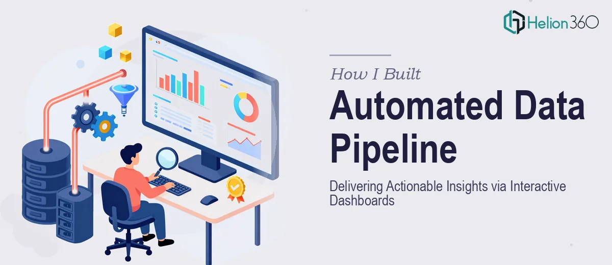
The stakes were real. The insights we needed were sitting in dozens of fragmented sources, updated constantly, and entirely unstructured. Manual collection wasn't an option — it was too slow, too error-prone, and completely unscalable. And the end goal wasn't just raw data. It was actionable insights delivered through interactive dashboards that stakeholders could actually use.
I knew immediately that this wasn't something to approach casually. Done wrong, you end up with incomplete data, broken pipelines, or outputs that don't hold up under scrutiny. This needed to be done right, from source to dashboard.
What I Found the Solution Actually Required
Once I started mapping out what a proper automated data pipeline would actually involve, the complexity became clear fast.
First, the data sourcing layer isn't just pointing a scraper at a URL. Medical and research sources have varying structures, access controls, and update cadences. Some require API authentication, others need scheduled crawling, and a meaningful subset requires navigating content behind paywalls or institutional access protocols. Getting clean, consistent data out of that mix is a non-trivial engineering problem.
Second, regulatory context matters enormously here. Working adjacent to clinical data — even aggregated, non-patient-identifiable research content — means HIPAA awareness isn't optional. The pipeline architecture needs to reflect that from the ground up, not as an afterthought.
Third, the interactive dashboard layer is its own discipline entirely. Turning structured research data into something stakeholders can explore, filter, and draw conclusions from requires both data modeling skill and visualization design judgment. These are rarely the same person's strong suit, and trying to bolt them together at the end rarely works.
What the Work Actually Involves
The foundational layer of any automated research data pipeline is source architecture and ingestion logic. The right approach starts with a structured audit of every target source — identifying the data format (HTML, JSON, PDF, structured tables), update frequency, and access method. A well-built ingestion layer uses scheduled crawlers with retry logic, rate-limiting respect, and field-level parsing rules for each source type. Practitioners building this properly write source-specific extraction schemas, not generalized scrapers that break the moment a site layout changes. Getting this layer right typically means accounting for at least a dozen edge cases per source before the pipeline runs cleanly end to end.
Once data is flowing, the transformation and normalization work begins. Raw research content arrives inconsistently labeled, structured differently across sources, and often containing duplicate entries or citation variants that need deduplication logic. Proper normalization means defining a canonical data model — field names, taxonomies, entity types — and writing transformation rules that map every source's output to that model reliably. In an oncology research context, this also means applying domain-specific tagging logic: trial phase classifications, therapeutic area taxonomy, and publication type flags. This transformation layer is where most DIY pipelines break down, because edge cases accumulate faster than expected.
The third layer is the dashboard and visualization output — and this is where analytical value actually becomes visible. Effective interactive dashboards for research data use a clear hierarchy: summary metrics at the top (volume by source, recency distribution, topic concentration), drill-down filters in the middle, and record-level detail on demand. Chart selection follows the data type — trend lines for publication volume over time, treemaps for topic clustering, ranked bar charts for source contribution. Building this properly requires defining the decision questions first, then designing the visual layer to answer them directly. Dashboards built without that anchoring tend to show everything and answer nothing.
Why I Brought in Helion360 to Handle It
Looking at what the full solution required — pipeline architecture, data normalization, regulatory awareness, and dashboard design — I recognized immediately that attempting to assemble this piecemeal wasn't realistic. The learning curve alone on the technical side would have consumed weeks before a single clean data record was produced.
Helion360's Data Analysis Services handled the full project end to end. That meant taking the source list and research objectives and working all the way through to functional, stakeholder-ready dashboards — covering ingestion logic, transformation rules, domain tagging, and the visualization layer in one continuous engagement. They turned it around quickly, in a fraction of the time it would have taken me to coordinate separate workstreams and manage handoffs between them.
What made the difference was that their team already had the tooling, the domain familiarity, and the pattern recognition that comes from doing this kind of work repeatedly. There was no ramp-up tax. The pipeline was built cleanly, the dashboards were purposefully designed, and the output held up the first time it was reviewed by stakeholders.
The Outcome and What I'd Tell Anyone in My Spot
What came out of this engagement was a functioning automated data pipeline pulling from curated oncology research sources on a scheduled cadence, with normalized outputs feeding directly into interactive dashboards that our team could actually use for decision-making. The research insights that had been buried in fragmented sources were suddenly organized, filterable, and current.
Beyond the immediate deliverable, the architecture was clean enough to extend — adding new sources or adjusting the taxonomy didn't require rebuilding from scratch. That kind of forward-compatible design doesn't happen by accident; it comes from practitioners who've seen what breaks in production.
If you're looking at a similar problem — automated data collection, structured research pipelines, or insights dashboards that need to hold up with a real audience — and you want it handled end to end without the weeks of learning curve, Helion360 is the team I'd engage. They delivered for me fast and brought exactly the execution depth this kind of work demands.