

When the Data Was There But the Story Wasn't
We were preparing to launch a new platform, and the first real challenge was not building it — it was understanding the market we were entering. That meant pulling data from multiple sources, cleaning it, and making sense of it quickly enough to guide product decisions.
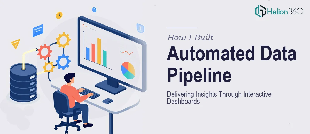
I started the process myself. I had a working knowledge of Python and had used BeautifulSoup before for small scraping tasks. The plan was straightforward: scrape the relevant data sources, run it through Pandas for cleaning, and then visualize it using Matplotlib. Two weeks to a working prototype. It sounded manageable.
It was not.
Where the Process Started Breaking Down
The first problem was the data itself. Different sources returned inconsistent structures. Some pages used JavaScript-rendered content that BeautifulSoup could not reach, which pushed me toward Selenium. That added setup time and introduced new failure points — timeouts, element detection errors, driver version mismatches.
Once I had data coming in, the cleaning stage was its own ordeal. Duplicate entries, mismatched date formats, missing values in critical columns — all of it needed attention before any analysis could begin. I was spending more time firefighting than actually building.
The visualization layer was where I really hit the wall. Static Matplotlib charts were not going to cut it for what we needed. The stakeholders wanted interactive dashboards — something they could filter and explore themselves, not just screenshots of graphs. That required a different toolset and a level of design thinking I had not factored into the original scope.
I was technically capable enough to get fragments of this working. But doing all of it together — scraping, cleaning, analysis, and polished data visualization — within the timeline we had was not realistic on my own.
Bringing in the Right Team
After hitting that wall, I came across Helion360. I explained the full scope: the scraping requirements, the data sources, the need for clean and well-structured outputs, and the end goal of presenting insights through interactive dashboards that non-technical stakeholders could actually use.
Their team took it from there. They asked the right questions upfront — about data freshness, update frequency, the number of sources, and what decisions the dashboards needed to support. That conversation alone told me they understood the project at a level that went beyond just executing tasks.
What the Delivered Work Looked Like
The pipeline they built handled the scraping reliably, including the JavaScript-heavy pages that had been blocking me. Data was cleaned and structured into a format ready for analysis — no duplicate records, consistent field naming, and clear documentation of what had been collected and how.
The visualization layer was where the work really came together. Instead of static charts, the dashboards were built to be interactive — filterable by date range, source, and category. The charts communicated the story in the data without requiring the viewer to understand how the data was collected. That is the part that is hardest to get right, and Helion360 delivered it cleanly.
The prototype was ready within the agreed window. When I walked the stakeholders through it, the questions they asked were about the data itself — not about how to read the charts. That is usually a good sign.
What I Took Away From This
The technical side of data scraping is approachable if you have the basics. But a full pipeline — from raw web data to a polished, interactive data visualization that communicates clearly to a business audience — involves enough moving parts that doing it well under time pressure is genuinely difficult.
I learned that the presentation of data is not a finishing step. It is a design problem that needs to be considered from the start. The cleaning decisions you make, the way you structure the data, the choice of chart types — all of it shapes whether the final output actually helps people make decisions.
If you are in a similar situation — you have the data or know where to get it, but the data analysis pipeline and presentation layer are more complex than expected — Helion360 is worth reaching out to. They handled the parts that were beyond my capacity and delivered something the team could genuinely use. For more context on how to approach this challenge, check out these resources on actionable business insights and raw data transformation.