

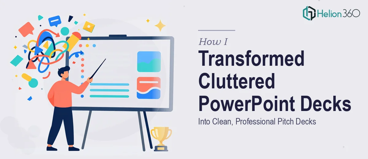
The Slides Looked Fine to Me — Until They Didn't
We had been building the deck for weeks. The content was solid, the story made sense (to us at least), and the data was all there. But every time I opened the file and flipped through the slides, something felt off. The presentation looked like it was assembled in a hurry — because it was.
Text blocks competed with charts. Fonts changed between sections. Some slides had too much white space; others were completely packed. For internal team reviews it was fine, but we had real pitch sessions coming up and the deck was not going to cut it.
What I Tried to Fix on My Own
I spent a couple of evenings going through each slide and trying to clean things up manually. I standardized the font, removed some redundant text, and tried to make the color palette consistent with our brand guidelines. I also attempted to replace a few dense tables with something more visual.
The problem was that every fix I made created a new issue somewhere else. Moving one element shifted the layout on the next slide. Replacing a table meant I had to rebuild it as a graphic from scratch, which I did not have the skills or tools to do well. The slide flow still felt uneven and I was running out of time.
At some point I had to accept that making a PowerPoint look professionally designed is a very different skill from knowing what information belongs in it.
Bringing in the Right Help
A colleague mentioned Helion360 after they had used them to redesign a sales deck. I reached out, shared the existing file, and explained what we needed — a cleaner layout, better visual hierarchy, consistent branding, and slides that felt like they were telling one continuous story rather than a collection of individual pages.
The team at Helion360 came back with a few questions about our brand colors, the context for each slide, and how the deck would be presented — whether it was a live pitch or a leave-behind document. That level of detail told me they were thinking about the design strategically, not just aesthetically.
What a Professional PowerPoint Redesign Actually Looks Like
When I got the revised file back, the difference was immediate. The visual clutter was gone. Each slide had a clear focal point and the information was arranged so the eye naturally moved through it in the right order. Complex data that I had been trying to display in raw table form had been converted into clean, readable charts with just the right amount of annotation.
The branding was consistent throughout — same font pairing, same color weights, same spacing logic. Nothing felt like it had been pasted in from somewhere else. The deck finally looked like it came from a company that knew what it was doing.
Slide flow was another thing they handled well. Some slides that I thought needed to be separate were combined cleanly, and a few transitions were restructured so the narrative moved more logically from problem to solution to traction. It was not just a visual upgrade — it was a structural one.
What I Took Away From This
Professional presentation design is not just about making things look pretty. It is about visual hierarchy, information density, layout logic, and brand consistency working together. When even one of those things is off, the whole deck feels amateur — even if the underlying content is strong.
For a startup heading into pitch sessions, that kind of first impression matters more than most people realize. Investors see dozens of decks. A clean, well-structured presentation signals that your team is serious and organized, before you even say a word.
If you are sitting with a PowerPoint that contains good content but looks rough around the edges, consider investor pitch decks — Helion360 handled exactly this kind of redesign work. You might also find value in learning how dynamic pitch decks impressed investors or exploring how average presentation decks became investor-ready materials for similar situations. They delivered something I could not have produced on my own in the time available.