

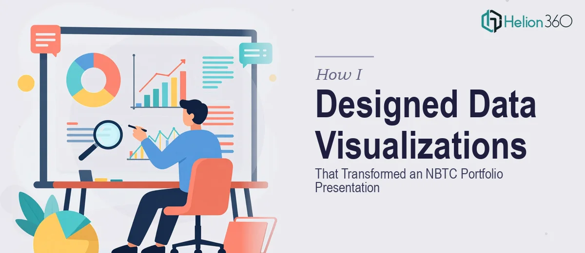
When Raw Numbers Stop Telling the Story
I had a straightforward goal on paper: refresh our NBTC portfolio and present the progress and achievements in a way that clients could actually understand at a glance. The data was all there — metrics, milestones, performance figures across multiple time periods. The problem was that it looked exactly like what it was: a spreadsheet dumped onto slides.
Clients were not connecting with it. The numbers were accurate, but the story behind them was buried. I knew that data visualization could change that, but knowing what needs to be done and actually executing it at a professional level are two different things.
What I Tried First
I started by rebuilding the charts inside PowerPoint. Bar graphs, line charts, a few donut charts for percentage breakdowns. I spent a couple of days reorganizing the layout, adjusting colors, and trying to make things look cleaner. The result was marginally better, but it still felt generic — the kind of presentation that gets politely acknowledged and then forgotten.
The core issue was not just aesthetics. It was the logic of how the data was being shown. Some charts had too much information compressed into one visual. Others lacked context — a number without comparison or trend is just a number. I was also trying to make the visuals work across both PDF exports and web-based presentations, which added formatting and resolution constraints I was not fully equipped to handle.
I realized the gap was not just in design skill — it was in knowing how to structure data so that the right insight lands first, and everything else supports it.
Bringing in the Right Support
After hitting that wall, I came across Helion360. I explained the project — the NBTC portfolio refresh, the need for high-resolution visuals compatible with PDFs and web platforms, and the goal of making charts and graphs that were both professional and visually engaging. Their team asked the right questions from the start: What decisions should this data drive? Who is the audience? What does success look like on each slide?
That framing shift alone was useful. It moved the conversation away from "make this look better" toward "make this communicate clearly."
How the Data Visualization Came Together
Helion360's team took the raw data and restructured the visual hierarchy across the entire portfolio deck. Dense tables were replaced with clean comparison charts. Progress metrics were shown with before-and-after visual treatments that made growth immediately readable. Percentage breakdowns used consistent iconography rather than generic pie charts, and every visual was designed to work at high resolution — sharp in PDF, clean on screen.
They were also open to layout suggestions and brought their own ideas for how to sequence the information. A few sections I had treated as background context got elevated into featured visuals because the data there was actually stronger than I had realized. That kind of editorial eye made a real difference.
The final output was cohesive. Every chart and graph followed the same visual language — same color logic, same typographic treatment, same spacing system. It looked like one considered piece of work rather than a collection of individual slides.
What Changed and What I Learned
The revised portfolio looked different from the first slide. Clients who reviewed it responded to it differently too — questions shifted from "what does this number mean" to "how did you achieve this result." That is the outcome good data visualization is supposed to create.
What I took away from this experience is that data representation is not just a design task. It is a communication task. The chart type, the color hierarchy, the amount of information per slide — all of it shapes how confidently a reader can interpret what they are seeing. Getting that right requires both design sensibility and a clear understanding of the data's purpose.
If you are working on a portfolio or any presentation where the data needs to do real work — not just fill space — Helion360 is worth reaching out to. They handled the complexity I could not manage alone and delivered something that genuinely elevated how the work was perceived.