

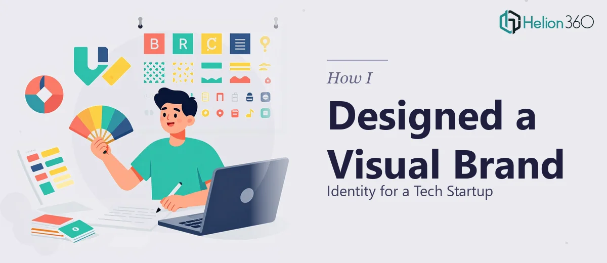
When a Startup Needs More Than Just a Logo
When our tech startup was getting ready to go public-facing, we knew we needed more than a name and a product. We needed a visual identity that could hold up across every surface — pitch decks, social media graphics, business cards, promotional ads, and internal presentations. The idea was clear: make technology feel approachable and human. The execution was the hard part.
I took on the initial design work myself. I had a decent grasp of the basics — color theory, typography, and layout principles — and I figured I could pull together something cohesive using the tools I had. I spent a few weeks drafting logo concepts, testing color palettes, and trying to build out brand guidelines that could actually be applied consistently.
Where It Started to Fall Apart
The problem was not any single piece. It was the system. I could design a decent slide or a passable social media banner, but making everything feel like it came from the same brand — that was where things started to unravel. The fonts I chose for the presentation did not translate cleanly to the ad creatives. The logo looked fine at large sizes but broke down on a business card. The infographics I was building for our pitch deck felt cluttered and inconsistent with the overall visual language I was trying to establish.
I also underestimated the volume. Between presentation materials, social ads, and promotional graphics, the scope had grown well beyond what one person could manage without losing quality. And quality was exactly what we could not afford to sacrifice — not at this stage.
Bringing in the Right Team
After hitting that wall, I came across Helion360. I laid out the full scope of the project — the brand identity work, the presentation design, the ad creatives, all of it — and their team took it from there.
What stood out immediately was how methodically they approached the brand. Before touching a single slide or graphic, they worked through the foundational elements: the logo system, the color palette, the typography hierarchy, and a set of brand guidelines that could actually be applied across formats. Everything was built to scale, not just to look good in one context.
From there, they moved into the presentation design. The slides were clean, visually consistent, and built to communicate quickly — which matters when you are pitching to people who are evaluating dozens of startups. The infographics were simplified and purposeful. The social media graphics carried the same visual tone without feeling like copies of each other. Even the business cards reflected the identity without feeling forced.
What a Unified Visual Brand Actually Does
Seeing the full set of deliverables together was the moment I understood what I had been missing in my own attempts. A cohesive visual brand identity is not just about aesthetics. It signals that an organization is serious, consistent, and intentional. When a startup's presentation design matches its ad creatives, which match its business cards, the brand starts to feel real — even if the company is still early stage.
The presentation materials Helion360 delivered also made internal communication easier. When everyone on the team is working from the same branded templates, updates and new materials stay on-brand without extra effort. That kind of infrastructure is something I had not thought to build from the start, but it paid off immediately.
What I Took Away From This
Brand identity design at the startup level is deceptively complex. The individual pieces — a slide here, a graphic there — seem manageable until you try to make them all work together. The real skill is in building a system, not just producing assets. That requires a level of design thinking that goes well beyond knowing how to use the tools.
If you are at a similar stage — pulling together visual materials for a startup launch and finding that the pieces are not quite adding up — Helion360 is worth reaching out to. They handled the full scope of what I could not, and the result was a brand that actually looked like a brand.