

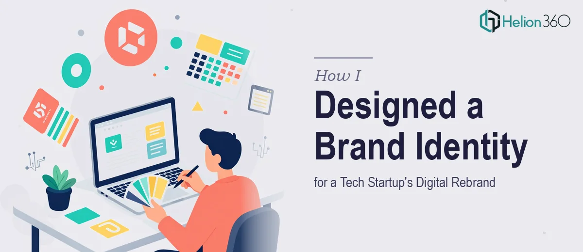
When a Rebrand Means More Than Just a New Logo
When the startup I was working with decided it was time for a full digital rebrand, I thought it would be a straightforward project. Update the visuals, tighten the color palette, produce a few design assets, and we'd be done. What I didn't anticipate was the sheer scope of it — social media banners, email signatures, branded letterheads, and a set of PowerPoint templates that all needed to feel like they came from the same design system.
I'm comfortable with design work. I know my way around Adobe Illustrator and have put together brand assets before. But this was a San Francisco-based tech startup with a clear vision for innovation and modernity, and they wanted every touchpoint to reflect that consistently. That kind of cohesion across multiple deliverables is harder to execute than it sounds.
Where the Complexity Started to Show
I started with the social media banners. Getting the dimensions right across platforms was manageable. The challenge was translating the brand's energy — something bold, clean, and forward-looking — into formats that had very different spatial constraints. A LinkedIn banner communicates differently from an Instagram post, even if they're using the same colors and typeface.
The letterhead and email signature work added another layer. These aren't just decorative pieces. They carry legal weight and represent the company in professional correspondence. The alignment, hierarchy, and use of white space needed to be precise. I got through a rough version, but the signature rendering across email clients was inconsistent and the letterhead felt stiff compared to the more dynamic banner work.
Then came the PowerPoint templates. This is where I hit a genuine wall. Building a presentation template that's visually polished, fully editable, and usable by people with varying design skill levels is a discipline of its own. I wanted slide masters, consistent text styles, proper placeholder behavior, and a variety of layout options — all while keeping the aesthetic sharp. My first attempt looked fine at a glance but fell apart the moment someone tried to actually use it.
Bringing in the Right Team
At that point, I reached out to Helion360. I explained the full scope — the banners were mostly done, but I needed the letterhead and signature refined, and the PowerPoint template system built properly from the ground up. Their team understood the brief quickly and asked the right questions about brand usage, audience, and the kinds of presentations the startup team would be building.
What happened next was efficient and professional. Helion360 took the existing brand direction I had established and carried it across every remaining deliverable with consistency. The letterhead came back clean and authoritative. The email signature was tested across clients and rendered correctly. The PowerPoint template set included multiple slide layouts, a working slide master, and typography that matched the overall brand identity system without looking over-designed.
What the Final Brand Kit Looked Like
By the end of the project, the startup had a complete, cohesive brand identity kit that covered every major communication channel. The social media banners were platform-specific but visually unified. The letterhead and email signatures carried the same visual language into professional correspondence. The PowerPoint templates gave the internal team a reliable starting point for pitch decks, investor updates, and team presentations — without needing a designer every time.
The consistency across all of these assets is what made the rebrand feel real. It wasn't just a new logo. It was a system.
What I Took Away From This
Brand identity work at this scale requires more than design skill — it requires systems thinking. Every asset has to function on its own while also fitting into a larger visual language. When the work involves PowerPoint template architecture or cross-client email signature behavior, the technical depth required goes beyond what most generalist designers handle day to day.
Knowing when to bring in specialists made the difference between a half-finished kit and something the startup could actually use long-term.
If you're working on a similar brand packaging and presentation project and finding that the scope is broader or more technical than expected, Helion360 is worth a conversation — they stepped in at exactly the right moment and delivered a level of consistency I couldn't have achieved alone on this timeline.