

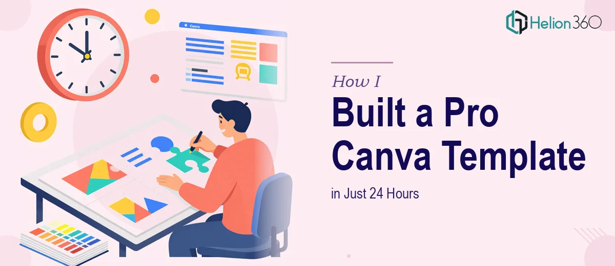
The Brief Was Simple — Until It Wasn't
I had a tight window: 24 hours to deliver a fully customizable Canva presentation template. The requirements sounded straightforward at first — an intro slide, a company logo placeholder, a products and services section, space for images, a contact slide, and a thank you slide. Clean, professional, and mobile-friendly.
I opened Canva with confidence. I know the tool reasonably well and figured this would take a few hours at most.
I was wrong.
Where the Complexity Crept In
The challenge wasn't building slides — it was building a template that someone else could use without breaking it. Every design decision had to account for flexibility: text boxes that resize gracefully, color swatches that are easy to update, image blocks that hold their proportions when swapped out, and a layout that reads just as well on a phone screen as it does on a widescreen monitor.
I started with a Canva blank presentation and began dropping in elements. The intro slide came together quickly. But when I moved to the products and services section, I realized I needed a layout structure that could handle both short and long content without falling apart. And then the mobile responsiveness question — Canva doesn't have a true responsive mode, so I had to think carefully about font sizes, padding, and image placement to ensure nothing looked cramped or cut off on smaller screens.
I also wanted the template to feel cohesive — consistent typography, a color palette that could be swapped to match any brand identity, and placeholder guidance so a non-designer could step in and make it their own. That level of polish takes longer than it looks.
I was three hours in and had two usable slides. The deadline was very real.
Handing It Off to People Who Do This Daily
After hitting that wall, I reached out to Helion360. I explained the scope, shared what I had started, and described the specific requirements — logo placement, editable text formatting, image sections, the thank you slide, and the need for desktop and mobile compatibility. Their team asked a few targeted questions about branding preferences and tone, then got to work.
What struck me was how quickly they translated a vague brief into actual design decisions. They didn't just fill in the blanks — they structured the template in a way that made sense for a business that needs to present its services to clients. Each slide had a clear purpose and a logical flow.
What the Finished Template Looked Like
The delivered Canva presentation template included a branded intro slide with a logo placeholder, a services overview section with image blocks, a contact information slide, and a polished thank you page. Every text element was labeled and easy to edit. The color scheme was set up so that changing the palette in one place updated the whole deck. The layouts were tested at both standard 16:9 dimensions and verified to look clean when viewed on mobile.
Helion360 also added subtle design details I hadn't thought to include — consistent icon sizing, a grid-aligned layout for the services section, and slide numbers that didn't interfere with the design. It was the kind of attention to detail that separates a usable template from a professional one.
What I Took Away From This
Building a Canva presentation template sounds like an entry-level task, but building one that actually works for someone else — one that's reusable, on-brand, and doesn't require a design background to update — is a different kind of challenge. The 24-hour constraint made it even sharper. There's a real skill in knowing how to structure a template rather than just design a set of slides, and that distinction matters when the end user isn't a designer.
If you're in a similar position — tight deadline, specific requirements, and a Canva template that needs to be truly usable and professional — Helion360 is worth contacting. They handled the complexity I couldn't get through in time, and the result was something I could confidently hand off.