

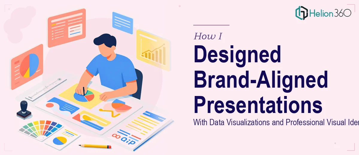
The Brief Sounded Simple — Until It Wasn't
Earlier this year, I was tasked with putting together a series of PowerPoint presentations for our company. The goal was straightforward on paper: showcase recent achievements, highlight upcoming initiatives, and keep everything visually consistent with our brand identity. We needed professional presentation design — clean, structured, and polished enough to be used across internal reviews and external-facing meetings.
I figured I could handle most of it myself. I had a working knowledge of PowerPoint, understood our brand colors and fonts, and could put together a decent slide. So I started building.
Where Things Got Complicated
The first deck came together reasonably well — maybe a 6 out of 10. But as soon as I started building the second and third presentations, the cracks started showing.
Brand consistency across multiple files is harder than it looks. What felt aligned in one deck looked slightly off in another. Fonts weren't perfectly matched. Color values were close but not identical. Spacing felt inconsistent slide to slide.
Then came the data slides. We had a fair amount of performance data that needed to be visualized — growth numbers, initiative timelines, comparison metrics. I could drop in a bar chart, sure. But making data visualization actually communicate something clearly, while also looking polished and brand-appropriate? That required a level of detail I didn't have bandwidth for.
I was spending hours on things that weren't moving the needle, and the output still didn't look the way I needed it to.
Bringing in the Right Team
After spending a week going in circles, I decided to bring in outside help. That's when I came across Helion360. I explained the full scope — multiple presentations, strict brand guidelines, data-heavy slides, and a need for visual consistency across the entire series.
Their team asked the right questions upfront. They wanted to understand the audience for each presentation, the data sources, the brand kit, and the overall narrative flow. That level of preparation made a real difference in what came back.
What the Design Process Looked Like
Establishing a Master Visual System
Rather than treating each presentation as a separate project, the Helion360 team built a master slide system first — a template architecture that locked in the brand colors, typography, spacing rules, and layout grid. Every presentation in the series pulled from that same foundation, so everything felt cohesive from the start.
This was the piece I had been missing. Without a shared design system, each deck ends up drifting slightly from the others. The master slide approach eliminated that problem entirely.
Turning Data Into Clear Visual Narratives
The data visualization work was where the biggest improvement happened. The team took our raw performance numbers and initiative timelines and translated them into charts, milestone graphics, and comparison visuals that actually told a story.
They didn't just swap in a default PowerPoint chart. They chose the right chart type for each data set, adjusted proportions so numbers read clearly at a glance, and made sure the design supported the point being made — not just decorated the slide.
For the corporate presentation slides that needed to communicate growth metrics to senior stakeholders, that clarity mattered enormously.
Maintaining Brand Identity Across the Full Series
By the time all three presentations were complete, they felt like they belonged together. The same visual language ran through every deck — consistent iconography, slide transitions that matched in style and pace, and a color application that felt intentional rather than accidental.
That's the difference between someone who knows how to use PowerPoint and someone who understands professional presentation design at a system level.
What I Took Away From This
The task wasn't beyond my capability — it was beyond my available time and depth of design experience at that scale. Managing brand-aligned PowerPoint design across multiple files, while also handling data visualization with precision, is genuinely specialized work.
Helion360 delivered all three decks within the agreed timeline, and the feedback from internal stakeholders was immediately positive. The presentations looked like they came from the same professional hand, which was exactly what we needed.
If you're working on a similar project — multiple branded presentations, data-heavy slides, or a deck that needs to reflect a real visual identity — the process I went through is worth understanding before you start.
Need Help With Branded Presentation Design?
If you're managing a presentation series that needs consistent branding, clear data visualizations, and a polished finish — and the scope is getting complex — Helion360 is worth reaching out to. Their team handles the design work end to end, so you can focus on the content and the message.