

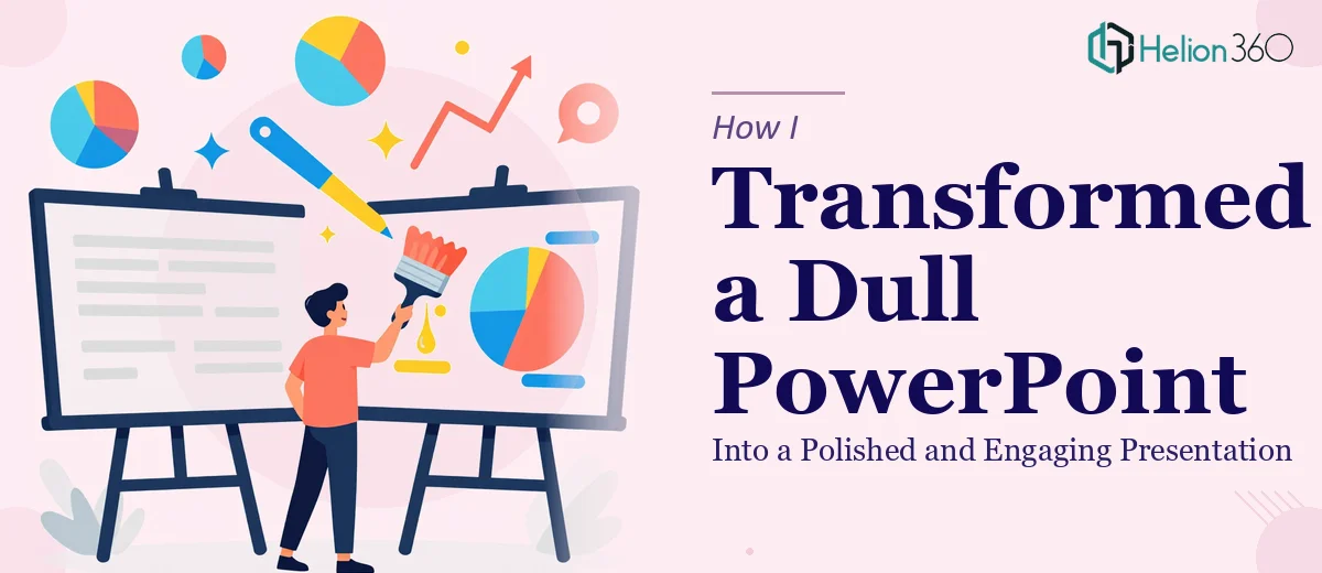
The Presentation That Made Me Cringe
I had a 22-slide PowerPoint that I had been building over several weeks. It had all the right content — data, context, a clear narrative — but every time I opened it, something felt off. The slides were cluttered. The fonts were inconsistent. The color choices looked like I had picked them at random. It was the kind of deck that would technically get the job done, but it would never make an impression.
I had an important internal presentation coming up, and I knew the content deserved better than what I had put together visually. So I decided to fix it myself.
What I Tried on My Own
I started by downloading a few PowerPoint templates and trying to adapt them to my content. The problem was that none of them matched the tone I was going for. Some looked too corporate and stiff. Others were flashy in a way that felt off-brand. When I tried to customize them, the layouts would break, icons would go out of alignment, and the slide master kept overriding my changes.
I also spent time watching tutorials on presentation design — learning about slide hierarchy, typography pairing, and how to use white space effectively. I picked up useful ideas, but applying them consistently across 22 slides while also managing the content itself was harder than I expected. I was spending three hours on a single slide and still not getting it right.
At some point, it became clear that knowing the principles and actually executing a polished PowerPoint redesign are two very different things.
Bringing in the Right Help
After hitting a wall, I came across Helion360. I explained what I had — a content-complete deck that needed a proper visual overhaul — and their team took it from there.
What I appreciated right away was how structured the process was. They asked specific questions: What is the audience for this presentation? What tone are you going for — formal, conversational, data-heavy? Do you have brand guidelines? That level of intake made me feel confident they weren't just going to apply a generic template and call it done.
I sent over the existing file along with a few reference examples of slide design I admired, and within a couple of days, I had the first version back.
What the Redesigned Deck Actually Looked Like
The difference was significant. Not just cosmetically — structurally.
Slides that had been wall-to-wall text were broken into cleaner sections with clear visual hierarchy. Data that I had presented in plain bullet points was now displayed in simple, readable charts. The color palette was consistent throughout, tied to a primary and secondary tone that felt intentional. Icons and spacing were uniform. The title slide actually looked like something worth opening.
One thing that stood out was how they handled the slides with complex information. Instead of stripping out the detail, they reorganized it so the most important point was always the visual anchor, and supporting detail sat beneath it. The flow felt natural in a way my original version never did.
What the Final Outcome Taught Me
The presentation went well. People in the room commented on how clear it was — not just the content, but how easy it was to follow. A few asked which template I had used, which told me the deck no longer looked like a template at all.
What I learned from the experience is that presentation design isn't just about making things look attractive. It is about making information easier to absorb. Good slide design reduces cognitive load for your audience. When the visual layer does its job, the content lands harder.
Helion360 delivered exactly what I needed: a professionally redesigned PowerPoint that preserved my content and elevated how it was communicated. The turnaround was fast, the feedback loop was easy, and the end result was something I was genuinely proud to present.
If you are sitting on a deck that has solid content but isn't doing it justice visually, the gap between a flat presentation and a polished one is often just a matter of getting the right design expertise involved.
If your presentation has the content but lacks the design, the team at Helion360 can step in and bring it to the standard it deserves.